Action for Children reveals new “friendlier” brand identity
Cheltenham-based consultancy ArthurSteenHorneAdamson (ASHA) worked with the children’s charity on a new logo, tone of voice and branded products.

Design studio ASHA has provided a new brand identity for the children’s charity Action for Children, to coincide with the organisation’s 150th anniversary this year.
Marksteen Adamson, founding partner at ASHA, says that the key aspect of the rebrand was finding the “fundamentals of the charity’s DNA”.
“A problem with creating a brand identity around what you do is that can change every six years, in particular for charities. You have to be nimble and light on your feet and create around who you are and not what you do,” he adds.
After developing ideas with the organisation, the studio decided to work from the concept, ‘we are family’.
“It’s noticeable when you go into the organisation that Action for Children is different,” Adamson says. “The staff behave like a family, and the children who are helped by the organisation say that it feels like a family.”

Tone of voice was “key” to conveying this concept, according to Adamson.
The studio came up with a language that was more “conversational”, inspired by the idea of a family being around a dinner table.
“If we are talking as a family, it needs to be reflected in how we communicate,” Adamson adds.
According to ASHA, the new tone of voice is “warm, straightforward and relevant” and “seeks to engage with people as they would a member of their own family”.
The “warmer” and “friendlier” tone of voice means that Action for Children can talk to children, parents, corporate partners and the government in a more uniform way across platforms, the charity says.

To emphasise this more casual tone of voice, the studio chose Appetite for the new font, which Adamson calls “extremely characterful”.
He also hopes that the font will “bring the charity’s many services together” by giving it a distinctive and cohesive look.

The charity previously used only red in its branding but “it’s hard to own a single colour,” Adamson says, pointing to similar shades used by Vodafone, Red Cross and Coca Cola.
“We’ve introduced a yellow, which adds the idea of hope to the branding.”
While the red represents the work the charity does for children in crisis, the addition of yellow looks to create a “spectrum between crisis and hope”.
“The two colours now signify the breath of what the organisation offers,” Adamson says.
A secondary set of background colours has also been introduced for booklets and leaflets.

As well as its scale, another challenge of the rebrand was the charity’s name. It is a “statement”, which can lead to repetition as well as a narrow focus, Adamson says.
“It means you’re always saying the same thing, but there are times you want to talk about other things.”
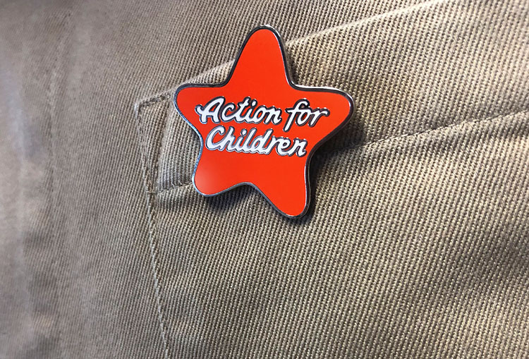
In an attempt to make branding more flexible, ASHA provided a new logo for the charity, adding a star shape around its name.
“Taking the name and writing it into a star made it more of an icon, so you can put it against crisis campaigns but also other services the charity runs,” Adamson says.
“Having a recognisable logo also means it’s easier for the brand going forwards, and the shape and colour work well for branded material as well.”
Another part of the new identity is an expansion into products for its 5000 members of staff, aimed at “maximising external impact”.
‘Keep it fresh’ is printed on the water bottle, ‘Heart Warming’ on branded mugs and ‘Good to go’ on tote bags.
“The staff have always been the brand and by wearing and using relevant branded items externally they also become the perfect visible brand ambassadors,” Adamson adds.

One of the challenges facing the organisation was its scale. It offers almost 500 services across the UK and needed an identity that can be used at a “local level”.
“You need to be able to use the identity to create a toddler group, for example, and not always just for a crisis,” Adamson says.
In response to this, the studio has created “branded templates for all communication requirements” in an attempt to create more “consistent” branding across platforms.
Adamson hopes that these “simple and creative” templates will “empower” staff and prevent any “stress” about design problems at a local level.
The new brand identity is rolling out now.
Read this next


This is so brilliant! It’s simple and positive. Love that star shape.
Google Carl’s Jr.
Chupa chups will love it!
Does anyone know what their fonts called?