Alex Breuer: “Guardian readers are a visually literate bunch”
The Guardian Media Group’s Sunday paper, The Observer, has launched a biannual, print design magazine, which looks to bridge the gap between consumer and specialist publications.

The Observer has launched a glossy, print supplement called Design, which will be published twice a year and aims to imbue The Guardian Group’s values of championing “sustainability, accessibility and the environment”.
The new 146-page magazine has been designed by a team led by Alex Breuer, executive creative director at The Guardian, and looks to explore issues that are relevant both to designers and consumers, such as eco-friendliness, living spaces, sustainability and design for wellbeing and comfort.
The Observer, which is owned by the Guardian Media Group, is a sister newspaper to The Guardian, which is published every Sunday and focuses on longer-reads and features rather than news.

Breuer says that the new supplement, which is edited by Alice Fisher, who launched another biannual magazine called The Fashion in 2013, will be relevant for Guardian readers, as they are already interested in these wider issues, as well as visual arts.
“Speaking to our readers about The Guardian’s recent print and online redesigns and launches, it has shown that they are a very visually literate bunch,” he says. “They are also passionate consumers, and care about social responsibility, so we were confident this would interest them.
“They also include a community of creative practitioners, too,” he adds. “Designers don’t work in isolation, they want to be immersed in the world around them, and The Guardian’s outlook of social purpose sits comfortably in that design world.”
The naming of the publication looks to follow a simple, discipline-focused trend, after The Fashion’s launch six years ago. The thinking is that the magazine could form part of a “growing portfolio” of supplements in future, says Breuer.

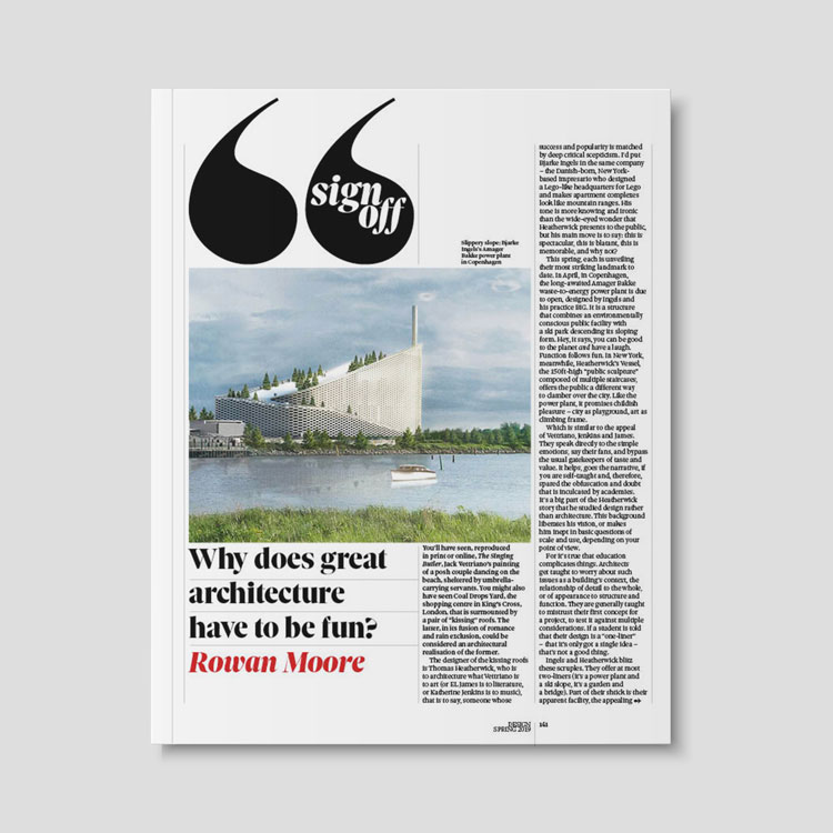
The new publication has been designed with a “simple and traditional structure”, he says, with a pared back aesthetic so as not to overshadow the design projects showcased in the magazine.
It includes features on interiors, architecture, product design, fashion and art, with the launch issue including articles written by product designer Tom Dixon and ex-Creative Review editor Patrick Burgoyne, and interviews with fashion designer Jonathan Anderson and former Calvin Klein creative director, Raf Simons. It also profiles up-and-coming practitioners, such as in a longer piece showcasing sustainable, “eco-designers”.
The front section of the magazine, called “Brief”, includes news and shorter features, which are laid out as a “classic, modular grid” to allow them “form, proportion and space”, says Breuer.

The middle section includes a range of longer pieces, profiles and portfolio articles, looking at specific projects and designers, or encompassing many projects in one piece. The back section features voices of columnists and specialist writers, including articles written by Burgoyne and Dixon.
The typeface choice has been inspired by The Observer, with the design team opting for serif type Sole, for headline and text font. The type family, which was originally designed by Italian foundry Cooperative Anonima Servizi Tipografici (CAST) is used throughout The Observer, and so “retains the essence of the brand”, says Breuer.
Design’s logotype is a bespoke typeface, again derived from Sole, which in its detail looks to hark back to features of “early days British modernism”, including the work of World War Two graphic designer, Abram Games.

The colour palette is “minimal”, says Breuer, focused on monochrome with accents of colour in subtle places, such as a piece of punctuation in a headline, which have been colour-picked from the imagery and photography that features on that page.
Breuer says the editorial and design teams were inspired by the recent surge in long-read, independent print publications, when conceptualising Design.
“With the internet and apps, the consumption of journalism has changed dramatically in recent years,” he says. “What independent publishing has shown is where print’s strengths still lie in journalism, which is towards visually-weighted subjects, and subjects that require exploration and discovery at greater depth, and which aren’t defined so precisely by time.”
While The Guardian and The Observer, as national newspapers, take a left-leaning political stance, Breuer says he hopes Design will appeal to that audience, who tend to be interested in visual art and design, but also a much “broader church” of demographic.

“We’re all consumers of design,” he says. “We want to bridge the gap between the consumerist end of the design publishing market, which is focused on interiors and “comfort living” design, through to specialist publications, which might focus more on moral imperative, sustainability and design practice and process.
“The aim is to democratise the subject [from a national newspaper perspective],and provide something for anyone who appreciates great design but who also lives in a normal house, which they don’t treat like a museum,” he adds. “Design is not art, it’s there to be held and used. That’s why we didn’t want to focus entirely on aesthetics.”
Design is available as a free supplement, twice a year, as part of The Observer newspaper, and is not available to buy separately. The first issue was released on 7 April. Some features from the magazine are currently online, with a view to expand to a full digital edition in the future.


Well, I hope all the apparent conscious decision-making counts as a win to their intended audience. Personally, I’m just not feeling it.