Bulletproof works up new Maynards brand and packaging
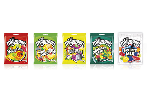
Bulletproof has redesigned the identity and packaging for the Maynards confectionary range, including Wine Gums, Wine Pastilles, Sours, Sports Mix and Midget Gems.
The consultancy was appointed in summer 2010 following a three-way strategic pitch.
It aimed to evolve the packaging design and make the brand stand out, while also providing a clearer role for each of the variants within the brand.
Anna Bouriak, Bulletproof senior account manager says, ‘Maynards had an ambition to modernise their brand and become emotionally engaging for a younger adult audience without alienating the current consumer.’
The new design uses a swirling ‘vortex’ device, ‘emulating the ease at which consumers get ‘lost in the chew’’, according to Bulletproof.
It used a bright colour palette to ensure on-shelf standout, and brought brand symbol Maynard the Moose onto the pack for the first time.
Lauren Milne, designer at Bulletproof, says, ‘The existing design was a little tired and lacked clear differentiation across the portfolio. Maynards wanted to give each product its own unique personality based on the individual chew experience, whilst still retaining great impact on shelf.
‘Our solution – create a swirling chewy vortex, inviting consumers to lose themselves in the ‘Maynards Chew-niverse.’’
The new packaging begins to roll out this week.
Read this next

-
Post a comment


