Central Saint Martins’ identity is “boisterous, anarchic and unpredictable”
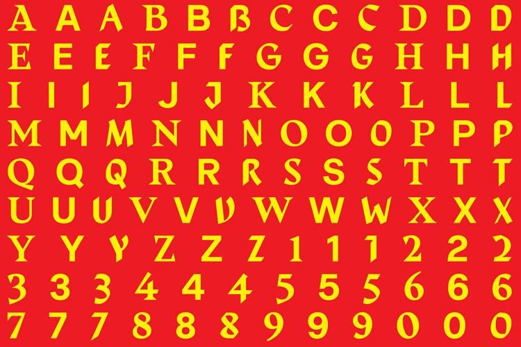
The new look features a dynamic custom typeface, CSM Shifts, which has been designed to reflect the past, present and future of the institution.

As part of an ongoing rebranding project, Central Saint Martins (CSM) has unveiled a new visual identity which will work across the college’s communications.
Since 2018, design studio Boyle & Perks has led the project, which looks to define the college as its own entity, while remaining under the University of the Arts umbrella. It has now unveiled its latest project: a bespoke dynamic typeface and a bolder colour palette.
CSM Shifts was designed in collaboration with Colophon Foundry and looks to celebrate the institution’s past, present and future. The typeface is therefore actually a combination of three different styles – one inspired by history, one contemporary and one futuristic – which randomises and changes based on a coded algorithm.
“Our first thought was actually that creating a font wasn’t the way forward,” says Elaine Perks, cofounder of Boyle & Perks, “but the more we got into the project we realised this was the best thing we could do.”
Perks, an alumna of CSM, says that finding a visual identity for the whole college was a challenge. CSM has nine course programmes, which cover disciplines including graphic, product and textile design, so creating a bespoke typeface appeared the best way to adequately represent the entire institution.
“The college does so many different things in terms of courses, exhibitions and events, and we didn’t want to restrict its creativity,” Perks says. “The whole point is about leaving space for experimentation.”

To create the three initial typefaces, the designers took to the college’s archives. “Central Saint Martin’s archives are just amazing,” says Perks, “so we were really able to get into the zone when it came to researching the past and looking to the future.”
In the end, the designers settled on the archived work of Edward Johnston, influential designer and teacher at CSM from the early 20th century, to form the basis of the ‘past’ typeface. For the ‘present’, a sans serif font was chosen to represent modern type trends. Running into difficulty trying to predict the future, the team settled on an updated version of the ‘past’ typeface.
After being soft-launched at the beginning of the academic year, the new look will be rolled out across all college communications.


Love this! So great to see visually exciting and intelligent design aligned to such a great art school.