Design in 2019 – what will editorial design look like?
As part of our series on design in 2019, Ross Lesley-Bayne, art director at The Big Issue, looks at what will happen in editorial design over the next 12 months.

What do you think 2019 will hold for editorial design?
In 2018, both the NME and Shortlist printed their last weekly magazines and moved to digital only and for me, they will both be sadly missed. I grew up reading the NME — it was the place I went to, to find out about new bands and had some of the best covers on the newsstand. Although my music tastes seemed to differ from it in later years, I would still pick up a copy and flick through it on the train. The same with Shortlist; both were welcome distractions on my commute.
In 2019, I hope that media organisations will once again embrace print. It’s easy to see it as a costly extravagance that we can do without in the digital age but it offers something that digital doesn’t — it offers an escape. A printed magazine has a structure, it takes you on a journey, each feature works with the pages before and after it. You don’t read a magazine cover-to-cover, you can dip in and out, you can read it over the course of a day, a week or a month and it will still be there, unchanged. I can’t count how many times I’ve seen something online, had the intention to go back to it later and either can’t find it again or simply can’t remember what it was I was looking for.
Magazines and newspapers will always be important. When they flow properly, use great imagery and are easy to navigate they can offer the reader a truly immersive experience — something that stays with them, something they can go back to and something they won’t find anywhere else.
What was your favourite editorial design project in 2018 and why?
The standout piece of editorial design in 2018 for me was The Guardian’s redesign in January. The move from broadsheet to tabloid (or compact) not only saved the paper millions of pounds but also demonstrated that print still really matters. With many media organisations looking at digital-first strategies (and some offering digital-only), it was refreshing to see The Guardian placing the printed edition at the heart of their redesign.
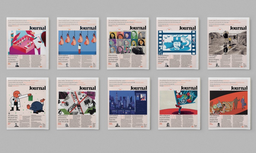
The redesign itself is simple, easy to navigate and flows well. The new Journal section stands apart from the main news run with its bold use of a coloured background wash and striking illustrations. It’s something that you would expect to find in a Sunday supplement rather than a daily newspaper but it works and is a welcome change of pace. The Saturday supplements have also been redesigned and they mostly work. For me, The Guide feels like it’s trying too hard and lacks the refinement of the otherwise stunning supplements.
A year into the new design and it is still evolving (as these things should). The masthead on the front page now has a blue background, which helps distinguish it from other tabloids on the newsstand. For many people, a printed newspaper is still an important part of their daily routine and for The Guardian to embrace this shows that in an ever-increasing digital world, print still has its place.
Read this next


As part of our series on design in 2019, Ross Lesley-Bayne, art director at The Big Issue, looks at what will happen in editorial design over the next 12 months.
no he doesn’t… he gives us an (old) justification for print that flies in the face of the painful reality all print publishers are experiencing, and a retrospective.