Design inspiration: our favourite projects from November
From colour charting the Beach Boys to a characterful pet food rebrand, these were some of our favourite projects from the past month.
The Colour of Iconic Albums, by Dorothy
You might know the sound of these classic albums, but do you know their colour palettes? Liverpool-based studio Dorothy has designed a new print which takes inspiration from 35 of the most loved albums from the last 60 years (from British, North American and European bands). Each cover has been distilled into a set of colour-coded circles. There’s pink, green and grey from The Clash’s London Calling cover, while The Strokes’ Is This It is represented in a simple black and white design with a red edge. It’s obvious once you know the answer, but you could spend hours guessing titles (which is also part of the fun). The studio has also designed a poster for Liverpool museum British Music Experience featuring only British bands, from 1950s pop to the present day.
Face This T-shirt collection, in collaboration with WePresent

Face This is a streetwear charity where Indonesian schoolchildren collaborate with artists on T-shirts – the proceeds of which are then used to improve the children’s schools. Since it was set up in 2008, the organisation has worked with five schools across the country. The latest collaboration was curated by WeTransfer’s arts platform WePresent – linking designers with students in Lombok (an island in Indonesia). UK illustrator Yukai Du and American artist KaCeyKal and more international creatives have teamed up with the pupils from Senggigi school, crafting drawings based on some of their favourite local spots – their town had been seriously damaged by an earthquake in 2018.
Story & Truth, written by Ian Douglas and illustrated by Ben Javens

Story & Truth is the first book from How Brave is the Wren – a travelling children’s book store which works out of a converted caravan. Written by Ian Douglas, it tells the tale of young man Story and elderly woman Truth – the former is welcomed into everyone’s home while Truth is shunned. Story doesn’t have an answer for that but he does know that people love a story. Ben Javens, who designs and illustrates for Studio Anorak, has illustrated the children’s tale, looking to the work of mid century illustrator Aliki Brandenberg as inspiration. “I decided early on that the illustration and design for Story & Story should reflect the age of the tale and so I looked to some old picture books in my collection to take inspiration,” Javens says.
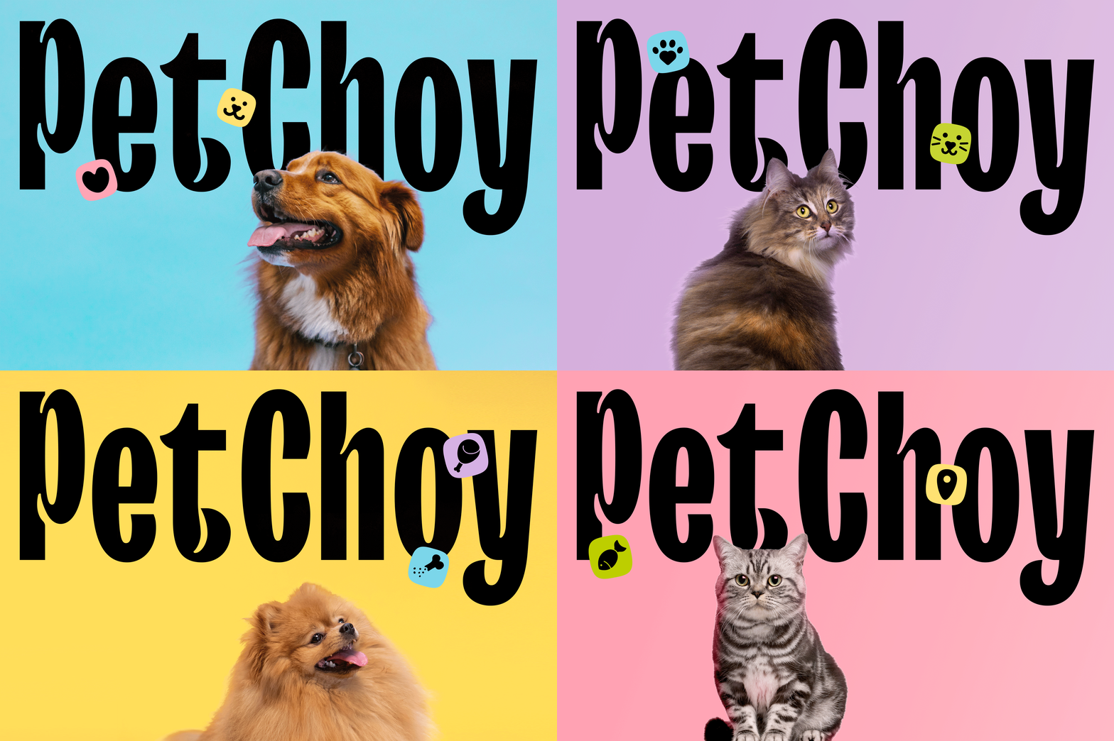
PetChoy brand identity, from M-N Associates

Vietnamese design studio M-N Associates has crafted the visual identity for Saigon-based pet food company PetChoy. As studio designer Dan Nguyen explains, the rebrand uses a custom version of typeface TT Trailers which features inktraps inspired by wagging tails and happy ears. This seeks to represent the happiness of a pet that knows it’s getting PetChoy for dinner, according to the design team. The pastel colour palette has been inspired by core ingredients – seafood, meat and vegetables. To further delineate the cat and dog food line, animal characters were designed which appear in the A’s negative space. M-N Associates also created a receipt motif for packaging which denotes the flavour and aims to give the food a high-end feeling. On pack it’s combined with the image of a pet’s paw to hint at the food’s desirability among four-legged friends.
Jagex homeware collection, in collaboration with Central Saint Martins

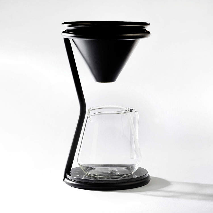
UK gaming developer Jagex (responsible for 2001’s cult online game Runescape) has collaborated with graduates from Central Saint Martins on a product range inspired by the world of video games. The brief was to design objects that were in tune with Jagex’s value of “community collaboration, scientific creative and courage for change”. Six products were chosen, from a wireless phone charger to an articulated lamp, which all interact with the world of video games. The coffee dripper and jug hints at the form of an hourglass, as a nod to the computer loading icon, for example. BA Product Design course leader Paul De’Ath says that the collaboration offered a glimpse into the changing nature of the gaming industry and “how the values held there can inform design beyond the usual gaming merchandise”.
-
Post a comment


