Design inspiration: the best studio work from April
Lego bricks designed to help blind children learn, a smartphone concept that gets people away from their screen and a fun campaign encouraging nurses to wash their hands are some of our favourite projects from the last month.
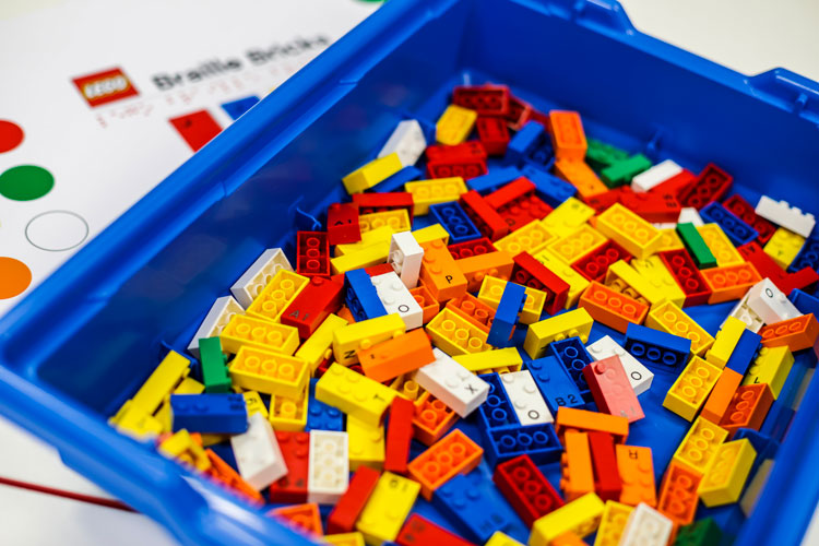
Lego Braille Bricks, by Lego

Much-loved children’s building block brand Lego has launched a new learning range, specifically for young people who are blind and have visual impairments. The special bricks feature tactile, braille dots on them, which indicate different numbers and letters, and so can be used to teach different subjects, from grammar and spelling to maths concepts and foreign languages. The aim is “make learning more fun”, the company says, as well as help to teach more young people how to use braille in an interactive way – according to the National Federation of the Blind, less than 10% of blind people in the US can currently read braille. The braille bricks have been launched by the Lego Foundation, a branch of the Lego Group that promotes learning through play.
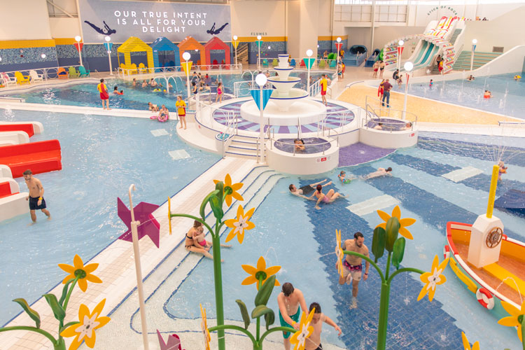
Butlin’s pool, by Fitch

Brand and retail design consultancy Fitch has designed a new pool at Bognor Regis’ branch of family resort Butlin’s, with the aim of “bringing the seaside inside”. It includes a helter skelter water slide, another slide modelled on a stick of rock, an art-deco inspired pool and various other features such as underfloor heating and UV filtration, which regulates the lighting so it always feels sunny “regardless of the weather”. Alongside designing the space, Fitch used virtual reality (VR) to show the client what the pool experience would be like, and this technology has now been imcorporated into Butlin’s booking shops for use by customers.
Anorak magazine redesign, by Anorak

Independent, illustrated kids’ magazine Anorak has had a redesign and rebrand, with new illustrations created by Ben Javens, designer at the magazine. The logo has been updated with a bespoke, rounded, sans-serif typeface, and a colour palette of pink, green, white and blue has been incorporated throughout the publication. A new website has also launched as part of the redesign, which will accompany the magazine. Anorak launched in 2007, positioning itself as a “quality alternative” to “throw-away” kids’ magazines that came with plastic toys, says founder Cathy Olmedillas, and looks to provide young children with a mix of games, activities and educational resources.
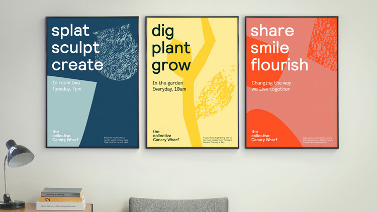
The Collective rebrand, by DesignStudio

DesignStudio has created a new visual identity for The Collective, a communal living (co-living) brand, which offers shared living spaces across the world. The studio’s brand ethos centres around “two’s company, three’s a collective”, says Campbell Butler, creative director at DesignStudio, so the identity features various compositions of three elements coming together, whether that be shapes, words, colours or patterns.
The logo features three shapes that make up an incomplete roundel. Collections of three words feature across marketing posters to advertise different communal spaces, such as “dig, plant, grow” for gardens and “splat, sculpt, create” for art rooms. Based on the idea of bringing different people together, DesignStudio worked with type foundry Colophon to create a bespoke, sans-serif typeface for the logo, which has characters with various curves and lines to emphasis eclectic personalities.
Smartphone concept, by Morrama

Design studio Morrama is conscious of how screen-time and the use of smartphones can impact people’s mental and physical health – so it has designed a concept for a phone that could help improve its users’ wellbeing. Currently only a hypothetical project, the phone includes several features that deter people from constantly looking at their screens. This includes a “mindful mode”, which is turned on by flipping the phone upside down, and limits phone use to calls, camera and tools such as weather, calendar and clock only.
It also includes an uneven phone back, where users can only see new notifications if they press down on the bottom of the phone, tilting it towards them, and a second display on the phone back showing the time and a voice assistant, which enables people to use their device without looking at its screen. The idea is to imagine a more “balanced” smartphone, that “considers the wellbeing of consumers as a fundamental part of product development”, says Jo Barnard, founder at Morrama.
NHS hygiene campaign, by Design Science

Studio Design Science has brought neon colour to the Imperial College Healthcare Trust (ICHT) in London with its new series of posters and stickers, encouraging clinical staff such as nurses to wash their hands. The bright green posters have been co-designed alongside nurses, and feature tongue-in-cheek, hand-cleansing prompts which are adaptations of songs by the likes of Abba, Prince and Queen. The print materials are placed next to sanitiser dispensers and sinks throughout the hospital’s 120 clinical areas, to make hand-washing “less of a chore”, and incorporate a sense of playfulness, simplicity and boldness into the messaging, which had previously been “confusing, inconspicuous and aggressive”, says Design Science.
Hospital play room, by Tigerplay

Indoor play manufacturer Tigerplay has created a children’s activity room at London’s West Middlesex University Hospital, which looks to encourage “traditional” play with physical toys such as cars, playhouses and kitchens. The room has been filled with bright, colourful illustrations across the walls to mimic different areas, such as gardens and houses, while there is also a sensory area, where lighting and equipment can be adjusted to be more calming for children with conditions such as autism and epilepsy.
There is an arts and crafts area, and a display cabinet to present children’s creations. The project has been funded by the Chelsea and Westminster NHS trust’s charity CW+ and is part of a special project to transform the hospital’s entire children’s in-patient ward. Support the appeal here.
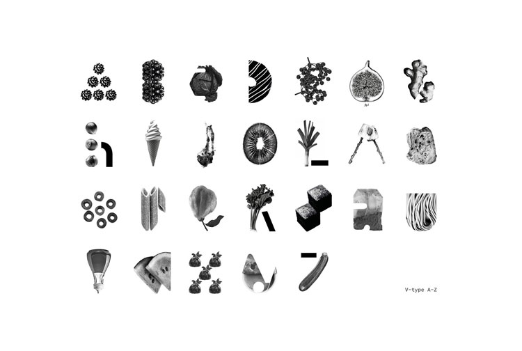
Vegan typeface, by Eat With Your Eyes

Branding studio Eat With Your Eyes has created a vegetable-inspired typeface called V-type, where every letterform is made up of a different vegan ingredient. Each letter is represented by something that starts with that letter – “A” for “Artichoke”, and “L” for “Leek”, for example. As well as aiming to be a fun and light-hearted project that encourages healthy eating and less meat consumption, the plant-based alphabet also aims to make for a “more indulgent visual experience”, says Steve Oakey, creative director at the studio. Not intended to be instantly decipherable, the letters need to be “consumed, digested and decoded” to work out the final message, he adds. See the full V-type alphabet here.
24 greeting cards, various designers

US-based paper company Neenah has worked with 12 different designers, including Luba Lukova, deputy art director at The New York Times, to create a set of greeting cards that mark various, notable world events, such as New Year’s Day, Mother’s Day, Halloween and Earth Day. Some have more generic messages, such as happy birthday and thank you, but all 24 feature a personal message on the back from the designer. UK readers can contact G.F. Smith, Neenah’s UK seller, to order a set of the cards.
Moon landing at 50 stamps, by Glazier Design

Glazier Design has created a set of eight stamps to mark 50 years since man first landed on the moon, in 1969, issued by the Isle of Man Post Office. The studio worked alongside the National Aeronautics and Space Administration (NASA) on the project, and the stamps feature a series of clever, embedded codes, quotes and other hidden elements. Design features include GPS coordinates of significant locations of moon landings, images from the NASA archive, significant dates and names of important astronauts and other people involved in missions, quotes, and hidden microtext codes that can only be read with a magnifying glass. The One Small Step collection is available from the IOM post office.
-
Post a comment


