
Design Week’s most popular news stories of 2019
The healing power of art in hospitals was proved, VW rebranded to forget its past and embrace its future, Extinction Rebellion’s rebrand captured imaginations and you told us why the Paris 2024 Olympic logo wasn’t working for you.
Filling hospitals with art reduces patient stress, anxiety and pain
This research from Chelsea and Westminster hospital showed the power of art in hospitals to make people feel better.
Measures of this included improved patient wellbeing, shorter hospital stays and the reduction of anxiety, depression and pain. Evidence showed those undergoing examinations, operations and intrusive procedures such as chemotherapy had benefited from an environment displaying visual art. Even labour was two hours shorter for mothers giving birth.
The kinds of things that made a difference were interventions ranging from mixed media installations in public spaces, digital artwork in examination rooms, animal-based murals in children’s departments and even an on-site cinema.
Halifax gets a new brand to keep up with digital banks
With the rise in popularity of digital only banks such as Monzo, 166-year-old high street bank Halifax rebranded with the help of Rufus Leonard as it sought a new look which would appeal to younger customers.
It looked to do this by losing a lot of its visual baggage. Carlo D’Lanno said that a “straightforward and simple feel” had been achieved with a “fintech meets humanity” brand strategy.
At the heart of this is a pared back “X” and a softened typeface set in blue and white supported by a secondary colour palette of green, yellow and pink.
BT Group rebrands to show it’s not just about telecoms

It was the simplicity of the BT logo at the heart of this rebrand which divided opinion, with one reader Steven Carter “not keen on the BT typeface” and another, Harry Meakin, praised the identity for “distilling a busy and confused brand down to something so simple”.
The rebrand by Red&White needed to increase public awareness of BT’s more holistic services such as cyber security and digital skills programmes for schools.
“The ‘global image’ of the world logo had become a bit tired,” Red&White creative director Paul Franklin told Design Week. “We wanted to help make the organisation feel more modern by creating a clear brand mark that could sit on top of all the things that BT does.”
Michael Bierut: “Slack knew 95% of people would hate the change”
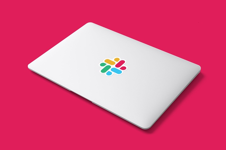
It’s not uncommon for a rebrand to field some criticism when it launches, especially if it’s a large brand. Pentagram partner Michael Bierut took this on the nose in the wake of Slack’s rebrand when talking to us about his overhaul of the communication tool back in January.
“With products like Slack, which people encounter every day and are so engrained in their lives, changing the branding is bound to cause dissonance and backlash. Slack was completed prepared for this and anticipated that 95% of its audience would hate the change,” he said.
Change was needed as Slack wasn’t able to own its hashtag symbol, according to Bierut who said it was problematic when applied to backgrounds or photographs of different colours.
The solution was an evolved hashtag shape, which makes better use of the brand’s broad colour palette.
Volkswagen unveils new visual identity for an “electric future”
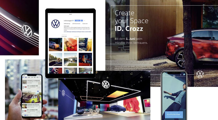
In September Volkswagen looked to embrace its electric-first future and put some distance between the company and its emissions scandal by rebranding.
To reflect this future, a clearer and flatter VW marque was designed, which on some applications glowed white to reinforce the idea of electrification.
Anywhere a human voice was to be used with the brand it would be female and the brand design and visual language were rethought to be “more personalised and much more individual”, according to the company’s chief marketing officer, Jochen Sengpiehl.
We wanted to understand how the company was trying to carve out a new future for itself, not just through its branding but its products, so we caught up with VW design director Klaus Bischoff.
How Extinction Rebellion designed “angry but peaceful” protest graphics

A movement which first captured the attention of young people and then the world, the rise of Extinction Rebellion was arguably one of the most defining moments of 2019.
It was propelled by prescient warnings from scientists, rallying cries from Greta Thunberg, disruptive protests and a graphic identity which is every bit as memorable as it is effective.
The identity was led by designer Clive Russell who we spoke to in April when the coordinated protests started to spring up.
The now famous egg timer symbol – which suggests time is running out – is copyrighted but only so that it’s not co-opted by anyone wanting to use it commercially. Otherwise it’s free to use.
“We drew some inspiration from the Paris, 1968 riot graphics,” said Russell at the time. “I also love Eduardo Paolozzi and drew from his colour palettes. The type looks deliberately a bit wonky, to give it that 1950s, analogue feel.
Skittles celebrates Pride 2019 with special packs by LGBTQ+ illustrators

More brands have been celebrating Pride in recent years by taking on the colours of the rainbow flag to show support for the LGBTQ+ community.
While this has been broadly praised it has been seen as a cynical appropriation by some. Over the last couple of years as Skittles already owned a rainbow it decided to take all of the colour out of its pack to show solidarity.
This year four artists from the LGBTQ+ community were invited to design packs themselves: artist Thomas Wolski; graphic designer Kate Moross; illustrator Maia Boakye and artist and filmmaker Fox Fisher.
“Contemporary” redesign for Kellogg’s looks to make it “instantly recognisable”

When Landor was called into Kellogg’s it was tasked with making the cereal packaging easier to recognise and it sought to do this with a less-is-more approach which looked to simplify a range of “muddled” products.
A “straight forward” and “jargon free” tone of voice was adopted to help propel this idea and a new bolder colour palette was introduced.
Paris 2024 Olympic logo revealed
The Paris 2024 Olympic logo captured a woman’s face – Marianne – a national symbol for the country and revolutionary spirit. It also comprised Olympic gold, the Olympic flame and represented the Paralympic competition. An accompanying Art Deco wordmark is a reference to the Paris Games of 1924.
We put it to experts who found it to be quite patronising. Pali Palavathanan found it to be “sexist simplification”, Tessa Simpson thought it looked like it was “more suited to a beauty salon” and Katie Cadwell thought it “looked a little Tinder”.
Turkish Airlines goes global with new brand identity

This new Turkish Airlines identity by Imagination features a wave graphic intended to represent the seven continents of the world. It is made up of seven lines to show this and indicate that the airline covers these regions.
A redrawn goose is featured in a roundel, pitched at a more diagonal angle and while a red associated with Turkey has been kept, a Halfeti rose gold has been added to give the brand a more premium and distinctive feel, according to the consultancy.
-
Post a comment


