
Epilepsy Research UK rebrands to appear more “authoritative”
The only national charity dedicated to research into the causes and treatment of epilepsy has been given a new look by Helen Holden Design, which looks to emphasise its scientific status.
Epilepsy Research UK has been rebranded, in a bid to draw attention to its work as a “scientific organisation” focused on the causes, treatment and diagnosis of the disease.
The charity is relatively young, and was founded in 2007 after two existing organisations, the Epilepsy Research Foundation and the Fund for Epilepsy, merged.
Its work is focused on supporting scientists and clinicians on investigating epilepsy, particularly its causes, high-risk patient groups, medically what happens in the brain during a seizure, and how to improve treatments for the disease, such as drugs and surgery.
Epilepsy is a common neurological condition affecting the brain, which can cause different types of seizures. These seizures can be triggered by different factors, including stress, lack of sleep, alcohol, drugs and flashing lights. For some, epilepsy may be the result of a head injury, stroke or tumour.
Around 500,000 people in the UK have epilepsy, which is one in every 100 people, according to the Epilepsy Society.
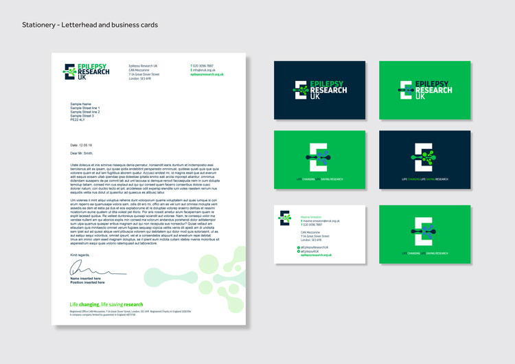
Helen Holden Design has rebranded the charity, swapping out its former green, typographic logo for a blue-and-green one that incorporates a new “E” symbol.
The new logo features the charity name set in all-caps, sans-serif typeface Darwin Pro, with different weights used across the logotype, such as a thinner one for “UK”. The type has distinctive flicks on the tails of certain letters, such as “R” and “K”.
“This adds warmth to the typeface but still helps the brand feel trusted and authoritative,” says Helen Holden, founder at Helen Holden Design. The typeface has been used across the wider identity in three weights of light and regular for body copy, and bold for key messages.
An “E” symbol sits to the left of the logotype, with its middle counter removed to make room for an illustration of neurones, which are the cells that carry messages to and from the brain, and the rest of the body.

By sitting in the centre, the neurone separates the “E” into two parts, Holden says — this signals an “interruption and energetic breakthrough”, to symbolise the charity’s work towards scientific breakthroughs to help epilepsy patients.
A core colour palette of two shades of green, two shades of blue and white has been used across the logo, and wider visual identity. Holden says that Epilepsy Research UK wanted to retain its signature green colour, as the organisation feels it is “distinctive” in its sector.
Three types of imagery have been used, including close-ups of scientific and medical imaging, photos of scientists and researchers, and photos of people affected by epilepsy and supporters of the charity.

Flat, graphic illustrations and infographics also feature across marketing materials such as information booklets, and the neurone graphic has been used in isolation too. A new strapline, “Life changing, life saving research” has been incorporated.
“We focus on research into the causes, treatment and diagnosis of epilepsy, and it’s important that at first sight you can clearly identify us as a scientific organisation,” says Maxine Smeaton, CEO at Epilepsy Research UK. “The deep blue of the new branding has a corporate feel, bringing a feeling of stability and security, while the evolution of our green has added modernity and liveliness.
“The capital ‘E’ sends a message of authority, to represent how our research is underpinned by a rigorous, scientific advisory board assessment and peer review process.”

The rebrand was undertaken with feedback from staff and supporters of Epilepsy Research UK, and took seven months to complete.
It is currently rolling out across all touchpoints, including the website and social media, print marketing materials such as reports and pamphlets, and merchandise such as stationery.


-
Post a comment


