Exploring the colourful work of pop art nun, Corita Kent
We chat to curator Olivia Ahmad and designer Fraser Muggeridge about Corita Kent: Power Up, an exhibition currently on at London’s House of Illustration, which delves into the subversive and political work of the American nun-turned-designer.

Design Week: What work is featured in the show and how is it structured?
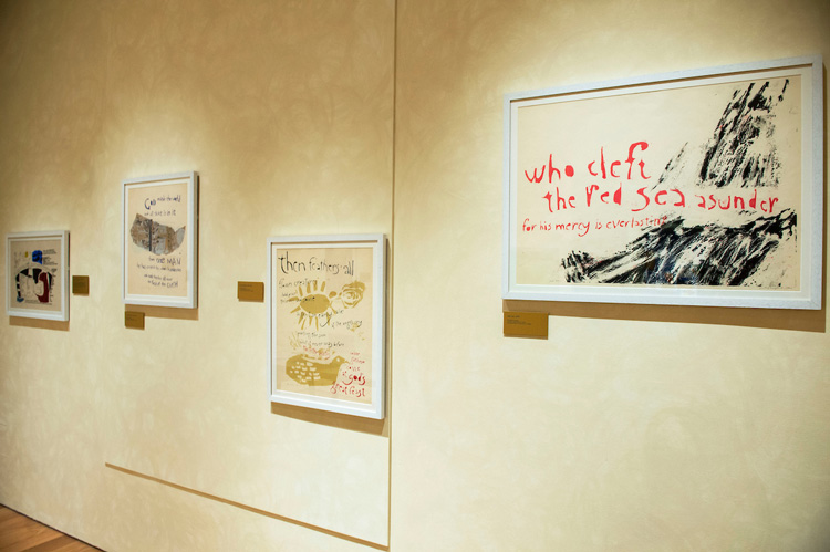
Olivia Ahmad: The exhibition presents a chronology of Corita’s work from her early 1950s prints to her final work, her ‘love’ stamp design, issued by the US Postal Service in 1985. The exhibition opens with Corita’s early work that uses Catholic iconography and figurative scenes to explore religious themes. Towards the end of the 1950s she began to introduce hand-stencilled texts from the Bible and other religious sources.

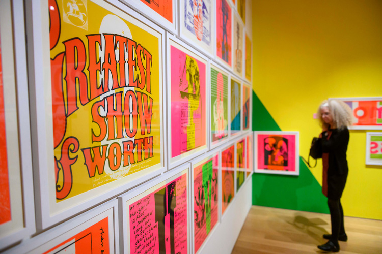
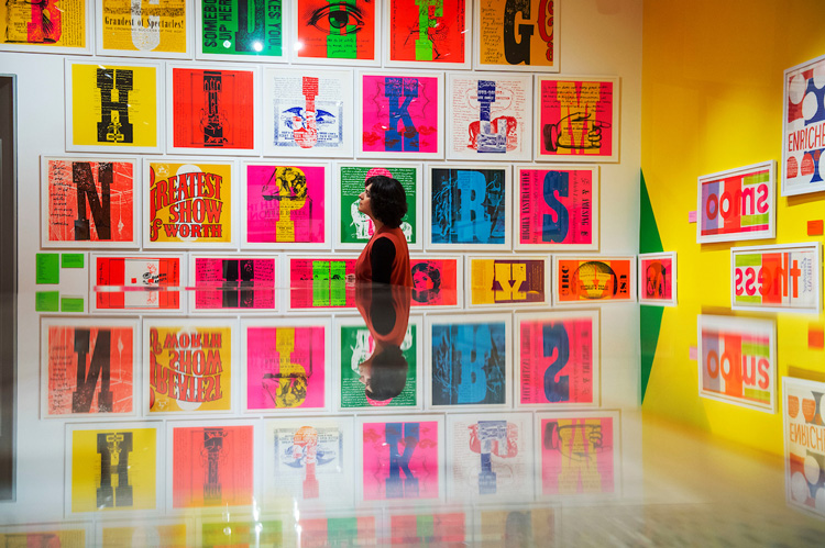
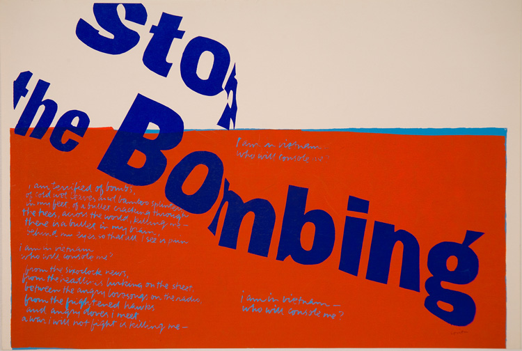
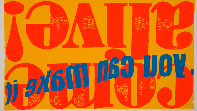
The next section of the exhibition looks at the 1960s, a time when Corita’s worked changed radically — she abandoned her earlier figurative approaches and focused on words. As well as using religious texts, Corita started to incorporate popular song lyrics, protest movement slogans and modernist poetry, sometimes all in one piece of work.
We felt that recognising these sources was key to understanding Corita, so Fraser’s studio produced a book of transcriptions for visitors that details the elements of each print — the transcriptions are colour-coded so that political, religious and commercial texts can be easily identified. It is a hardback with a cloth-covered case and foiled letters, drawing inspiration from prayer books.
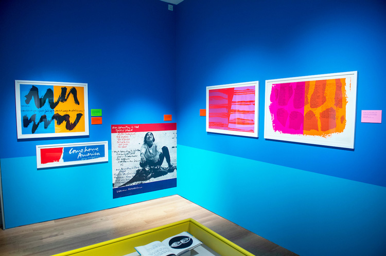
The final section of the exhibition looks at Corita’s work after she left the Sisters of the Immaculate Heart College (IHC), the convent and private school which she attended herself then worked as an art teacher. Without the support of the church, Corita needed to earn a living, and with her sister acting as her agent she took on commissions for a wide range of companies, including broadcasting company Group W, advertisers and book publishers
She also continued to produce personally-motivated prints that reflected her view on spiritual life. Corita’s commercial commissions appear in the exhibition as large-scale reproductions to distinguish them from her other work of this time, and to give a change of scale to the final section.
DW: How does the space’s design represent Kent’s radical artistic style?

OA: The design responds to the tactile, crafted and handmade nature of Corita’s work — it also speaks to the spirit of collaboration that characterised the IHC in Los Angeles, US, where Corita worked alongside her students and fellow sisters.
The wall treatments were produced by our technicians — the supergraphics were drawn and painted by hand and the “stucco effect” walls that are seen in the exhibition’s introduction were painted by hand with sheepskin mittens.
Fraser Muggeridge: The space reflects the transition that appears in Corita’s work, so the exhibition is chronological. The intention of the first room is to be a more religious and spiritual space, with the hand-brushed wall and the gold caption encouraging visitors to experience an ethereal and liturgical mood.
The second room, which displays works from the 1960s, is a celebration of graphics and colour. Here we translated the more subversive nature of the work into large-scale graphics. This space is directly influenced by the artist’s messages and works. The third room looks at Corita’s commercial practice and has examples of advertisements and commissions from later in her career.
DW: What graphic elements have you employed in the design of the space?
FM: The typeface is a manipulated version of Old Style No. 7, a serif typeface used in Corita’s time. We modified the shape and spacing of the letters to give the feeling of imprecision and blobbiness, similar to screen-printing and hand production.
These key concepts of “hand production” and “making” define the space. Immersive graphics cover the large central space, in contrast to the sparse and spiritual mood of the first room. These are hand-painted and have been extracted from one of Corita’s prayer books, Footnotes and Headlines, which is on display in the space.
The captions have been screen-printed, in a local workshop called Print Club London, on coloured corrugated cardboard, a material that was often used by Corita and her students at the IHC. Every caption is different, in both colour and feeling, a result that is impossible to achieve by digital production.
DW: What aesthetic were you going for?
FM: The overall vision behind the design was the fidelity of the space – in other words, the precision and exactness we employed in trying to mirror Corita’s style and work. The graphics and the approach reflect the concept of “making”, a central aspect to Corita’s production. From the small details (typography) to the large-scale graphics, we tried to create a consistent hand-made visual language.
DW: How does this show distinguish itself from the one recently put on at the Ditchling Museum of Art and Craft?
OA: Around half of the works in the exhibition were featured in Ditchling’s Corita Kent: Get With The Action exhibition, which ran last year. The other half were loaned to us by the Corita Art Center in Los Angeles, so the exhibition offers an expanded view of Corita’s practice. We added more works to the section on the 1970s, which looks at Corita’s work after she had left her life as a nun, which included commissions for contract office furniture, advertising and book illustration.
All exhibition photos © Paul Grover and courtesy of the House of Illustration.
Corita Kent: Power Up runs until 12 May 2019 at the House of Illustration, 2 Granary Square, King’s Cross, London N1C 4BH. Tickets cost £7.50 and £5 for concessions.
Olivia Ahmad is curator at House of Illustration and Fraser Muggeridge is founder at his self-named practice, Fraser Muggeridge Studio. Read our in-depth piece on the life and work of Corita Kent here.


Read this next

-
Post a comment


