How to design a flexitarian food brand that isn’t “preachy”
‘This’ is a new vegetarian offering that hopes to those who want to cut down on meat a viable alternative that looks and tastes like the real thing.

Johnson Banks has named and created the visual identity and packaging for a new meat alternative brand that looks to ditch the “holier-than-thou vibe” of vegetarianism.
Named ‘This’, the new brand sells a range of soy and pea-based products that emulate the look and taste of different meats, including chicken, beef and pork.
Aimed at the flexitarian market, so those who want to reduce meat consumption rather than completely stop eating it, the brand uses a tongue-in-cheek tone to draw attention to the products’ similarities to various meats, rather than “guilt-trip people into changing their diets”, says Michael Johnson, founder at Johnson Banks.
The name ‘This’ was chosen to enable the brand to talk about its different product lines across marketing materials and packaging; for example, “This isn’t chicken” and “This is endorsed by piglets”.
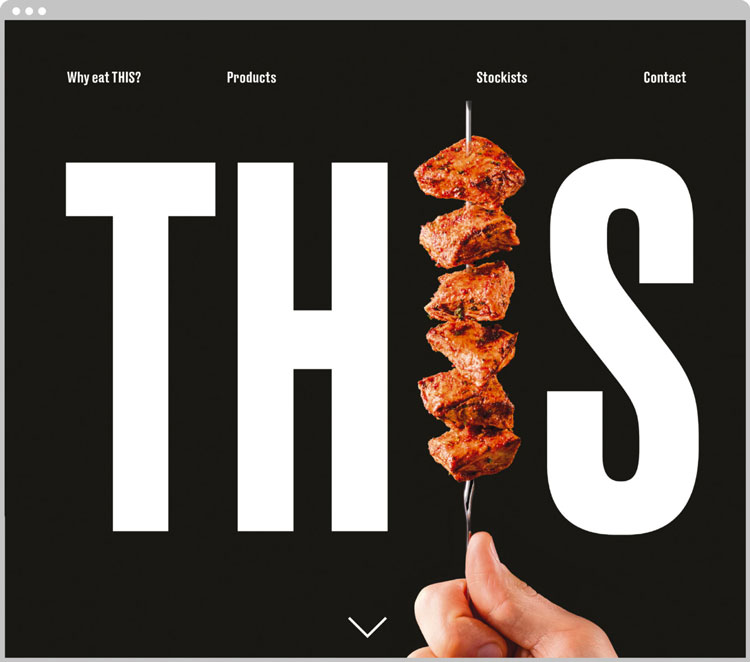
A bold sans-serif typeface called Druk has been used across all touchpoints, including the logotype, in varying weights and font sizes, and looks to create a “big impact and ‘in-your-face’ attitude”, says Johnson.
A monochrome colour palette has been employed for the same reason, with the studio steering away from “the sector’s colour codes of oranges and greens” and “over-styled photos of plates laden with kilos of green salad”.
The “I” in “This” has been replaced with food photography to represent different products in the range, emulating the long and tall figure of an “I” letterform through forks, chopsticks and skewers.

The food, shot by photographer Ben Monk and styled by Seiko Hatfield, aims to be “naked” with “no garnishes, serving suggestions or embellishments”, says Johnson. Used alongside the bold type and black-and-white palette, the photography aims to be “really noticeable”, he adds.
The bold typography, humorous straplines and overt food photos aim to lighten the tone of vegetarian and flexitarian brands, says Johnson.
“The two company founders are pretty critical of the sometimes ‘preachy’ tendency of vegetarianism,” says Johnson. “I’m vegetarian myself but I see their point! There can be a kind of ‘holier-than-thou’ vibe. We created the brand and tone of voice to make it more fun – the name ‘This’ is a gift for great writing.”

Johnson Banks has also designed the packaging for the brand, which is a cardboard tray that uses 90% less plastic than typical retail food containers. The monochrome palette has been used to differentiate between products that need to be cooked (white) and are ready-to-eat (black).
‘This’ launched in 2018, and will start appearing in health food stores, supermarkets and selected restaurants across the UK later this year.
The new branding is currently rolling out across all touchpoints, including print marketing materials such as posters and business cards, merchandise such as tote bags, product packaging and online platforms including the website and social media.


‘This’, (amongst others) is highly processed, intensely farmed, fake food which is not healthy and certainly not good for you or the planet. You’re better off eating whole vegetables.
However I know the article is about the design and not the industry, so, to be on point, I don’t mind the black and white with photographs, but some of those quotes are way too contrived.
This is great. have been waiting for proper Johnson style brand project for a while. Their recent work seemed a bit restrained and lacked the Johnson effect. This is provocative, daring and fun. I still don’t get vegans mind, but each to their own!
I do find though that the messaging is preachy. Saying that there’s no dead animals in the product and that their product is better for you and the environment is the definition of the “holier-than-thou” tone.
So we’re allowed to make comments just as long as we agree with what this article says. Nice one. No room for critique and growth.
I found the whole thing ironic to the title..