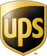
FutureBrand delivers UPS revamp

Global courier UPS has unveiled a FutureBrand-designed identity revamp this week – its first for more than 40 years – to reflect the changed nature of its business, which now embraces financial services and supply chain management as well as transportation.
The FutureBrand team, led by New York office president and chief creative officer Claude Saltzberger, has reworked the 1961, Paul Rand-designed shield logo. It has retained brown as the principal corporate colour, but dropped the bow-tied parcel image.
Saltzberger says the biggest challenge, apart from working with ‘such an iconic and ubiquitous brand’, was ‘enveloping’ the strategic positioning within the brand’s core elements.
The design work is intended to make explicit the breadth of UPS’s business and geographic reach. A strapline – Synchronizing the World of Commerce – has also been introduced to sum up the company’s offer and act as the basis for brand marketing campaigns.
‘UPS is a vastly different company than most people realise,’ says Atlanta-based UPS chairman and chief executive Mike Eskew. ‘We are [now] bringing our look up to speed with our capabilities.’
The UPS logo appears on more than 88 000 vehicles, 257 large jet aircraft, 70 000 drop-off and retail access points and one million staff uniform items.
FutureBrand won the work against two other shortlisted groups in August 2001.
-
Post a comment


