High speed boat race SailGP gets new brand identity to “redefine sailing”
The designs by GBH.London include a “bold” wordmark, contrasting colours and patterns which reference the boats’ movement on the water.

Design studio GBH.London has created a brand identity for international sailing race SailGP, which aims to make the sport more accessible to a wider audience.
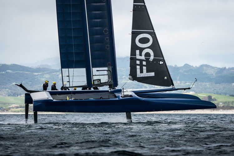
SailGP is a new championship in which athletes from different nations compete at high speeds in various locations across the world.
Competitors sail identical F50 wingsail catamarans, which can reach up to nearly 60mph, battling it out for a $1million (£783,130) prize.
The annual competition, which is broadcast on television around the world, kicks off in February in Sydney, Australia, with further rounds in locations including New York and San Francisco and the final in Marseille, France.

Matthew Caldwell, designer at GBH.London, says the aim of the new identity is to “completely redefine sailing” and “change people’s preconceptions of the sport”.
“The brand we have created strives to push sailing into the modern age, positioning it as a sport to be enjoyed by all, not just the select few,” he says.
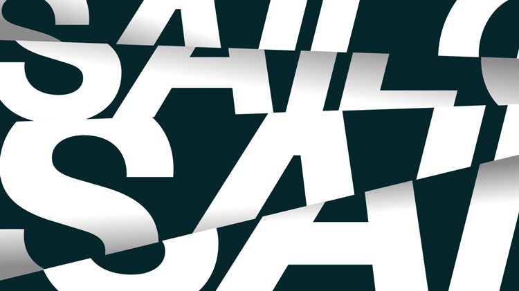
The design consists of a wordmark logo which reads “Sail GP” in a sans-serif, all-capitals typeface called Founders Grotesk by Klim Type Foundry. The letters are cut in half horizontally across an invisible line, with the top half of the letters shifted slightly out of line.
“The logo references […] the fact that [the boats] literally fly, balanced above the water on wave-piercing hydrofoils, always right on the edge of what is possible on water,” Caldwell says.
The “bold” and “modern” typeface contains “subtle calligraphic hints”, he adds, “inspired by early 20th century ‘Grotesque’ typeforms”.
A wordmark has been chosen instead of an image in a bid to steer away from sailing’s traditional roots, as “the majority of sailing competitions use pictograms of sails”, Caldwell says.
Animated forms of the branding include the logo’s letters shifting from side-to-side and appearing and disappearing in parts. The animations reference the idea of “shifting the narrative” and “cutting through expectations”, Caldwell says.
The colour palette includes bright orange, a turquoise blue, black and white. Geometric “dazzle” patterns are used as backgrounds, featuring jagged lines in contrasting colours.

“The ‘dazzle pattern’ physically takes inspiration from wakes and ripples left behind by our F50 racing machines as they carve through the oceans,” Caldwell says.
The patterns looks similar to the “dazzle” camouflage used on ships in the First World War, but Caldwell says the intent of the patterns the studio has used are to “stand out and be bold” which is the “complete opposite of dazzle ships”, which looked to blend in.
The new branding is rolling out across multiple touchpoints including print and digital communications, merchandising, advertising materials, online, on TV and in physical race locations around the world.


-
Post a comment


