Identity for east London art walk The Line – “both contemporary and primitive”
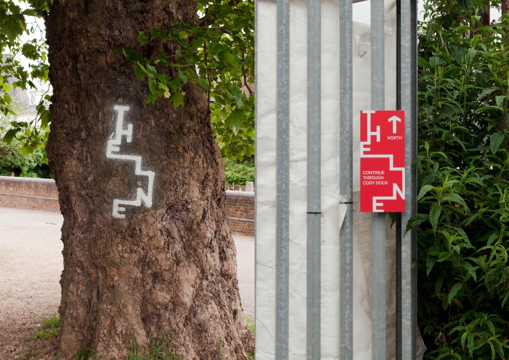
The Beautiful Meme has created an identity for the new art walk, which features artworks by Damien Hirst, Martin Creed and Eduardo Paolozzi. The consultancy says it wanted to create a mark that “could just as easily appear on a tree or a rock, as on website or signage”.
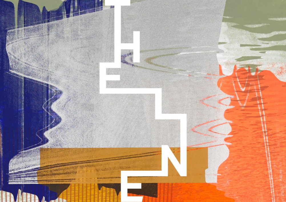
The Beautiful Meme has created the identity for The Line – a new art walk in east London that links the 02 and the Queen Elizabeth Olympic Park.
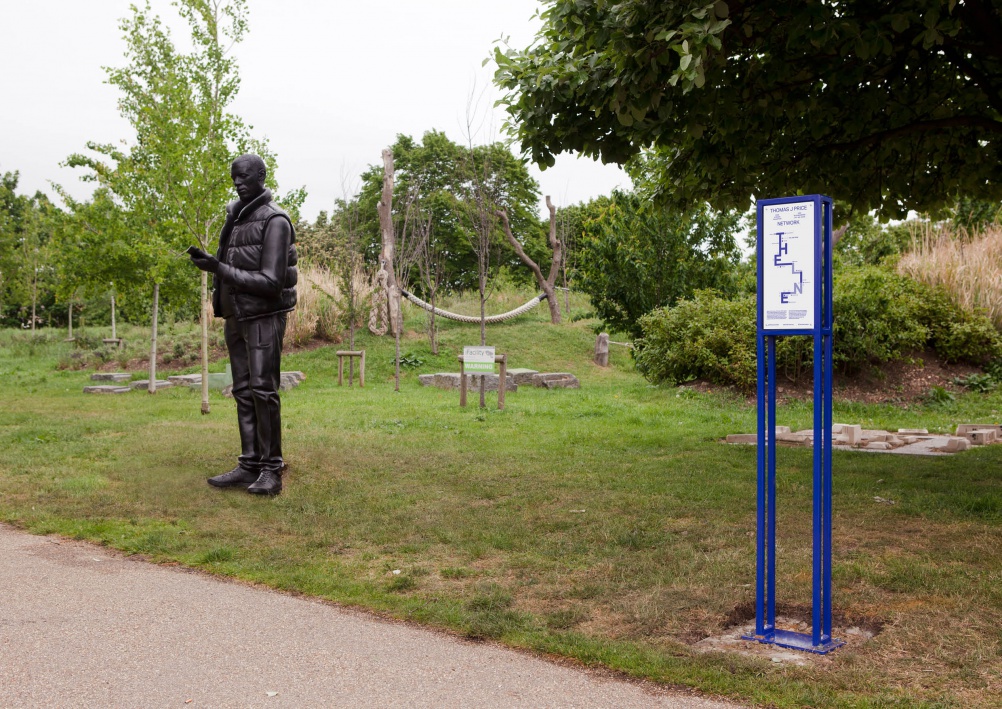
The walk includes a series of sculptures by artists including Damien Hirst, Martin Creed, Gary Hume and Eduardo Paolozzi.
There are nine initial sculptures on The Line, which were chosen by a panel including artist Mark Wallinger, art critic Richard Cork and The Line co-founder Megan Piper.
The Line is set up as a community interest company – supported by fundraising – and has been co-founded by art dealer Piper and urban regeneration expert Clive Dutton.
The Beautiful Meme says the starting point for the identity was the idea of journeying through the landscape.
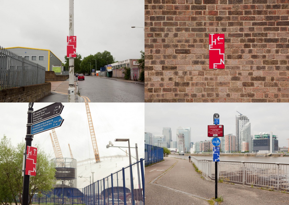
Consultancy creative director Tom Sharp says: “You could look at The Line as a series of world-class sculptures along a three mile route – essentially an outdoor contemporary art gallery. Or you could look at it in the context of ancient humans marking significant journeys with standing stones and art. We choose the latter.”
The Beautiful Meme created a “positioning story” for The Line, which it says takes cues from Alfred Watkins’ ‘The Old Straight Track’ – the first description of ley lines – and Bruce Chatwin’s book Songlines.
“You discover who you are when you journey. So travel the Greenwich Meridian with us and along the path of those before you. We’ve inscribed the land with totems. Works of art that act as a marker to where we are. See the layers of East London. The very old song of its waters. The towering of its ambition. The democracy of a single sky. People have been journeying for millennia. Feet in ancient times finding paths through a changing landscape to tell or untell a story. Works of art singing us along. Pack your thoughtfulness. Walk The Line.”
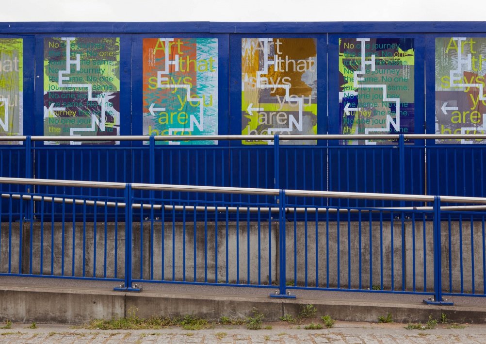
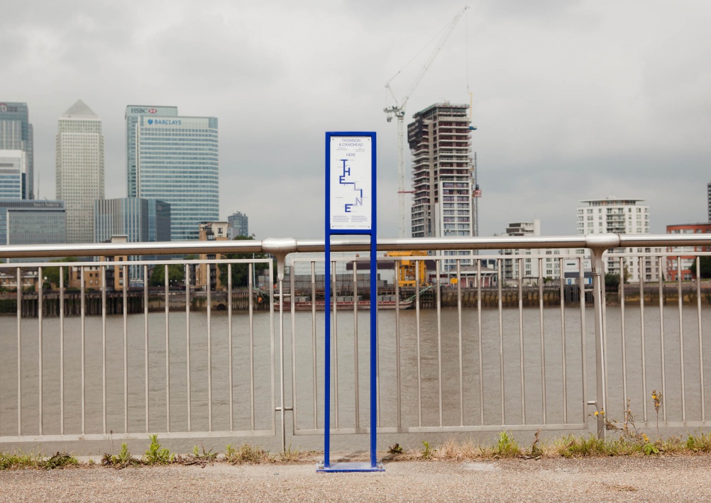
For the identity itself, the consultancy says it wanted to create a mark that “could just as easily appear on a tree or a rock, as on website or signage”.
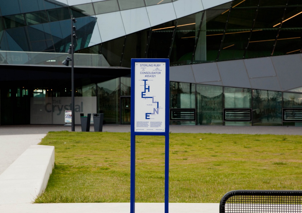
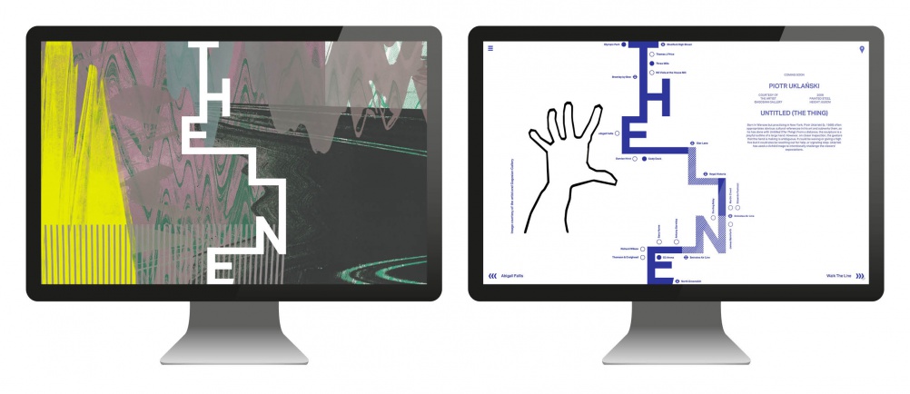
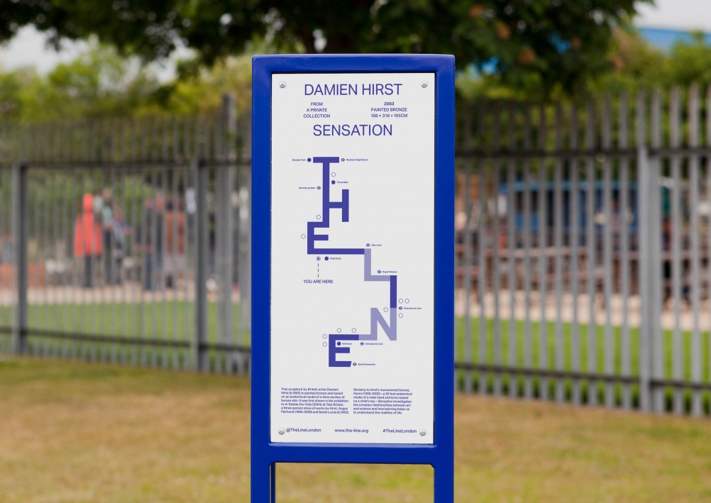
The Beautiful Meme creative director Ben Haworth says: “Using the pure vertical and horizontal strokes of the seven characters, our logo is an interpretation of the path of The Line – in the same vein as Beck’s tube map.
“More importantly though, it is designed to feel simultaneously contemporary and primitive.”
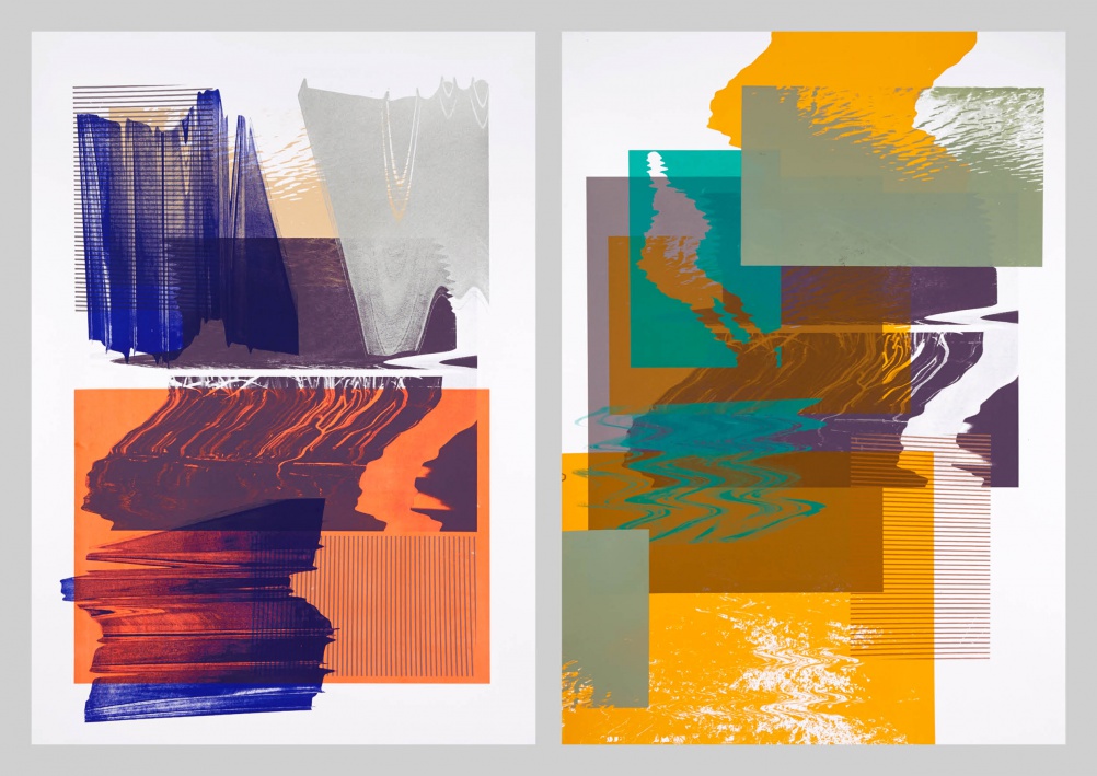
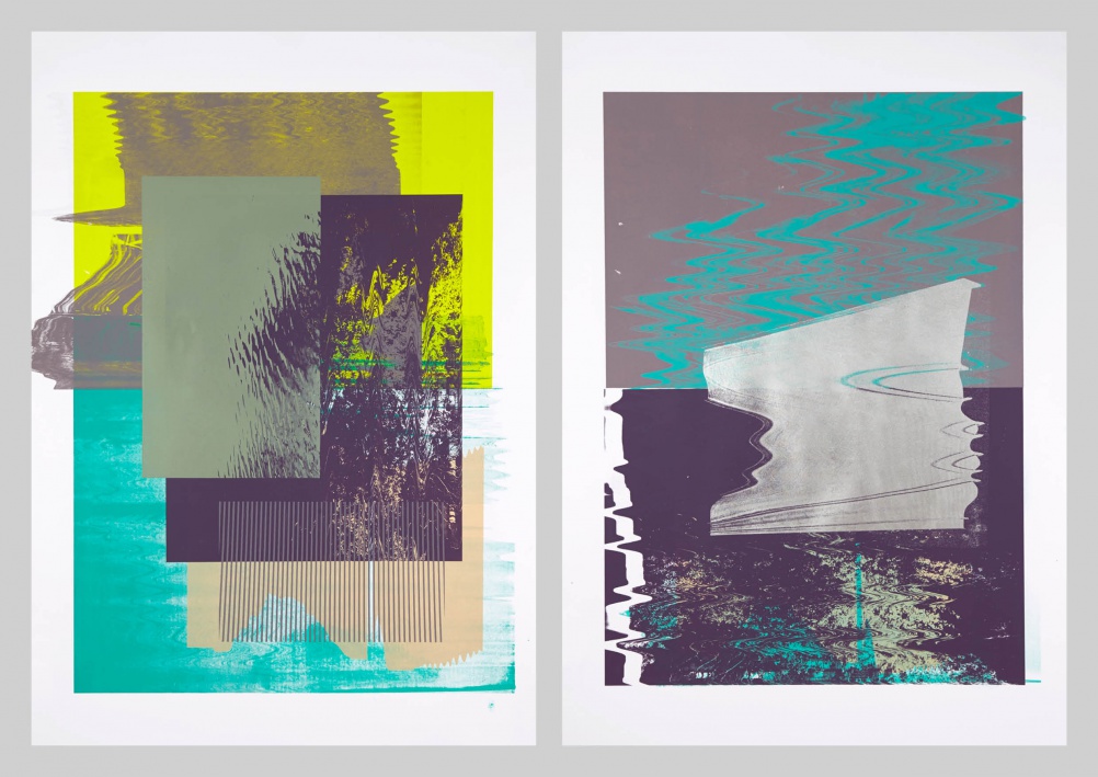
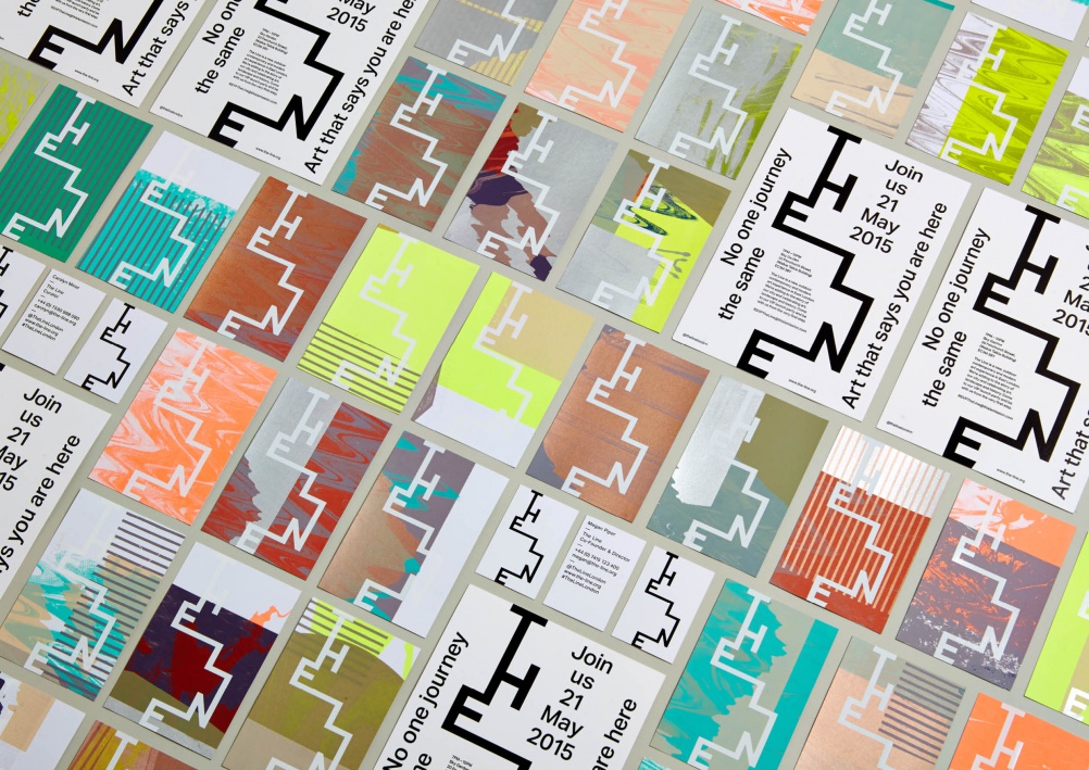
The identity uses a customised version of Dalton Maag’s Aktiv Grotesk typeface, and The Beautiful Meme worked with printmaking studio Heretic to create a series of prints using base images of points along The Line – from sculpture to nettles to river to sky.
Haworth says: “We wanted the visual language to reflect landscape – external and internal.”
Sharp adds: “For us the resulting images represent the variety of landscape you encounter on The Line and the ever-changing internal experience a walker has. As our tagline says ‘no one journey the same’.”
-
Post a comment


