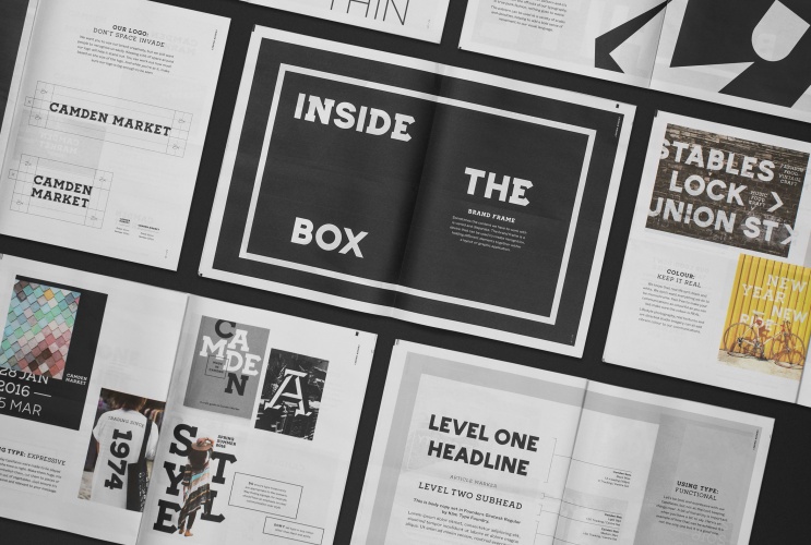
Camden Market rebrand, by Ragged Edge

Ragged Edge has rebranded Camden Market. The consultancy took inspiration from the hand-painted Camden Lock sign on the bridge, using the letterforms as a template to create two bespoke typefaces: Camden Slab and Camden Sans.
Each typeface has a range of weights, giving the brand the flexibility, and a black and white colour palette has been used throughout.