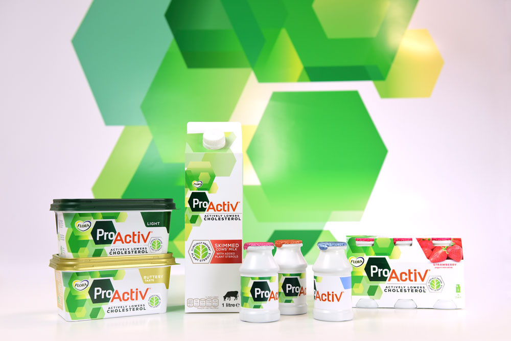
Flora ProActiv branding, by Design Bridge
Design Bridge has created a new visual identity for margarine brand Flora’s ProActiv range.
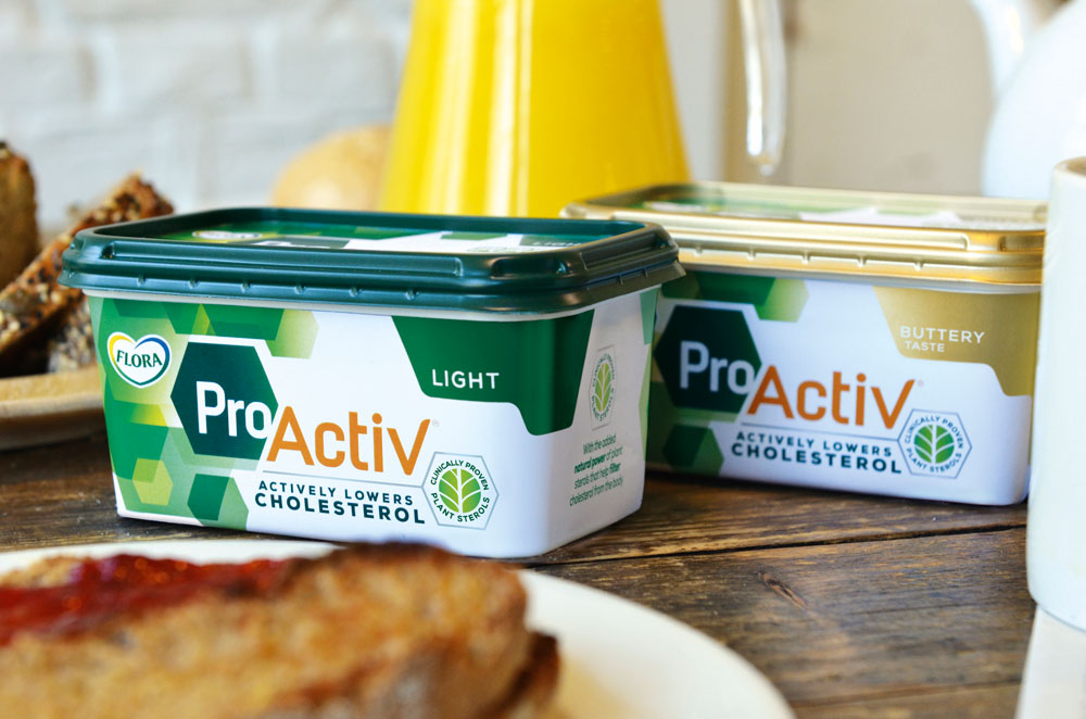
A new logo, typography and photography style has been created for the range, using the colour palette of orange and green.
The consultancy aimed to emphasise the “duality” of the words “Pro” and “Active” in the new branding, says Chloe Templeman, design director at Design Bridge.
“Pro” appears in a “clean” white font against a dark green background to represent “scientific efficacy”, while “Activ” is in an “energetic, vibrant” orange font to represent the “positive benefits of a healthier lifestyle”, she says.
As the product contains an active plant ingredient, Templeman adds that Design Bridge wanted to convey “science of nature” in the packaging design, through creating a pattern of hexagons to represent molecular structures.
The new visual identity is also being extended to other ProActiv range products, including milk and yoghurt drinks.