Fortnum & Mason biscuit packaging, by Design Bridge

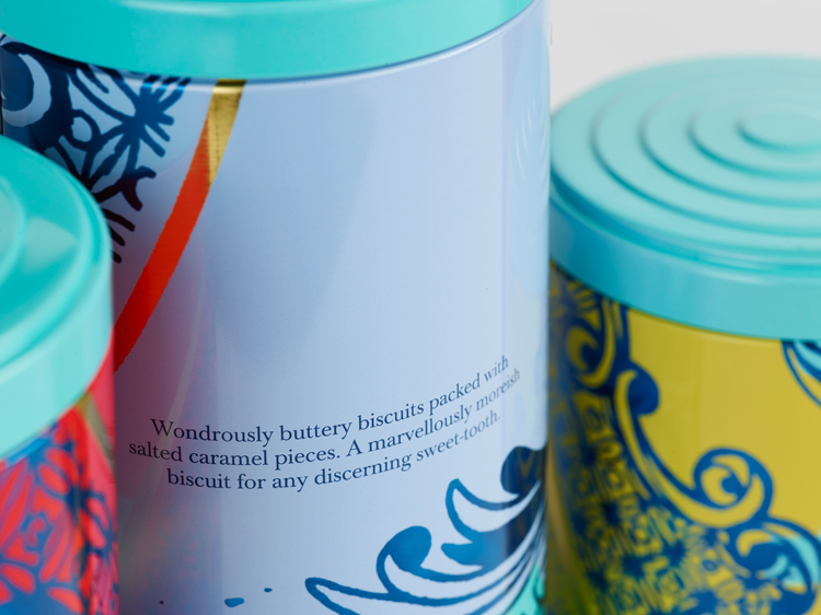
Design Bridge has designed new packaging and tins for Fortnum & Mason’s core range of biscuits, using decorated ceramics and fine china as inspiration for the illustrations.
The design aims to add a “contemporary twist” to a classic, “British” teaware style, and create tins “special” enough to be seen as a replacement for a plate, says design director Chloe Templeman.
The illustrations on the packaging have been hand-drawn, and have varying flower patterns to distinguish between the six different flavours.
A range of “vibrant”, metallic and non-metallic colours have been used, with a de-bossed square in the centre of each packaging design to create a “calm” focal point, adds Templeman.
Design Bridge also reimagined the structural design of the biscuit tin, so they can be stacked more easily on shelves. It features an embossed, gold Fortnum & Mason logo, alongside a lid inspired by a “vintage” style.
The new packaging is currently rolling out in store at Fortnum & Mason and online.