Nestlé Special. T packaging, by B&B Studio

B&B has redesigned the packaging for Nestlé’s Special. T range of teas.
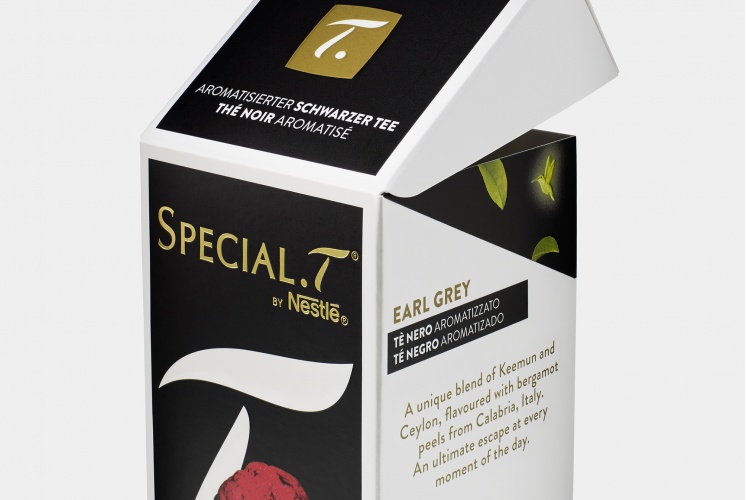
The new packaging features an enlarged and isolated T – also seen in the logo – position on the front of pack, overlapping the imagery.
Each flavour of tea has also been given a unique personality, using images ranging from a tiger wearing a turban on the Earl Grey pack, to a flamingo-grapefruit hybrid for the Pink Pamplemousse infusion.