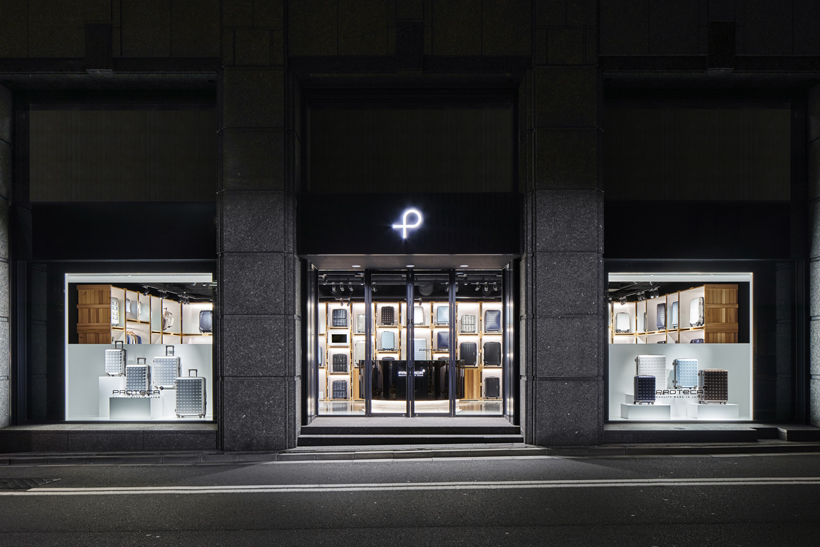
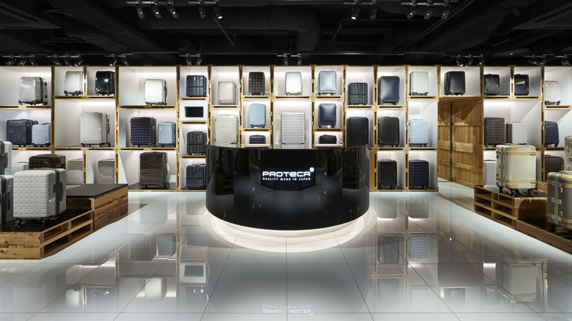
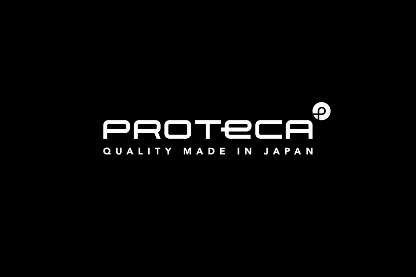
Proteca branding, by Nendo

Japanese consultancy Nendo has created a new identity for suitcase brand Proteca as it marks its 10th anniversary.
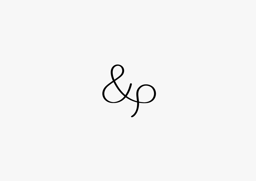
The new identity uses a “simple shape” that resembles a “p” drawn in a single stroke.
Nendo says this aims to represent several elements: “The ‘p’ in Proteca; an image of two arms carefully safeguarding what is packed inside; connecting people with places, and with other people; the smoothness with which the suitcases move; and a return to the Earth once retired from use.”