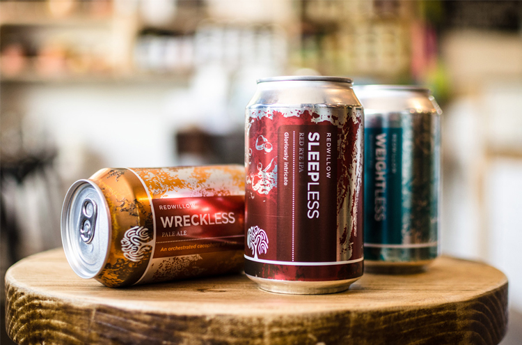
RedWillow Brewery branding and packaging, by Visual Sense
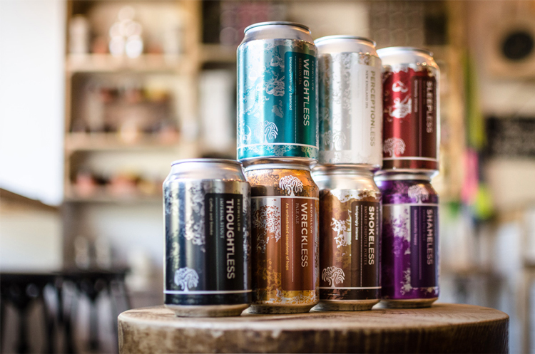
Consultancy Visual Sense has rebranded Macclesfield-based RedWillow Brewery, and redesigned its beer can packaging.
The new design aims to mimic the “fluid” movement of the beer within the can, represented through “swirling, foaming patterns and shapes”, says Visual Sense.
The patterns run around the circumference of the cans, treating the “whole can as a canvas”, says the studio, and compensating for when cans are shuffled and reordered on supermarket shelves and in pub fridges.
The branding features a simple, sans-serif, all-caps logotype set in white.