Hausmann rebrand, by Nalla
 Nalla consultancy has rebranded Australian marketing agency Hausmann to mark its 25th year in business.
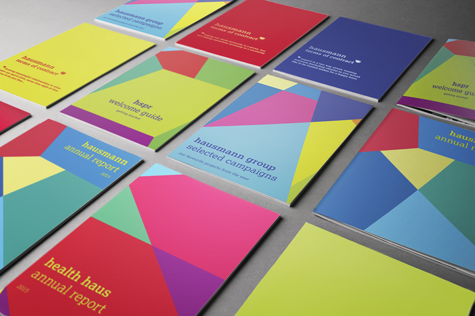
The consultancy collated Hausmann’s three sub-brands – Hausman, Health haus and HSPR – under one umbrella group named The Hausmann Group, and one unifying visual identity.
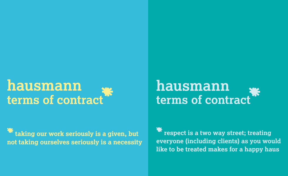
Nalla was briefed with creating a solution that kept the brand’s star logo at the “heart of the concept”, while evolving it for a “modern audience”, says Vicki Young, founder at Nalla. The traditional star has been changed to a “starburst” shape, providing The Hausmann Group with “flexibility”, she says.
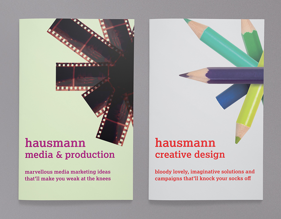
“Crops of the logo crate dynamic slabs of contrasting colour and patterns,” says Young. “Placing the burst in place of an asterisk allows Hausmann to visually champion their straight-talking attitude. Real-life objects are also used, showing off the skill sets and services they offer.”


