
Irish channel TG4 reveals new logo and folklore-inspired idents
Red Bee Creative has designed the new look for the Irish broadcaster, which includes footage from the four provinces of Ireland.
Irish language channel TG4 has revealed a new brand identity and range of animated idents, to match the platform’s positioning of “Expect the unexpected”.

The updated look has been designed by London-based agency Red Bee Creative and has begun to roll out. The work was a collaboration with TG4’s in-house design team.
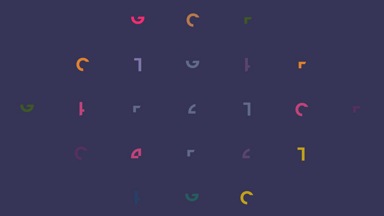
Deconstructing the logo
TG4’s logo has been deconstructed to provide a more “liberated visual language,” says Red Bee Creative head of design Jane Fielder.
Part of this was driven by the channel’s diversification of output. As well as traditional television formats, the identity needed to work for a variety of social channels and screens.
The logo has been broken out of its former boxes and formed into “elegant shapes” which can be used in a wider variety of applications. “It was about giving them all the cards so they could rebuild it in a different direction,” she adds.
The deconstructed logo means that the identity is “more alive and playable”, Fielder adds. This aims to provide a more flexible brand identity. The identity also comprises multi-purpose backplates.
There was already an audio mnemonic but the logo has been animated to make that “lovely trill of notes” stand out, Fielder says. “In a way, the deconstruction allows the logo to arrive with the lovely music, which has become the call to action sound,” she adds.
The new logo also incorporates the wider colour palette that TG4 had recently adopted. “Being able to run through in different colours made it feel really fresh,” Fielder adds.
The channel’s diverse audience also had to be taken into account, Fielder says. Likening them to the Channel 4 of Ireland, she adds that there is a younger audience on social platforms, traditional older viewers and an even wider audience for sports like Gaelic football.
Like many channels, TG4 has expanded beyond the traditional framework of television and the brand needed to be immediately recognisable across platforms, according to Fielder. “We were trying to build in bits so you knew what brand it was just by the characteristics,” she says.
Behind the new folklore-inspired idents
For the idents, the design team travelled all around Ireland, in an attempt to show the full landscape of the country, according to the designer. The idents feature scenes from the four provinces of Ireland: Leinster, Ulster, Munster and Connaught.
They take inspiration from traditional Irish phrases, with six themes: Windy Day, Seaweed, Rain Dance, Leporine, Glass Blowing and Street Crossing. Traditional scenes such as a forest field or glassblowing factory are combined with CGI characters.
The idents also contain references to tales of Irish folklore. One such story is about a woman who turns into a hare, and the rural ident depicts people and hares jumping in and out of the ground.
The futuristic animation was inspired by Cinema 4D technology, which is widely seen on Instagram, according to Fielder. “There’s so much experimental 3D happening right now, but you don’t see it much in television,” she adds.
The technology can sometimes be paired with blank backgrounds but the team sought to combine it with the everyday scenes. “We wanted to be playful with the juxtaposition of the 3D humour and new craft and putting it to the background of those amazing sets,” she says.
During the planning stage, the team thought about visual jokes that could be told through this contrast. “We had cows rolling down hills and all sorts of funny little gags,” Fielder says. “It was a blend of the social world and the ident world.”
One of the idents is set in a glassblowing factory and depicts a worker being created through the craft making process over and over. Another features seaweed farmers working on the shore while the aquatic plants take shape into a creature that walks into the sea.
A more urban-based ident shows people jumping across an intersection at night, with the logo appearing in a shade of bright pink. One celebrates Ireland’s wet landscape, showing a liquid CGI figure dancing on a rainy street scene.
Fielder adds that sound design was crucial to the project. As well as featuring traditional music, a lot of time was spent mixing the sounds of the scenes such as the wind turbines and deer noises.
“It’s subtle but it’s really brought them to life,” she says. “It’s the bit that makes the hair on the back of your neck stand up.”
What do you think of TG4’s new look? Let us know in the comments below.


Fun, witty and delightful. But on a more serious note, it is sad that this Irish language tv station didn’t go with homegrown creative talent. I find it difficult to believe that it doesn’t exist?
My thoughts too, but an excellent job all the same. That little tune will stay in my head for the foreseeable.
If anyone at TG4, responsible for the commissioning this project, is reading this, can you explain why you didn’t use an Irish design company? It does give the impression that there are none good enough? I hope you can answer the question.