Developer Ballymore looks to align brand with cultural sector
New branding designed by Made Thought avoids luxury and instead looks to cultural and creative brands for inspiration.

Developer Ballymore has been rebranded by Made Thought, which has looked to design a more “progressive and innovative” identity with a look that borrows from the cultural rather than property sector.
Ballymore says the new brand has “an inherent simplicity and understated confidence” and is designed with “bold, iconic and effortlessly simple design cues.”
Made Thought undertook a detailed research phase by interviewing all stakeholders and used its findings to eschew “luxury branding” in favour of something which aligns Ballymore with “cultural and creative brands.”
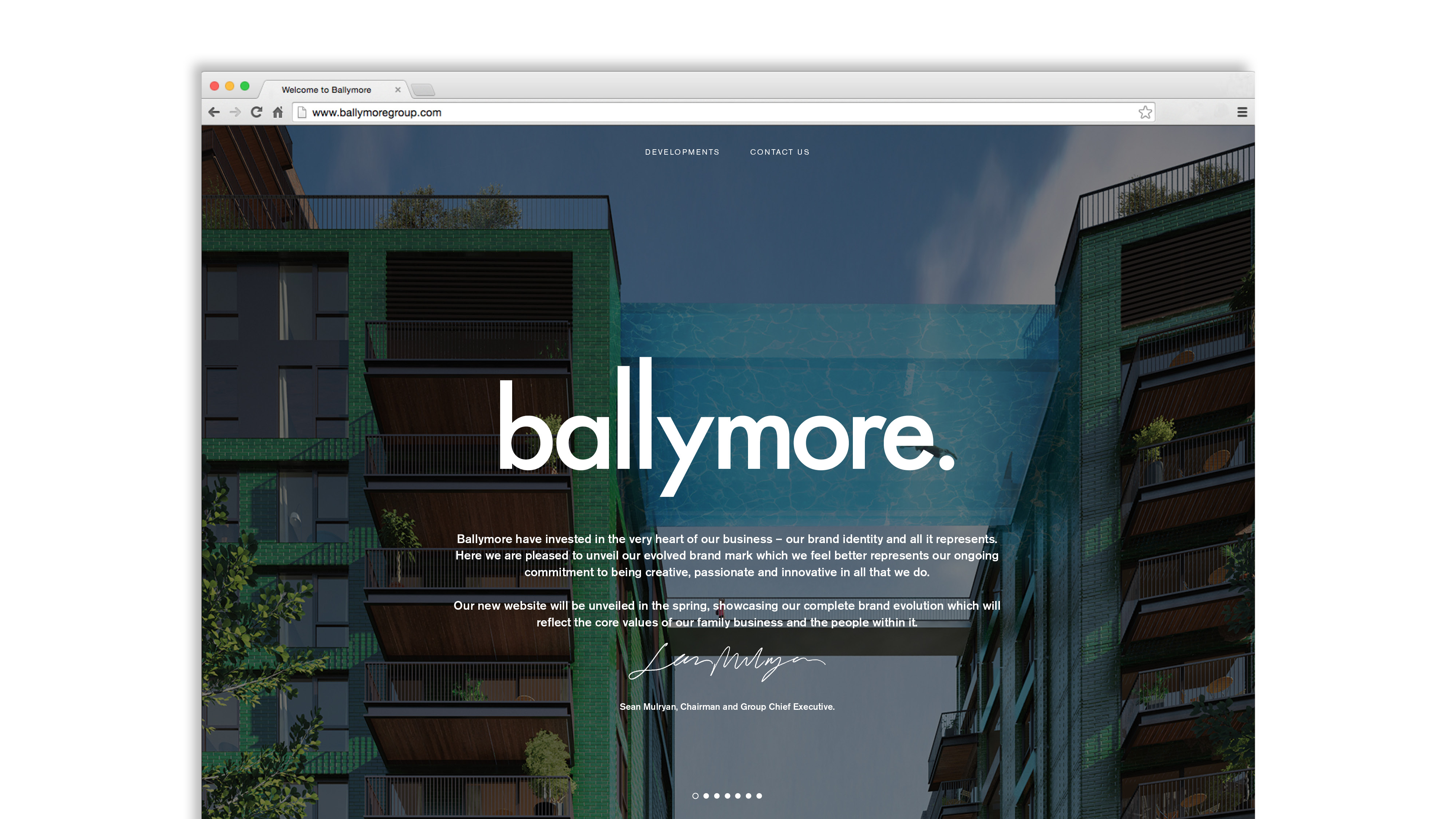
In the wordmark, the vertical stems of the “b” and “l” are designed to show the “architectural calibre” of the product.
The new brand is rolling out across online, environmental graphics and stationery.
A new website is also being redesigned and is set to go live in the spring. Ballymore Group chairman Sean Mulryan says: “Our new website showcases our complete brand evolution, which will reflect the core values of our family business and the people within it.”


Read this next


Subtle, elegant and timeless. I like it.
lovely. Only tweak would be to redraw the Y so it accents the baseline rather than floats over it.