The Guardian Weekly: “Words are not always the best way to tell a story”
This year marks the centenary of the global print publication, which redesigned last year, changing its format from newspaper to magazine. We speak to editor, Will Dean, and deputy creative director, Chris Clarke, about how it has changed over the decades.
Last year, The Guardian’s global, weekly newspaper underwent a major redesign, relaunching as a glossy magazine that looks to take a “slower” approach to news, and keep up with long-read publications like Positive News and Delayed Gratification.
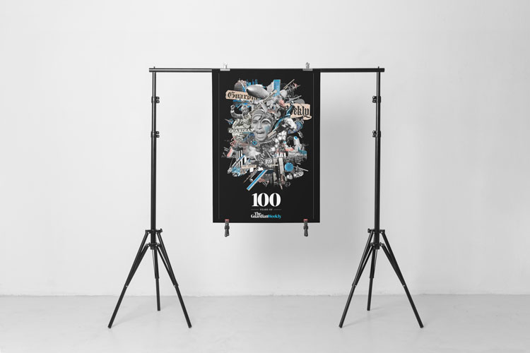
Now, the magazine celebrates its 100th birthday, having been originally launched in 1919 by then editor CP Scott, to showcase the best of The Guardian each week, and also provide people around the world with a condensed digest of the publication’s news.
A lot has happened in the world of journalism over the last 100 years – whereas previously, print papers would be the only way of informing the public of national and international news (except perhaps word of mouth), today’s consumers have access to global happenings 24/7, at a swipe of a page or a click of an app.

“Up until the 1980s, and even 1990s, The Guardian Weekly might have been people’s only source of international news,” says Will Dean, editor at The Guardian Weekly. “Now, people have immediate access to multiple international sources. So, we shifted from being a newspaper, and although we still try to have that news overview, we’ve also tried to slow it down, and have more analysis and features.”
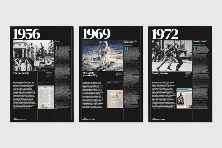
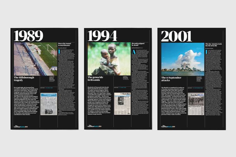
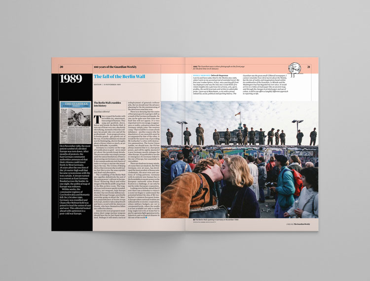
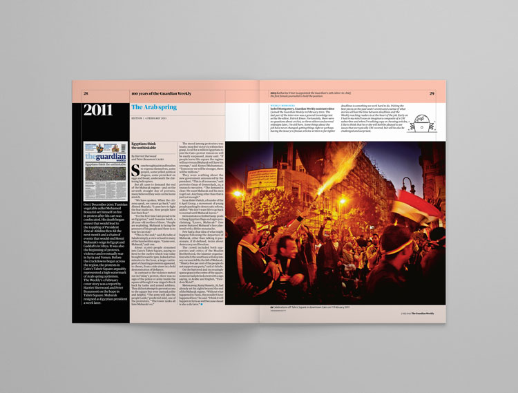
To document the change that the newspaper’s seminal global publication has seen over the last 100 years, The Guardian Weekly has published a special supplement which presents readers with a visual and explanatory timeline of the paper throughout the decades, from the text-heavy, serif type days of the 1920s through to the colourful, photography and infographic-focused glossy that it is today.
As well, the timeline highlights the key news stories that gripped the front pages and spreads of the newspaper throughout the years – from the Wall Street Crash of 1929 through to the Hillsborough, football match tragedy of 1989 and the Rwandan genocide in 1994.
To complement this, the media organisation has also published a small exhibition of the visual timeline in the foyer of its King’s Cross, London headquarters, to tell its story to employees and visitors alike.
What is clear from the timeline is that, over the last 10 decades, the publication has devoted its pages to global, rather than British, news. While this focus will continue, the editorial and design team now need to think carefully about how to package up these stories, given people’s immediate online access to events.
“We have always represented information for an international audience,” says Dean. “But we wanted to look back over time at how The Guardian Weekly had covered a lead story, to help keep it relevant.”
In the nine months since The Guardian Weekly relaunched as a magazine, Dean says he’s noticed a considerable change in reader demographic – while readers have traditionally been older, there has now been a surge in younger people, in their twenties and thirties, buying the magazine.
“I realised that these people, like myself, would consume news by blasting the overall headlines, and getting a reasonable overview, but maybe didn’t have the time to read The Guardian’s long reads online straight away,” says Dean. “They want to sit down and read it, but know it’ll take half an hour. We know people love reading in print, taking their time, and carrying it in their bag. So, with the magazine, we wanted to give these online features another life.”
Now, with the constant flurry of online news, The Guardian’s homepage and landing pages are constantly changing and updating, meaning unless someone is always refreshing, they could be missing big stories – the editorial and design teams have taken note of this, and now give weight to some of these stories that might get missed.
“The US team produces several news features a day – for example, the Democrat debate wasn’t right at the top of The Guardian’s website but it deserves an audience,” says Dean. “We’ve tried to use the tactile feeling of reading in print and beautiful design to give our journalism a longer shelf-life.”
When examining how the style of the weekly publication has changed over time, the editorial and design team have spotted a gradual shift to fewer and fewer words appearing on the front page, as well as an increase in “areas of visual interest” and “entry points” into the paper, says Chris Clarke, deputy creative director at The Guardian Weekly – in other words, things that grab readers’ attention and encourage them to engage and read on, such as pull quotes, infographics, photography and illustrations.

As well as this, iterations from previous decades reflect the sign of the times, showing either austerity or luxury. While the inter-war years of the 1920s and 1930s saw use of expensive, luxurious paper, the 1940s – straight after the Second World War – saw flimsy, airmail paper, as paper production was another industry subject to rationing.
“When we were looking for stories in copies from the ‘40s, the paper was disintegrating in our hands,” says Dean. “Equally, those early editions were completely packed with words – there was no imagery, and the front page was a real romp around the whole world.”
As well, the paper’s design absorbed the artistic and design styles of various decades – issues from the 1990s saw a contemporary shift, featuring a “heavy, Swiss, sans-serif style”, which broke away from the more austere, serif type that had been previously used, says Clarke. This has been coupled with a change in how news publications present their information – as more forms of media have become available, design teams have increasingly looked for engaging ways to tell stories.
“It used to be much harder to print imagery but now we know that the written word is not always the best way to communicate a story,” says Clarke. “Now, we use more navigational and entry points that give the magazine more energy than a printed newspaper could ever have.”
But what hasn’t changed is the ethos behind the global publication – originally founded after the end of the First World War in a bid to improve international relations across the world, the newspaper’s launch came as the world was seeing a time of change – the League of Nations had been founded as an international, diplomatic group that looked to try to solve disputes between countries before war erupted again.
“The newspaper started as a really progressive, international voice, with the aim of The Guardian’s reporting being shared around the world, with as many people as possible,” says Dean. “CP Scott wanted people in Germany, France, the US, all countries to take part in it. That purpose is the same today – we take an international view of the world, rather than being focused on Britain, and we have freelance contributors across the planet.”
While it’s true that now people have access to international news at the click of a button, Dean says that the need for a global magazine is more pertinent than ever, given the social and political issues that are affecting the globe, from climate change through to populism.
“The Guardian website has been successful in growing a global audience,” says Dean. “But the weekly offers a slightly different way to approach international news, which complements the online version. There is so much stuff online, that even the editors don’t catch all of it first time round – having an edit of all that in a beautiful magazine helps us follow our global purpose.”

Read this next

-
Post a comment


