Hamilton and Hare boxer short rebrand packs a punch
Design Bridge has redesigned the “premium” underwear and loungewear brand, drawing inspiration from the boxing ring.
Design Bridge has redesigned the visual identity and packaging for men’s underwear brand Hamilton and Hare, basing it on the sport of boxing.
The company markets itself as a “premium” brand, with the ethos that “underwear shouldn’t be an afterthought” and should “be given the respect it deserves”.
It was launched in 2012, and is inspired by the original “boxer short” worn by fighters in the ring.
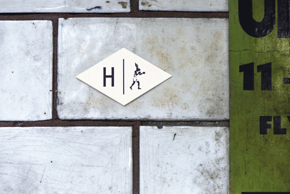
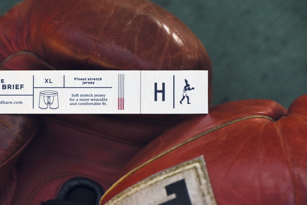
The brand proposition has been based on a “ready for everything” ethos. The identity has been changed from two hares “locked in battle” to one “primed-to-fight” hare, Design Bridge says. Labels also feature graphic lines, which aim to represent the ropes of the boxing ring.
“We wanted to create a look and feel for the brand that embodied the characteristics of a quintessential boxer,” says Rory Harker, senior designer at Design Bridge. “One who is committed and ultimately ‘ready for anything.’”


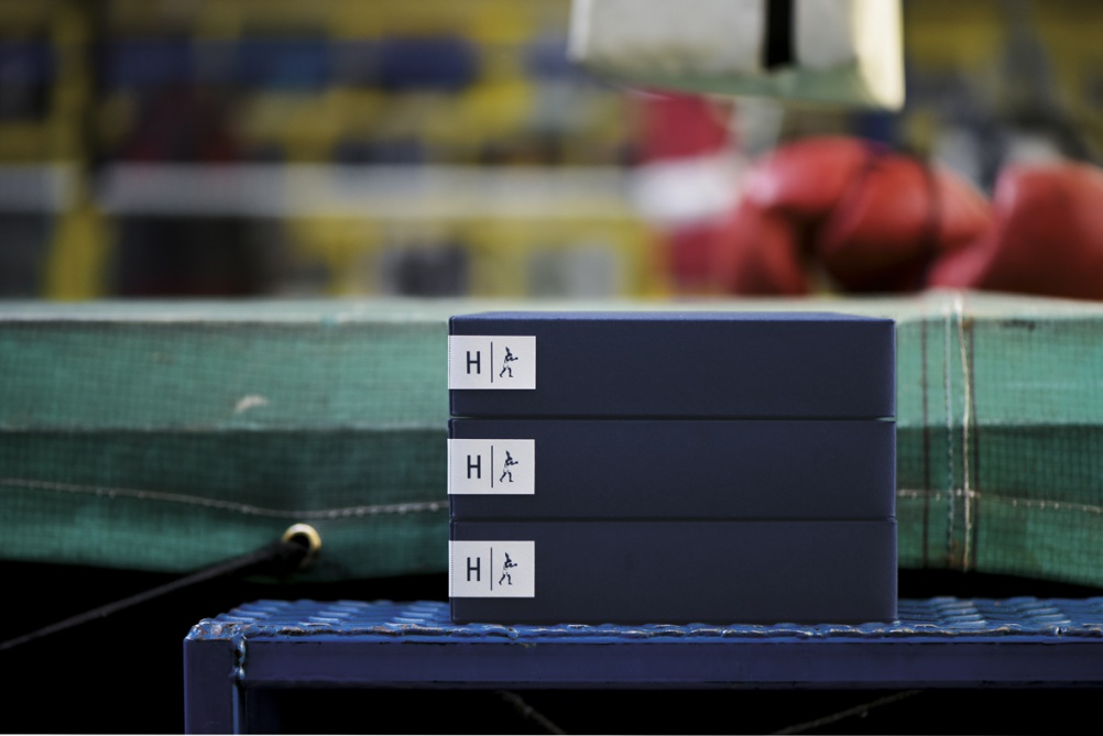
The packaging is rectangular with a border, aiming to mimic the shape of a boxing ring, while the perforated label that seals the box aims to replicate old boxing tickets.
The new look is being rolled out across packaging, online and print collateral.

Read this next

-
Post a comment


