Design inspiration: the best projects from February
Some of our favourite projects from the month included a cinematic identity for the Glasgow film festival and an interactive literary journal.
Glasgow Film Festival identity, by O Street
Glasgow-based design studio O Street has created the new identity for the city’s film festival. Now in its 15th year, the event showcases world cinema and also Scottish film, though this year’s offerings will be all at-home. The studio designed a “minimal and adaptable” screen-shaped logo, which is supported by full technicolour animations as well as illustrated icons that pay homage to cinema and the city. The virtual aspect of this year’s festival was incorporated into the accompanying campaign, which plays on the “juxtaposition between the glamour of cinema and watching movies in your PJs”, according to the studio. O Street director David Freer adds that his favourite detail is a custom festival filter for taking selfies on Instagram.
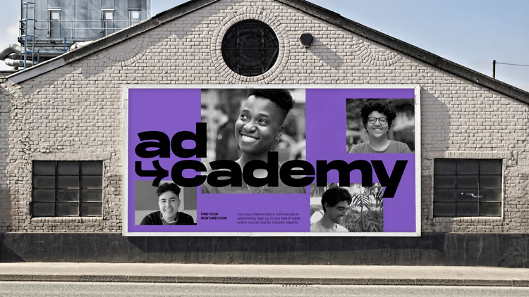
Ad-cademy brand identity, by Mother Design

Mother Design has created the identity and campaign for Ad-cademy, which has been curated by Brixton Finishing School. The 8-week virtual platform aims to help young people aged between 18-25 from underrepresented backgrounds break into the advertising industry. Mother design director Thomas Humeau says that the branding aims to “celebrate digital visual vernaculars” such as swiping and scrolling, thereby portraying the industry from a youthful point of view. Meanwhile the launch campaign aims to demystify industry career terms such as ‘creative’ and ‘social media experts’ by playing on tropes and conventions of these different roles.
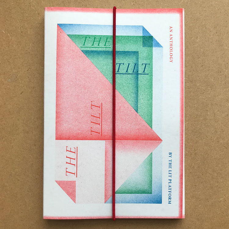
The Tilt literary journal, from The Lit Platform

The Tilt is an illustrated collection of writing about identity and inequality in the publishing industry. Available as limited-edition copies, the riso-printed journal features writing from emerging talent about representation and language. The design aims to mirror the content; each chapter is written in different languages, and the audio can be “unlocked” by scanning illustrations on the page. Art direction was headed up by Falmouth University lecturer in illustration Phyllida Bluemel who says that she “wanted to give each new voice their own space and identity, while still allowing for overlaps and conversation between them all”. “I couldn’t resist creating something tactile, with different parts to unpack and shuffle,” she adds.
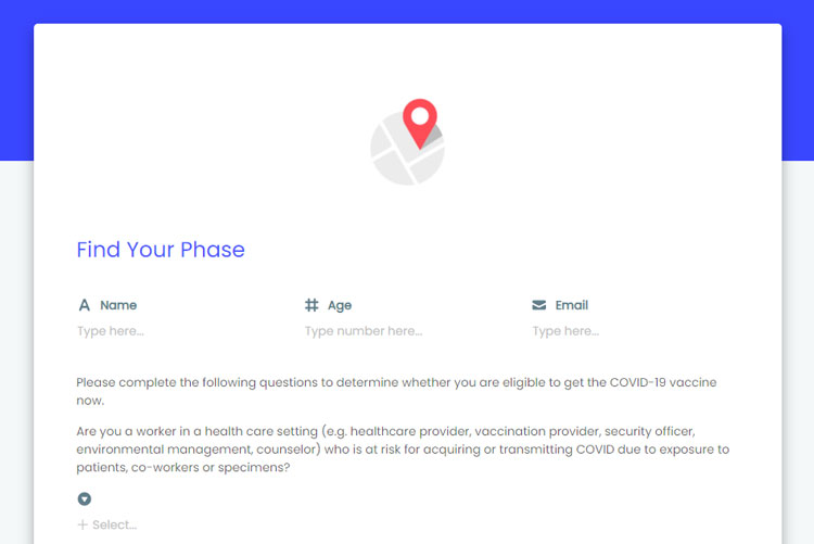
Covid administration toolkit, from Hims.ai

Software company HyperOffice has designed a series of Covid apps in the attempt to streamline the vaccine roll-out in American healthcare centres. Available through its Hims.ai platform, the apps use AI and automation technology to track patients on their vaccine journey – sending information about their appointments or second-dose reminders, for example. The apps also help to send vaccination data back to government agencies. Hims.ai president Farzin Arsanjani says that the apps have been designed in consultation with medical care workers in the hopes of understanding the complications and needs of patients more accurately. Crucially the apps aim to have a fast roll-out, with a deployment target of under a week. “With vaccine distribution well underway, administrators who are in the eye of the storm don’t have the luxury of time and drawn out implementation projects,” Arsanjani says.
Travelport rebrand, from Studio Parallel
London studio Parallel has rebranded one of the world’s biggest travel retail platforms Travelport with an “editorial look”. The B2B platform enables transactions between travel services like airlines, hotels and rental companies and travel agencies. The company’s new look seeks to differentiate it from the rest of the tech sector, according to studio co-founder Paul Fox. He says that the team looked at magazines like The Economist and newspaper weekend supplements in the hopes of creating a distinct voice for Travelport. The updated logo references both ‘T’ and ‘P’ which demonstrates how the organisation is moving forward with a different perspective, according to the designer. The display typeface Druk seeks to reinforce a editorial voice. A colour palette comprising olive green and sand tones is a further attempt to avoid anything corporate, Fox adds. Parallel has created over 150 illustrated icons for the rebrand and set photography guidelines which aim to show the joy and experience of travel and not simply people at airports, according to Fox.
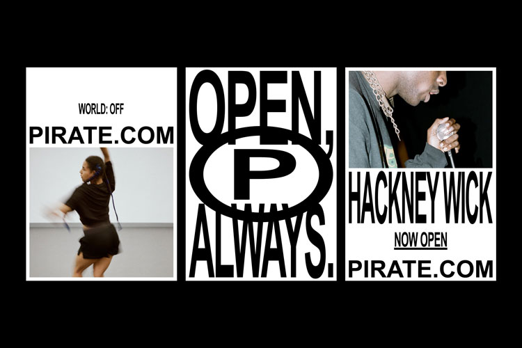
Pirate identity and location redesign, from Only

Pirate – an international network of musical creative spaces – has a new look. The organisation provides 24-hour access to over 600 studios around the world in the hopes of making music production more accessible, from rehearsing to recording. Manchester-based design studio Only has created the new “democratic” identity which rolls out at locations all over the world. The typeface Arial is used widely and the sound recording symbol Ⓟ has been adopted as a “digital shorthand”, the studio adds. At Pirate studios, place names have been “free-stretched” on the exterior while an interior wayfinding system makes use of an off-the-shelf modular racking system. These interior choices can be rolled out at a low-cost manner and in a way that is “both ownable and utilitarian”, according to the design team.
-
Post a comment


