New identity for Equality, Diversity and Inclusion in Science & Health initiative
The branding created by Tothepoint is launching while the issue of diversity in the sciences has been hitting headlines for the wrong reasons.
In a week when the topic of diversity in science has hit headlines for the wrong reasons, a light has been shone on an organisation that wants to tackle the issues surrounding underrepresentation in the sciences.
The Equality, Diversity and Inclusion in Science & health (EDIS) initiative, which says it aim to break down barriers for all to have better access to career progression, research and its outcomes in these fields, has unveiled a new identity created by the Tothepoint.
EDIS has been set up with a goal of creating equal opportunities for people from diverse minority groups and for those who are underrepresented in the world of science and health research.
Backed by the The Francis Crick Institute, Wellcome Trust and GSK, the organisation’s mission is to “build a powerful, connected and coordinated movement to advance equality, diversity and inclusion in Science and Health,” EDIS says.
The branding for EDIS created by Tothepoint, includes a logo which becomes animated and a series of icons.
Creative director at Tothepoint, Kevin Cox, says: “This issue is becoming more and more high profile in the media in particular with the science sector making headline news with ill-judged comments from the likes of Cern Scientist, Prof Alessandro Strumia of Pisa University.”
 “We are proud to be a part of an incredibly relevant and important initiative, helping EDIS to communicate their message and gain traction in this sector.”
The studio started the project by creating panels which explored the group’s missions and vision, along with the new look that were used at an identity launch and fundraising event where over 40 speakers discussed the issues EDIS aims to tackle.
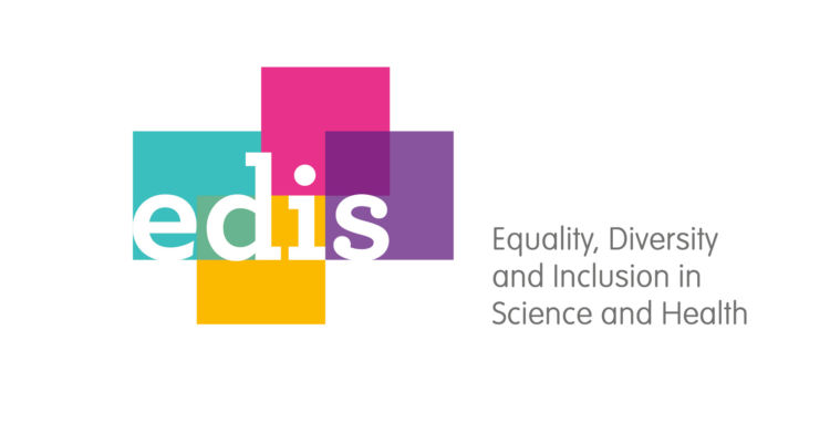
The visual identity has been made up for squares of different colours representing diversity, according to Cox. The squares are all the same size, symbolising equality, and come together to meet in the middle, as a representation of inclusion. The letters “edis” are written over the top in a white lower case font.
Cox says: “The identity needed to reflect the ethos of the organisation. It was important that the brand look and feel was non-threatening and approachable, with the planes coming together representing a simple interpretation of the initiative.”
He says the logo was designed with “flexibility” for the print and digital world in mind. An animated version of the mark sees the squares coming together from different sides and forming one shape around “edis”.
 The studio also created four icons representing each of the words that make up the acronym EDIS, which it says can be used for signposting and navigation purposes.
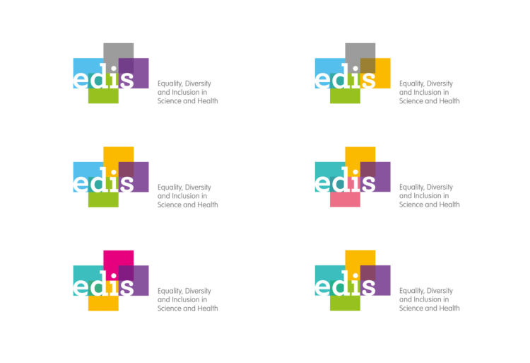
The colours chosen were pink, purple, yellow and turquoise, which were selected after experimenting with various combinations of shades, with the goal of optimising the mark for colour-blind people.
Cox says the studio involved Colour Blindness Awareness, a community interest company which raises awareness of the condition, in the testing process to check how well different colour combinations work for colour blind individuals.
Tothepoint, which has previously worked on branding projects for The Francis Crick Institute, hope to develop the project with EDIS.


I really like the simplicity and flexibility of this new identity, although I would have thought using such colours for those affected with colour blindness might have been a hindrance. I’m also unsure of white revered out type in a yellow background. Those colour combos have very a low LRV. Really nice though.