Progression Design tones Cannons brand
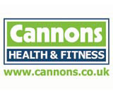
Progression Design has redesigned a visual identity for Cannons health and fitness club chain. Due to be unveiled this week, the marque will appear on signage, promotions and corporate literature.
Progression creative director Allen Betchley says Cannons wanted to emphasise the health and fitness elements of the brand. ‘They felt the old logo wasn’t pushing these aspects enough, and they wanted more vibrancy.’
Betchley retained the existing typographic form, but framed the name in a bold, green bar. ‘By creating a further bar to hold the health and fitness sub-line, and encompassing the two within another block, we feel that we have now brought these elements together and given both a stronger, balanced relationship,’ he says.
Progression Design secured the branding project through its work on Cannons Group’s promotional literature over the past five years.
Read this next

-
Post a comment


