Poulters helps preserves get out of a jam
Following major research and new product development work with Leeds design consultancy Poulter Partners, UK spread manufacturer Chivers Hartley is launching a new product in an effort to halt the decline of the brand and the jam sector.
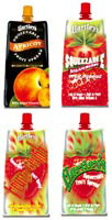
That’s Fruity is targeted at families, and is packaged in tactile and flexible printed foil pouches to create a strong visual impression when the different flavours are stacked on the shelf. It also aims to provide a fun aspect for younger consumers when squeezing the pack to dispense the jam. It hits shelves in mid-June.
‘It became apparent that there was an opportunity to build on the strengths of the existing Hartley’s brand with a new, smooth, extra-fruit Jam. And so Hartley’s That’s Fruity was born,’ explains Poulter Partners account manager Matt Small.
‘The challenge for us was to create a range of packaging that was functional, fun and communicated the high-quality values of the product to the purchaser,’ he adds.
Available in strawberry, blackcurrant, apricot and raspberry, each package uses highly finished illustrations of the fruit, which on the front and sides appear to be lightly resting on, or slightly submerged in, a rich, smooth background. Various uses for the product are also suggested on the packs, including squeezing it on to desserts, yoghurt or even just spreading it on toast.
Small adds: ‘The target market for That’s Fruity is families, but purchased by mum. With this in mind the packaging design had to communicate Hartley’s long-standing reputation as a quality brand to mum, while offering the kids a fun experience when using the jam.’
Client: Chivers Hartley
Design: Poulter Partners
Design director: Geoff Crumack
Senior designer: Ian Durman
Fruit Illustrations: Studio Liddell
-
Post a comment


