Spinner pins down image for European judo school
The European School of Judo is wrestling off its ‘stuffy’ image with a name, logo and identity created by Spinner Design.
From next week the organisation, which has half a dozen centres in the South of England, as well as various affiliate schools, will be known as Eudo.
It is hoped that the new name, a ‘hip’ compression of the original nomenclature that significantly removes the word ‘school’, will present a more credible and fun image to potential participants in and sponsors of judo.
‘The previous name was very authoritative,’ says Spinner creative director and project leader Jonny Old. ‘The organisation wanted to convey the fact that judo is about fitness and play, rather than being wholly serious.’
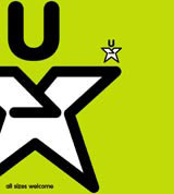
The previous 12-star logo, which was reminiscent of the EU motif, has also been retired. Taking its place is a star-shaped character, which will feature on T-shirts, posters, letterheads, certificates and compliment slips – also to be designed by Spinner.
‘The original logo was rather stuffy,’ continues Old. ‘Eudo needs a younger, fresher mascot if it is to feel confident about approaching potential sponsors.’
It is hoped the revamped look will encourage increased purchases of Eudo merchandise, providing the school with expansion capital at a time when judo is enjoying increased popularity.
‘This will enable us to push the organisation to greater limits and ride that popularity wave,’ says Eudo managing director Nick Lowe.
Spinner was appointed to the project earlier this year on a recommendations basis. There was no pitch for the business.
Read this next

-
Post a comment


