Would you vote for this logo? We look at the rise of politician branding
With political candidates on both sides of the Atlantic making headlines with their personal logos, we look at what makes a successful identity for a politician.

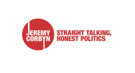
In the UK, front-running Labour candidate Jeremy Corbyn has been making his case for party leadership in recent weeks through a campaign fronted by this logo. Corbyn’s logo is bold and memorable, but will it prove effective?
Left-winger Corbyn is using the strapline “straight talking honest politics” and his message is gaining traction with younger voters on social media, some of whom are adopting his snappy #jezwecan message, which echoes Barack Obama’s #yeswecan presidential election campaign of 2008.
On both sides of the Atlantic social channels have become an increasingly important political arena.
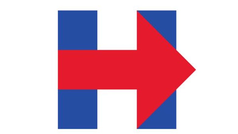
This week we’ve also seen graphic design used as a tool for political jousting in the US as the teams of Democrat candidate Hilary Clinton and Republican candidate Jeb Bush manipulated each others messages and logos in a rather public Twitter spat.
It was a battle-ground of reactive photo-shopping and impassioned polemic rather than the result of any considered political satire. Here’s what happened:
Cost won’t be a barrier to an education. Debt won’t hold you back. Read Hillary’s plan: http://t.co/A4pWb3fOf4 pic.twitter.com/KVyr8SlSVn
— Hillary Clinton (@HillaryClinton) August 10, 2015
@HillaryClinton pic.twitter.com/m6LAHYCLok — Jeb Bush (@JebBush) August 10, 2015
.@JebBush Fixed it for you. pic.twitter.com/d4q9EWpXCA
— Hillary Clinton (@HillaryClinton) August 10, 2015
.@HillaryClinton fixed your logo for you. pic.twitter.com/141nXHQe4Z — Jeb Bush (@JebBush) August 11, 2015
In years gone by we’ve more used to political parties’ campaigns being fought across direct marketing and billboards.
But the last few elections in the US and UK have seen the importance of online and social channels grow – and candidate logos are now being drawn into this battle-ground.
Therefore a politician’s logo now needs to be robust enough to compete in this space, while also communicating the ideals of an individual and a party – and hopefully capturing the mood of the nation in some way.
So what does make a good political candidate logo today? We asked some experts.
Siegel+Gale EMEA President Philip Davies:

“It must convey leadership, defined by three key things, which are really the three things that anyone putting themselves up there as a leader should embody: authenticity, empathy and logic. If the logo can play well to each of these, you’re probably on to something good.
“Technically, there are some principles to apply: Is it ageless? It needs to represent a wide range of people. Is it versatile? It needs to be used in various formats and sometimes under basic production. Is it representative? It needs to truly demonstrate something about the beliefs of the candidate? Are they offering something new? Something familiar? Something about change? Something about continuity?
“Whatever is the candidate’s core message and philosophy, it should be evident implicitly or explicitly in the logo. Is it simple? It needs to cut through and do all the above with clarity.
“If we look at Jeremy Corbyn’s logo it does feel authentic. It’s Jeremy Corbyn. Red. Utilitarian. Direct. Socialist. Unionist. It doesn’t have empathy though. It’s blunt. The capital letters feels distant and shouty. It isn’t particularly logical. It’s simple. But doesn’t make sense.
“The extended J and Y. Why? It appears as if he’s going in two different directions; thereby indicating he doesn’t know where he’s going.
“Finally, it’s not the famous ‘O’ of Obama’s 2008 campaign. That raised the bar and not many have reached it since. Although Hilary Clinton’s ‘H’ with Arrow is good.
“Political logos have evolved in the wake of Obama’s. Moving a little more in to the corporate style of iconography as opposed to the traditional political lobbying style.”
Rufus Leonard executive creative director James Ramsden:

“We are starting to see political logos move in the right direction.
“There was a time when these icons represented the cause, purpose, idea or mission of the party but that is becoming harder for them to achieve in a clear, memorable and authentic way. With cynicism rife and overly complex topics venturing into every conceivable life matter imaginable, shouldn’t we aim for more simplicity in politics?
“To design a really good political logo today, it needs to be distinctive and different to the endless arrangements we’ve seen over the years.”
“Those candidates who consider a true brand ecosystem or framework that is more akin to how the best brands design their brand identities will fare well.
“In turn this will help them to create compelling communications rather than defaulting to an expected colour and splodge left, type right arrangement.
“Often the true personality and character of the party is delivered through the leader rather than through the identity, as its arguable that ‘the leader is the brand’ in this circumstance. Those candidates who are driving more leader character into the brand identity, such as Hillary clinton, rather than trying to pack an outdated embodiment of a purpose, idea or mission will do better.
“And of course it needs to be ready for digital, TV and social.”
David Kimpton, Kimpton Creative:
“Jeremy Corbyn’s candidate logo seems to take visual inspiration from the Hoover logo – and it sucks.
“A decent political candidate logo should be something bold and distinct that displays a passion for what you believe in – robust enough to take the fight to the opposition – a metaphorical ‘flag’ to rally the troops behind.”
C Space chief creative officer Franco Bonadio:

“Funny, the Corbyn symbol reminds me of The Who logo and of a time when people wore badges for fashion. So is this retro approach an accident or a strategy ?
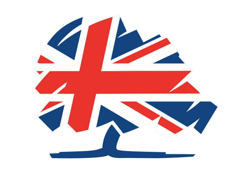
“Not long ago the approach would have been to create a symbolic picture of something we could relate to like a Tree (Conservatives) or an aspirational message like Obama’s ‘Yes We Can. ‘ Both worked well in changing the political conversation at the time.
“Today we have little faith in our politicians or their promises so anything remotely suggestive of positive symbolism would most probably be trashed instantly via social media.
“So look back at the recent history of political logo’s (trees, birds, flames, flowers, flags etc) and steer well clear of all of them. So no logo then, just their name and picture… Wait a minute, just had an idea… make Jeremy Corbyn the new Che Guevara!”


Given Jeremy Corbyn’s recent press there’s a certain irony to the logo using a a red oval – a commonly used symbol for Stop, Hazard, Danger or Warning.
The extended type looks like an example of Doing something for the sake of it “Just because you could… (doesn’t mean you should!)” and implies a “Could Go Up – Could Go Down” attitude which is probably not ideal for politics.
As for the strap line – I always thought Politics was the opposite of that and if it is possible to be honest and straight talking – it should be demonstrated not shouted as part of your logo..!