
North gives the International Paralympic Committee an “energetic” identity
The IPC, which organises the Paralympic Game, has been given a new look in time for the summer games in Tokyo.
The International Paralympic Committee (IPC) has been given an identity update — including revised symbol, visual guidelines and new typeface — by London-based design studio North.
North’s Josef Clinch tells Design Week that the IPC initially wanted to “simplify” their brand. “They came to us with practical challenges about their existing identity,” he says.
After having conversations about movements within Paralympics sport, the IPC and North saw an opportunity to be more “energetic” and “exciting” in its approach.
“Parity” with the Olympic rings
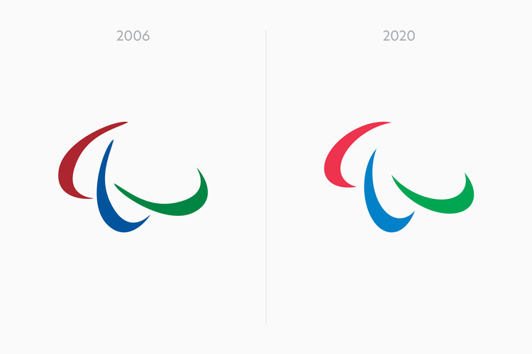
Though it is a “subtle” change, the update to the symbol is significant. “None of those three shapes were the same,” Clinch says. It was presenting problems with multiple application of the guidelines.
“We had seen applications of the symbol where it was in three dimensions, and the shapes were backwards,” he adds.
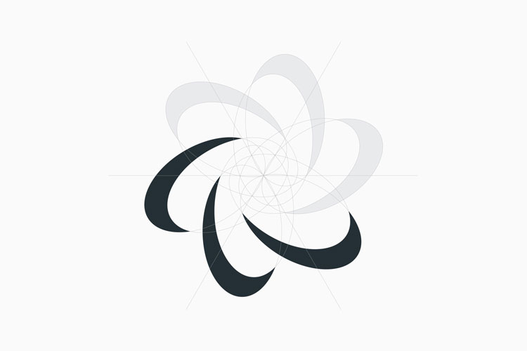
The colours have been brightened to match the blue, red and green of the Olympic rings. The discus-like shapes have been redrawn and repositioned so that they are more symmetrically aligned.
“Before it looked as if it was based on someone drawing it by hand,” Clinch says. “But now it’s based on a very strict geometry.”
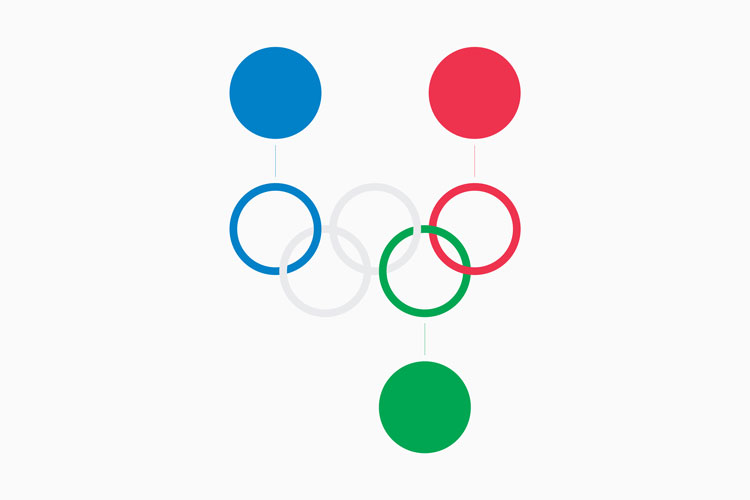
He adds: “It’s seen next to the Olympic rings, which is one of the world’s most iconic designs and has a strict geometry, and we wanted something that would feel equal to that.
“If we had one overarching goal, it’s to help the identity represent the future of the Paralympics as being equal to the Olympics.”
Branding guidelines
The branding guidelines had been “built on over the years”, Clinch says. “It was about stripping lots of the complicated stuff away so they could focus on the personality more.”
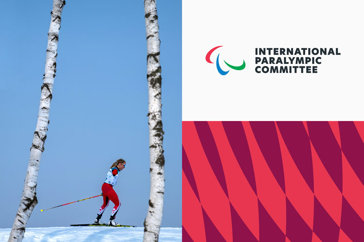
The IPC was previously much more reliant on photography to communicate it message, but the updated symbol provided new geometrical patterns and a colour palette which can be used as an “alternative to photography”.
That’s especially important for the wide range of documentation that the IPC has to produce. As the studio notes, “nobody wants to be on the front cover of the Anti Doping Guidelines.”
A new typeface has also been introduced. New Hero “enables a more motivational, energetic style of messaging”. This ties in with North’s guidelines about tone of voice for the IPC.
“It’s about making people rethink how they perceive the Paralympics,” Clinch says.
A “flexible” design system

The IPC is a global organisation, with many sub-groups on an international and national level such as National Paralympic Committees and Regional Paralympic Committees. It needed a more “flexible” system that could work across that wide variety.
“It was about making those third parties feel more consistent,” Clinch says. “The existing system wasn’t robust enough.”

The new system is able to communicate the IPC’s values and identity more quickly with its partners, according to Clinch. It will be used across a “broad variety of materials”, such as athlete handbooks and the IPC’s video channels.
The Paralympics and Olympics
While this update to the IPC’s identity aligns with what is expected to be the biggest games in the organisation’s history, it is only at the Paris 2024 Olympics that the logos for the Olympics and the Paralympics will be the same.


Omg, couldn’t they have chosen a better photo for that woman between the birch trees? It looks like she has a stick in her butt!
Reminds me of something… a brand, can’t recall what they were called… ‘Nick’?, ‘Nyke’… something like that.