
Meet the designer rebranding English and overseas football clubs
Christopher Payne reveals how he is helping league and non-league clubs balance cultural history and heraldic charm with the modern age.
Graphic design was not Christopher Payne’s first choice as a career. “I always wanted to be a professional footballer,” he says. “But things weren’t happening on the pitch.” After studying at London’s University of the Arts, Payne took an in-house job at a tech company in Buenos Aires, Argentina before moving to San Francisco where he is currently based. Despite a varied workload, his love has always been for branding and football. “But there are a limited number of football clubs,” Payne says of combining those passions, “and so many designers who probably have the same interest and projects on their wish list.”
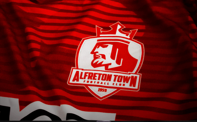
He saw his opportunity when Alfreton Town FC was taken over by American owners. Payne had always been interested in the Derbyshire town because of its royal links. It is said to have been founded by King Alfred, and there are a number of references to the Saxon king in the local geography, from pubs to street names. He sent off spec work with a crest inspired by King Alfred. It turned out that the new owners were also keen for a rebrand.
Since Alfreton Town’s rebrand in 2015, Payne – known as the football brand designer – has turned his eye to a number of UK clubs, from Taunton Town FC to Hitchin Town FC as well as international teams like Napa Valley 1839 FC, of California, US. According to Payne, many English clubs are ripe for redesign. “A lot of teams have been around for 100 years and their brand design hasn’t really changed in the past 25 to 50 years,” he says.
The need is mostly driven by the shift to digital. Icons need to be scalable and work across many more platforms, Payne explains. “Club logos were often made around 50 years ago before the dawn of the internet,” he says, adding that the more complicated designs “weren’t made to work well on social and digital media”. It’s not always necessary, of course. He points to Nottingham Forest FC’s crest – designed by a lecturer in graphic design in the 1970s for a competition – as an example that’s “stood the test of time”.
“I never want to throw history away”
For Payne, the rebranding process involves all stakeholders including fans. He interviews the latter in a series of ‘listening sessions’ throughout the design process. He asks the same questions to different audiences and begins to find “repetition in their answers”. Questions include what fans feel best represents the club, their memories of matches, and the songs they sing on the terraces. He also sometimes asks them to draw the current logo from memory. Payne says he tries to keep these sessions “visual and open” and doesn’t lead the fans into a particular direction.
The listening sessions for Hampshire’s Eastleigh FC brought up the local pride in the Spitfire aeroplane. Southampton International Airport – previously known as Eastleigh Aerodrome – was the place of the Spitfire’s first flight. The team has the nickname the Spitfires and Payne decided to embrace that moniker. Now a Spitfire appears prominently in the club’s logo. He also designed a bespoke angular typeface for the club named Spitfire Sans, which is inspired by type found on the side of the aeroplane model. “I never want to throw history away,” he says.

Fans’ feedback is so important because Payne is aware of how much clubs mean to them. “Some are going to buy merchandise, and some will get it tattooed on them,” he adds. On the club side, it can also be a profitable exercise – especially for more local clubs with smaller budgets. “The work can have a big impact,” Payne adds. “They make money from merchandising, new sponsorship, and new business partners.” In the case of Alfreton Town, club chairman Wayne Bradley says that merchandising sales have been “running at over 200%” since the redesign.
“You really want your club to have the opportunity to be a lifestyle brand”
Payne’s most recent work is for Hitchin Town FC, located in North Hertfordshire. Like Eastleigh, this was a case of aligning the nickname and the logo more closely. Hitchin FC are known as the canaries, and now the yellow bird appears on the new logo perched upon the FA cup (the club was one of the eight original teams to participate in the inaugural 1871 FA cup tournament).
The club also had an archive of photographs that spanned 100 years, according to Payne. “That brings inspiration but also the reality of the pressure you’re under to produce something right for the fans and that embodies the history of the club,” he says. In particular, Payne drew inspiration from typography found on match cards from the 1930s. “You get so much information from everyone,” he adds, that it becomes about “what to leave out and what to keep”.
While comparisons will be made with Norwich city, the yellow and green club colours and the canary are symbols associated with Hitchin Town’s history.
Typography is crucial for this kind of branding, according to Payne. As well as making clubs “more recognisable”, it is used in a number of places – from players’ shirts to campaigns. He believes a lot of big clubs could do a lot more with their typography. “Having a custom typeface is really advantageous,” Payne says.
He also often looks outside the world of football design for inspiration. “You really want your club to have the opportunity to be a lifestyle brand,” he explains, pointing to the influence of fashion on club culture. Payne is also interested in label and tattoo design, which often combine symmetry and symbolism into small spaces. “The canvas is really small so you can’t fill it with things that doesn’t mean anything,” he adds.
Football vs. soccer branding
After Alfreton Town’s rebrand, Payne experienced an uptick in interest from clubs – particularly from American clubs who liked the royal-themed identity. He has now designed the branding for a number of US-based clubs, where he says that football – or soccer – is a “booming” industry. Local businessmen have seen the opportunities in building communities and stadiums around the sport, according to Payne, though the design approach is different. “In England, it’s history and tradition,” he says. “Here, it’s more a blank piece of paper and you can build something from the ground up.”
One example of this start-up energy is in his work for New Amsterdam FC, based in New York. The club, founded in 2020, is currently based in the Bronx (a northern borough of the city), explains Payne. The club’s name refers to the 17th century Dutch settlement in what is now known as Manhattan.

With its reference to the past, Payne says that he couldn’t use any “modern day New York iconography” like the Empire State Building or the Statue Of Liberty. Instead, the logo features a 16th century Dutch ship while the more modern typography has an “industrial tradition” to it. “We had to really create a story and organically bring it out,” he says of the project. For another new club Flower City Union, based in Rochester, New York, Payne designed a lilac flower crest.
While football is his original love, Payne says it would be an “informative process” to design for different sports. In America, a contrast to football’s simpler aesthetic is baseball, he explains. “It’s more illustrative, and dare I say it, cartoony,” the designer adds.
He also keeps track of what is happening with the big club crests and admires Juventus’ “extremely bold” rebrand from 2017 by Interbrand. “Juventus really opened a lot of people’s eyes,” he says of the Italian club’s black and white J-themed logo. “It was controversial at the time, but it’s stood the test of time.” He also praises Tottenham Hotspur’s crest which has been simplified over the years as well as the club’s “distinct typography style”. Payne would love to work on Liverpool’s branding, which he says could be “a little more simplified”. “It has a super rich history, and it’s one that would need a lot of care and attention,” he says.
Originally from Ripley in Derbyshire, Payne still supports local club Derby County FC. The club currently features a ram prominently in its crest which is a “difficult shape to work with”, the designer says. “I used to go there as a kid and had a season ticket for five years,” Payne adds. “Do they need a rebrand? Probably not, but if they approached me, it would be a dream come true.”


Im no football fan, but they all look so American?