Gothic grind
After years of being shunned by designers, one of the oldest scripts in the history of typography has made a comeback, initially appealing to youth DIY culture. Simon Loxley looks at how Blackletter has been given a new lease of life

After years of being shunned by designers, one of the oldest scripts in the history of typography has made a comeback, initially appealing to youth DIY culture. Simon Loxley looks at how Blackletter has been given a new lease of life
The wheels of typographic fashion don’t turn as quickly as those of the catwalk, but turn they do, nonetheless – from the condensed moderns of the 1980s, through the craze for copperplate gothics, those blocky sans-serifs-with-serifs that were so prevalent in the early 1990s, to today’s sans serif stranglehold, itself now overdue for challenge.
But who ever thought the spotlight of aesthetic approval would find its way back to that typographical pariah, Blackletter, so overladen with undesirable historical associations, so divorced from any notion of form following function? Never rule out a comeback by typography’s most battle-hardened street fighter.
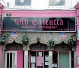
Created at the birth of European printing to simulate the writing of the scribes who had previously copied books by hand, Blackletter, as a family, has always had to contend with a split personality in terms of image and perception. On the one hand, Old English is redolent of a gentle medievalism – the wandering minstrel in search of his next pint of mead, the cloistered monk patiently illuminating his manuscript. For 18th century printers it still served a valid function, in the absence of anything better, as a ‘black’, a bold face. But Victorian display letters and then the arrival of the type family, with its range of weights, cast Old English to the outer fringes. Blackletter’s German cousins, led by the angular, aggressive Fraktur, persisted as text faces until World War II, becoming Hitler’s typefaces of choice. Lying outside the bounds of polite taste, they became the perfect statement of intent for 1980s heavy metal bands, keen to co-opt the jagged, uncompromising letterforms to an image of life lived on the edge. By the same token, Blackletter also worked well for tattoos, far more so than, say, Frutiger Roman.
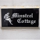
Old English, despite its stylistically indefensible, virtually unreadable capitals, retains a surprising popularity in the UK, but its use has been almost entirely vernacular. Unlike most fonts, it has survived through being used by people who are not designers. Any establishment styling itself ‘Ye Olde’ always makes a beeline for Old English, and house name plates in rural districts are another stronghold. For the non-designer faced with choosing lettering, Old English has the reassurance of extreme familiarity combined with considerable visual presence – it looks important, even sophisticated.
But how do you drag Blackletter from its traditional heartlands and make it fashionable again? Adoption by a new generation of users who never knew, or have no interest in, its previous connections, is how. Although skateboarders see themselves, not entirely without justification, as misunderstood devotees on the fringes of society, the pursuit, nevertheless, represents big business, which is inevitably both heavily branded and merchandised. As well as the boards themselves, there are T-shirts, footwear, baseball caps, hoodies, beanies and jewellery, all demanding supporting graphics. In this fiercely competitive commercial market, Blackletter has been a star performer. The letterforms are already so convoluted and tortured that a little stylistic battering and distressing does them no harm whatsoever, and their Gothic overtones give them the required air of edgy, apocalyptic otherness, the perfect typographical accompaniment as you hang, just you and your skateboard, momentarily suspended in mid-air above a giant vert ramp, before beginning the dizzying downward plunge, the Ramones’ Blitzkrieg Bop hammering from your iPod.
Skateboarding and music go hand in hand, but this time Blackletter has escaped from the realm of Spinal Tap. American guitar band Good Charlotte used it for its logo, and the centripetal force of fashion, which dictates that any style that is successful on the outer edges will inevitably migrate – usually in diluted form – to the centre, has seen Blackletter creep via hip-hop into the mainstream, appearing in the service of chart acts Gwen Stefani and R’n’B belter Anastacia.
As evidence that it has reached the level of cultural signifier (or of knee-jerk creative thinking, depending on your point of view), a visit to the shop of my nearest football team revealed that Blackletter had even filtered down into the merchandising of the Coca-Cola Championship. It was used in a sweatshirt design clearly aimed at the football supporter who sees himself as just that bit different to the replica-shirted herd around him, the lettering impinging dangerously on the hitherto sacrosanct territory of the club badge. ‘Look refreshingly, disturbingly uncompromising, while still being one of the crowd’ seems to be the message here.
Love it or hate it, what Blackletter undeniably possesses is style. Have that, whatever shape it takes, and the laws of fashion dictate that if you stand still for long enough, the world will always make its way back. Maybe there’s a lesson here for all of us.
Simon Loxley is editor of Ultrabold, the forthcoming journal of the St Bride Library, and author of Type: The Secret History of Letters
Read this next

-
Post a comment


