Oven proofs
The younger generation wants to cook, but they don’t want a boring step-by-step guide. Sara Manuelli looks at a new breed of funky titles that are spicing up Delia Smith’s traditional recipe
With the rise of celebrity chefs, super-glamorous restaurants and cosmopolitan recipes, food has become something more than just nutrition over the past few years. Having dispensed with macaroni in tins, Britain has learnt how to fill its ciabatta with sun-dried tomatoes and to distinguish Le Caprice from, well… Caprice.
The Naked Chef, Ready Steady Cook and the new look Delia Smith on TV have all led to the promotion of a foodie hedonism, even beyond the chattering classes.
But if you believe in the mantra “you are what you eat”, you might need to consider changing it to “you are what you read”, as the impressive list of cookery titles on bookstores’ shelves today shows something more than just a collection of recipes. How you package a bunch of recipes into a particular ethos and promote it to a hungry public is, ultimately, a design issue.
Cookery books come in three broad categories. The mainstream kind is still conceived with the simple aim to teach you how to cook. Delia Smith’s best-selling figures prove that Britain still needs to learn how to cook an egg. For these titles, design shows no surprises, as illustrations record the step-by-step procedures and immaculate still-life photographs pinpoint the final effect. Some books, like Nigella Lawson’s How to Eat, show even more restraint and use hardly any images. Working space for designers appears to be limited.
A second category of books is the restaurant book, spearheaded by the River Café Cookbook in 1995 and followed by titles such as The Ivy, Le Caprice and the Mirabelle cookbook. These publications bank on the fame of celebrity restaurants or chefs and offer a tantalising glimpse into the life of the people who really know how to do lunch. As a result, the design usually aims to reflect the original mood and feel of the restaurant, which can be either Hello- oriented or idyllically Italian.
But it is arguably the third category that gives food for thought. Comprised of the writings by a new generation of cooks like Kevin Gould and John Torode, these books approach food with irony and without the old fashioned reverence. They attempt to demystify gastronomic connoisseurship and make it democratic. Design in this mode follows suit, using retro type, bold colours and playful references. Pointing to the food directly is not necessarily the main priority, but captivating a younger audience is. So like magazines, these books promote a set of values that go beyond learning to cook.
“Linking a lifestyle to a book is a very natural thing to do,” says Gavin Pretor-Pinney, art director for the Kyle Cathie cooking title Soup, “because getting into cooking is a lifestyle choice for most young people today. Most busy professionals will eat out or buy convenience food, but if you decide to embrace it creatively, it’s a lifestyle.” He credits the proliferation of cookbooks to a vanished social practice. “I think it’s also because of the breakdown of transmission of recipes between grandmothers, mothers and daughters, it just doesn’t happen anymore,” he says.
His book Soup shows how to transform an old fashioned formula into a slick package. Soup as a marketing concept cashes in on the idea of a wholesome healthy snack, while transporting us back to the simplicity of our liquid infant meals. Soup Works, the London chain founded in 1998, sells imaginative variations on the soothing broth in modernist designer bars. The book, written by founders Nick Sandler and Johnny Acton, reflects the reinvention of soup as a “zeitgeist ingredient” and still manages to convince foodies with the substance of its recipes. With photographs by Georgia Glynn Smith, it tours the global and the gastronomic in search of versatile ingredients. Via cropped images, Soup transforms the cookbook into a clean, graphic statement.
“If you look at old-style books for soups they are often apologetic about how the soup looks,” says Pretor-Pinney. “They need to jazz it up, with chopsticks and maybe some Japanese calligraphy in the background. None of that happens in Soup. The only colour comes from the soup itself. There are no props, only white bowls.” A cut-out spiral on the cover rather than the classic wooden bowl, crackling fire in the background sums up a fresh approach.
The title Relax it’s only food also rides the informal food wave. Written by Australian cook John Torode, ex-Conran protégé, TV chef and restaurant owner, it aims to captivate readers with “the joys of eating with friends and family”.
Designed by Lawrence Morton, now art director of London Evening Standard ES magazine, it has a light-hearted feel which reflects Torode’s not too serious attitude to food. Morton was a newcomer to cookery books, so the look reflects a populist approach usually found in magazines. “I was editing Joyce, a fashion magazine published in Hong Kong,” he explains. “And I thought a book would be a great thing to explore. The Torode book is very much connected to the magazine from a creative standpoint.”
With its 1950s American bold colour squares and slab serif Giza typeface, the book attempts a different take on designing food. Divided into chapters that range from spicy to classic, it plays on how colour charts symbolise different moods such as “chocolate and denim for comfort, gold and Wedgwood blue for posh”. It combines pictures of scrumptious- looking food with the unpolished quality of Bruce Ingam’s illustrations, transforming recipes for Thai curry into an entertaining read.
“There is room for a divergence of styles [within cookery books],” says Mary Evans, creative director and founding member of Quadrille Publishing. “People want it. The market is so diversified and people are now much more aware of design. With all our books we tend to push the boundaries, we are aware of what’s happening in magazines and we try to use individual designers and people who haven’t done cookery books before so they can bring something new.”
With the publishing world’s constant search for the next new thing, coming up with a way to represent the most elemental of human necessities can prove exhausting. “I think we have reached a point where someone needs to come up with something new,” says Morton. “Things like drop focus photographs have reached the end of their natural life.” He believes that the restaurant book may well have had its day. “Le Caprice is the ultimate restaurant book, the last of that breed,” he says. Which begs the question: where do you go next?
London design consultancy Unlimited, responsible for designing The Ivy and Le Caprice cookbooks, seems unfazed by the predicted death of the restaurant book. Both of these titles, published by Hodder & Stoughton and linked to the capital’s most glamorous gastronomic institutions, have been saluted as a revolutionary take on designing food as a lifestyle. With shots of calf liver, pictures of chaos reigning in the kitchen and text by AA Gill, this is definitely not Delia.
“Many cookbooks were aesthetically hopeless until the River Café came along and we wanted to take it further,” says Suzi Godson, partner at Unlimited. “When we started to illustrate The Ivy, we tried to look at food in a different way. We lived in the restaurant for three weeks and shot [pictures] as we found things, since we were not allowed to actually photograph the restaurant.” The result is, according to Godson, a departure from traditional cookery books. “[It’s] going away from just the pretty finished picture. It’s the polar opposite of how to boil an egg,” she says.
“Le Caprice was very different,” continues Godson. “We had to promote old world glamour, a mystique that nobody really understands. We try to pick up on that and portray an ideal place, without really showing it.” Considering the strict “no paparazzi” policy that the owners Jeremy King and Chris Corbin operate, this is the closest a common mortal will ever come to Madonna’s morsels.
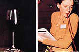
The changes in food values in this country have created opportunities for designers. Unlimited seems to be exploiting this potential. Testing the waters further, it has approached a traditionally elitist subject like wine and designed the Sensational Liquid, by Malcolm Gluck. His guide to testing wine is narrated by a storyboard of photographs by Robin Grierson, each detailing the sensory experience of drinking. Again, the book is very different from conventional old school Chablis charts.
Arguably, the way forward could be shown by Kevin Gould’s first cookery book, Dishy, due out this April, by Hodder & Stoughton. Gould is renowned in party circles for catering the ultimate fashion bash with a few simple good ingredients. He is the owner of delicatessen Joy, the Aveda café Love and writes regularly for Food Illustrated, Elle Decor and the Daily Express. For this book he wrote 96 recipes ranging from Egyptian Bread soup to Date and Banana Cream pud, illustrated by design consultancy Michael Nash & Associates and photographed by Annabel Elston, Jason Lowe, Derek Hillier and Joanna Waller. Keeping the promise of its title, this book shows that food can be sexy. Fashionable fuchsias, picture collages and snippets of stories introduce recipes to the reader in a way which is both visually engaging and helpful for producing good food.
“The making of the recipes reflects Kevin,” says Anthony Michael, partner at Michael Nash & Associates. “The book needed to show all the things he represents and make that information [about the recipe] available. Many books rely on a grid. They offer just some ingredients and a formula for executing it. In this way, the spirit of the recipe gets flattened. While what Kevin does when he caters is to reflect the personality of the client with the food. Its all very ironic, he doesn’t take it too seriously, it’s an enjoyment.” The recipes are structured as a school flowchart and are a clever way to outline the step-by-step procedure. You can follow the flow or branch out and create a slightly different dish.
In the making, Gould always added something to a dish, whether it was a photograph, a story, or a visual. “Kevin would describe the personality of the dish, of the people eating it and where it would be eaten,” says Michael. “That’s what made it such hard work. Each dish was like a project, like a record sleeve.”
“Kevin felt there was a whole audience out there comprised of a younger market,” adds David Hetner, designer at Michael Nash. “But cookery books, even the Naked Chef one, are still very formulaic in terms of content and illustration. In contrast, we wanted to give each dish a personality. A lot of books have food pictures which are almost like tests. If the finished product doesn’t look the way it’s photographed you feel like you have failed the test, even if it tastes delicious. With the flowchart you can follow the instructions but also branch out in any direction. It allows you to be really flexible.”
With new cookery books targeting niches, (Unlimited is designing a cookbook for children out in April), you might ask how long can it will be before the market is saturated. As Pretor-Pinney points out: “You don’t need to know how to drizzle your rocket with Tuscan extra-virgin olive oil. These books are a luxury, a form of entertainment. As such, they can be bought either as a badge, or because you need to come up with a new recipe.”
Read this next

-
Post a comment


