Blonde Bombshell shock
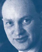
Hugh Pearman pays tribute to pioneering graphic designer Abram Games
I was first bowled over by the work of Abram Games years ago when I got intrigued by the notion of a graphic designer proselytising for modern architecture at the height of World War II. Using the late-1930s buildings of Berthold Lubetkin, Games suggested a radical world of apartment blocks and health centres emerging from the rubble of bombed slums.
This notion of transformation permeated much of his work, as you’ll find if you visit an exhibition of Games’ work in the Ben Uri gallery in London’s St John’s Wood, put together by the Design Museum. The wartime ones, of course, are the most evocative. ‘Your Britain – Fight For It Now’ as a slogan certainly packs more punch than the average Guinness ad (though he did those, too). One of his ‘Grow Your Own Food’ posters, showing gardening implements turning into knives and forks on a table, is one of the cleverest pieces of graphic work I have seen. No computer manipulation then, of course: Games just worked with pencil and airbrush.
Games (1914-1996) was a rebel. He hated St Martin’s School of Art. He was fired from his first commercial art studio in 1936 on account of his ‘rebellious and undisciplined attitude’. With no work to fall back on, Games nonetheless decided from that point on that he would be independent, serving only his own clients. And he took no nonsense from them. Having refined his design down from around 30 rough ideas, he only ever presented clients with one. If they didn’t like it, he would gently suggest they took their business elsewhere. Few did.
Games’ mission was to modernise the art of the poster. But how do you start a career from nothing in this uncompromising way? Games produced ‘what if?’ designs, such as a simple poster for Air Mail. Combining words and image, the ‘A’ is the triangular, upturned flap of an envelope, the ‘M’ its lower half. It was a high-impact device guaranteed to grab people’s attention. Or as he put it: ‘When the name is closely associated with the product it does its job in the swiftest and most direct way.’
The war made his reputation. He was a conscript in the army and ended up producing 100 posters (how typical of Games, that it should be exactly 100) for the War Office. He did propaganda, but it was not necessarily the sort his masters wanted. Winston Churchill hated his vision of modern architecture, not just because Games’ work showed a notoriously Socialist borough, but because he felt it raised expectations too high. It was, said Churchill, ‘Exaggerated and distorted propaganda. The soldiers know their homes are not like that.’ Games wanted better homes. That, in his view, was one of the things the soldiers should be fighting for.
Then there was the affair of the Blonde Bombshell. Tasked with producing a women’s recruitment poster for the Auxiliary Territorial Service or ATS, Games drew a uniformed figure with film-star looks. He knew the ATS was seen as dowdy and old-fashioned. The poster was a huge success, reproduced everywhere. But once again, the Government felt it was giving out the wrong sort of message. This time it was minister Ernest Bevin who pulled the poster.
If that was glamour, Games could also do sinister. His poster ‘He wanted to look inside’, a surreal juxtaposition of coffin, hands and mechanical equipment, warned of the dangers for children of playing with weapons. If you think today’s drink-driving campaigns are hard-hitting, this wartime stuff hit harder.
Though Games is famous for his posters – and his logos, such as for the Festival of Britain, the first televised symbol of the BBC, or later the Queen’s Award for Industry – there is also his product design. Working with Stanley Godsell, an art student who showed him how to use a lathe, he designed coffee-makers, vacuum cleaners, duplicating machines, even tyre treads for Dunlop.
What remain seared into the memory, however, is those posters. They were direct, unpatronising, witty, often subtle. They have never been bettered. Games’ secret – apart from an extraordinary self-belief and self-discipline – was to refine everything down to essentials. For a ‘Freedom from Hunger’ poster he did for the United Nations in 1960, he went through 200 drawings before arriving at the solution. His often-quoted saying is well-worth taking to heart. ‘The harder I work, the simpler it looks’.
Abram Games: Maximum Meaning, Minimum Means is at the Ben Uri Gallery until 27 February
Please e-mail comments for publication in the Letters section to lyndark@centaur.co.uk
Read this next

-
Post a comment


