In the raw
Untreated papers with tactile finishes are flavour of the month in the paper trade, as clients cultivate a rougher aesthetic.
‘I love this invitation,’ said a non-design friend of mine at a recent event. ‘I just want to keep stroking it.’ Paper is much more than just a means to an end. A fundamental aspect of every piece of print design – be it a swanky invitation, a corporate report, a catalogue or even packaging – paper engages the senses visually and physically.
Developments in paper manufacturing and print techniques now mean that designers – if they’re looking for an interesting approach – have an enormous choice of special effects to employ, from budget to bank-breaking.
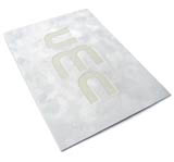
Some are making the most of it. The invitation in question was created by Cog Design. White-on-white, the front of the 400gsm board was covered in white imitation suede, on to which white letters were then foil-blocked. The result was a deceptively simple design that was deliciously tactile and had a pearlescent sheen.
Robert Horne Group national design support manager Natasha Hornsey says there’s a definite trend that’s seeing designers move away from obvious paper solutions.
‘A few years ago it was metallic and textured stock,’ she says, ‘but today there’s a demand for more urban stock, such as Dutch Grey Board, which is most commonly used as the back cover on spiral-bound notebooks.’
Rawer papers seem to be in fashion. Petroleum giant Shell chose embossed Dutch Grey Board as the cover for its environmental report and the Youth Justice Trust Annual Report by Love Creative saw an unusual combination of Beer Mat Board interleaved with different primary colours of Kaskad.
According to Hornsey, the trend for simplicity extends to print techniques. ‘Brochure covers, annual report covers and packaging projects are going down the less is more route,’ she says.
The Eden Project’s first report is a case in point. Designed by Gendall Design in Falmouth, it achieves interesting effects on an eco-friendly paper. Printed on Retreeve Smooth Brilliant White 280gsm, the cover is pale and monochromatic. It reproduces the written welcome that greets visitors to Eden, with type debossed on the front and embossed on the back.
Going one step closer to nature, London group Direct Design used Eco Hots Pure Pulp for the cover of the catalogue it produced for Through the Surface, an exhibition of work by textile artists from the UK and Japan.
This Curtis product strips paper back to its rawest state by using four raw pulps – cotton, native, virgin and waste. Curtis doesn’t issue print guarantees, but the catalogue shows the impact of embossing and clear foil blocking on a pulp product.
‘The catalogue is designed to look and feel like a workbook, with the various paper stocks and the wire-bound finish,’ according to Direct Design director Gerry Diebel.
‘The paper gave the book the tactile quality the subject matter demands,’ he says.
Arjo Wiggins operational marketing manager Simon Shenton says the theme of ‘engaging the senses’ is very fashionable. He’s seen a growth in demand for papers that have a tactile component, such as the company’s Wet Touch range, a paper ‘that feels damp and floppy’.
McNaughton’s Jim Whittington, who is national sales manager for the Connect team that deals with designers, agrees. He says designers are ‘playing with wet-feel papers’. He also sees a trend of using varnish on uncoated stock, which he says is ‘not strictly the done deal but it really can work’.
A promotional postcard for Manchester graphic design group Lulu Butterfly is one example of a successful use of uncoated paper with a combination of varnish techniques.
Created by graphic designer Yoko Washimine, it uses screen printing on Metaphor White 310gsm from the Curtis Eco range. A cluster of dots and images are animated by the use of varnish, and the visual effect changes as the postcard is moved in the light.
‘I didn’t want the result to look artificial; [I wanted] something made to feel touchy and warm. I also wanted to have a paper that resembles raw material,’ explains Washimine.
Some designers are prepared to search high and low for the effect they need, as when Webb & Webb designed the catalogue for a 50-year retrospective exhibition of David Gentleman’s watercolours. ‘We wanted a paper that had the feel of a watercolour paper,’ says Webb & Webb founder Brian Webb, ‘but we were using eight colours on the cover, four solid colours and a four-colour process, and on some uncoated papers the colour would become very flat.’
The group found the stock it needed at Monadnock Paper Mills in Boston in the US. ‘Its products are made using very slow running paper machines. It’s astronomically expensive, but it came up with beautifully even, really intense colours,’ explains Webb.
It might take time, but getting the right stock and choosing special effects judiciously can make for a piece of print that moves beyond the ordinary.
-
Post a comment


