Robson Dowry uncorks wine look
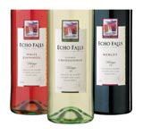
Robson Dowry has created the branding and packaging for Echo Falls, a Californian wine range from drinks group Matthew Clark that launches next week.
The brand is being positioned as an ‘entry level’ mainstream mass-market product, at the crucial ‘under £4 price point’ that accounts for 44 per cent of all UK wine sales, according to Matthew Clark senior brand manager Jacqui Wilson-Smith.
The consultancy came up with the name for the brand – in conjunction with the client team – as well as designing the labelling and all point-of-sale material.
‘We’ve aimed to strike a balance between contemporary looks and classic wine values,’ says Robson Dowry joint managing director and design director Andy Sanders. ‘The inspiration for the name is the magnificent waterfalls in the Yosemite National Park, close to Madera in California, where the wine is made.’
Sanders says conveying a sense of ‘authenticity’ is a key requirement in designing for wine brands at present, which is why reference is made on the label to Mission Bell, the Echo Falls winery. ‘It was important to create a believable provenance,’ he adds.
Wilson-Smith envisages the brand being bought at supermarkets and off-licences, mainly by women and ‘brought home where it’s also consumed by men’. As a result, the design needed to have a cross-gender appeal so that men wouldn’t find it ‘too girly’, she says.
The consultancy won the project in May, having worked on a number of previous briefs for Matthew Clark.
Led by Sanders, the design team included senior designer Richard Barkaway and designers Guy Patterson and Christina Bergmann.
-
Post a comment


