Signals of overcrowding
Regular commuter Clive Walker seems to be able to complete his train journey each day without information overload, but is this the case for most passengers?
Network Rail, the not-for-profit successor to Railtrack, got the green light last week, prompting calls from train passenger watchdogs for improvements to station signage and limits on branding.
Since privatisation, 25 different rail operators have blitzed stations with branding, which, says the Midlands Rail Passengers Committee, causes customer confusion and serves little purpose.
Recent cases of mass-branding include Virgin Trains’ revamp of Manchester Piccadilly by Fitch London, which involved bringing all station communication, including signage, wayfinding systems and computer-badging, in line with Virgin’s familiar red and silver palette. The operator is now preparing to rebrand the 113 other stations its trains pass through.
But what role should branding play in the concourse environment? Do designers and operators need to achieve a balance between helping customers navigate their way round concourses and delivering brand and marketing messages? And what are the challenges faced by operators in branding their offer in a crowded, often run-down environment that they don’t own and can’t control?
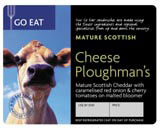
A spokesman for GNER, which operates the London to Scotland East Coast Main Line, says the operator has opted for clarity and runs only one consistent campaign across its 12 stations at any given time. The most recent example is the Go Eat marketing push for its on-board food service devised by Elmwood (pictured above right).
‘Our strategy is to keep messages consistent
and simple across all sites because there is a potential for a mish-mash of information to create confusion. We want customers to go away with a single message in mind, which, at the same time, doesn’t distract from other information such as engineering alerts,’ according to a GNER spokesman.
He adds, ‘The philosophy extends on board trains. Interiors are kept neutral and we do not allow branding on the side of cars, unlike other operators which see rolling stock as a kind of mobile advertising space.’
A characteristic of the Go Eat brand is the distinctive fork-shaped visual that ensures the brand is unmistakably associated with drinks and snacks. Similarly, Midland Mainline has adopted a leaping stag as a way of distinguishing its identity among the clutter of text-heavy brands.
Elmwood managing director Jayne Barrett sees increased use of visual reference points as the answer to the problem of cluttered signage and branding.
‘Designers should steer train companies towards graphics rather than words. We recognise Midland Mainline because of its leaping stag logo. The industry can learn a lot from the hospitality sector, which uses familiar symbols like a cup and saucer to alert drivers to a nearby motorway service station,’ says Barrett.
‘Branding can actually help wayfinding. A case in point is Heathrow Express at Paddington where, despite a sea of branding and signage, it is easy to identity the operator’s platform because distinctive graphics act like a beacon.’
Branded signage is especially important in situations such as London St Pancras where rail operators share stations and are vying for customer attention among a sea of marketing messages.
Former British Rail executive design manager Tony Howard, now Roundel project director, argues that station branding is still an unknown quantity for most consumers accustomed to a relatively brand-free state-run network.
‘There’s a hierarchy to station signage and messaging with wayfinding at the top. Obviously, the train operators would like to see their branding higher up the pecking order. Train brands need to stand apart from things like station retail offerings and there needs to be respect among operators for each other’s visual identity,’ says Howard.
‘Branding should not be a battle ground because the network cannot support such activity. A lesson can be learned from airports operator BAA, which allows branding on ticket desks, but elsewhere it is strictly controlled,’ he adds.
Roundel is currently developing signage for the new St Pancras Channel Tunnel rail link. To help make journeys less stressful, the consultancy is proposing a new generation of timetables and other areas of micro-branding where destinations are listed alphabetically along with the operator’s identity. Each operator will also have a dedicated platform gate for branding. Otherwise corporate communication will be limited.
In a move to foster greater co-operation among train companies, Howard suggests operators sign up to a set of branding guidelines, controlled by the Strategic Rail Authority, which would dictate presentation and volumes of customer information and marketing activity.
Significantly the SRA insists that tight controls on, for example, the number of concourse poster sites, are already in place to avoid customer confusion and it has no plans to alter the status quo.
This stance is likely to infuriate pressure groups such as the Midlands Rail Passengers Committee, which is pressing the SRA to impose a standard marketing template for all signage and branding across the network.
‘The SRA is looking at limiting the number of train companies using any major station in the interests of efficiency and clarity. In cases where the operator has no direct competition on a particular line it makes very little sense to have any branding at all,’ says Midlands Rail Passengers Committee secretary Paul Fullwood.
Ironically, the official launch of Network Rail foists a further brand on an already congested marketplace. While the body must first tackle the thorny issue of rail safety, passenger pressure groups and operators alike will be anxious to see if it’s full steam ahead or the end of the line for station branding.
Read this next

-
Post a comment


