Craig Oldham “gets back to what Rough Trade is all about” with new book publisher
Craig Oldham is behind the designs for a new publishing venture from record label and indie record shop group Rough Trade, creating pamphlet-like designs that deliberately fly in the face of traditional publishing conventions.

Rough Trade Books describes itself as “bringing the same original spirit and radical direction” of the record label to the world of book publishing, and like the label’s first releases, once costs are covered, the sales will be split 50/50 between Rough Trade and the books’ authors.
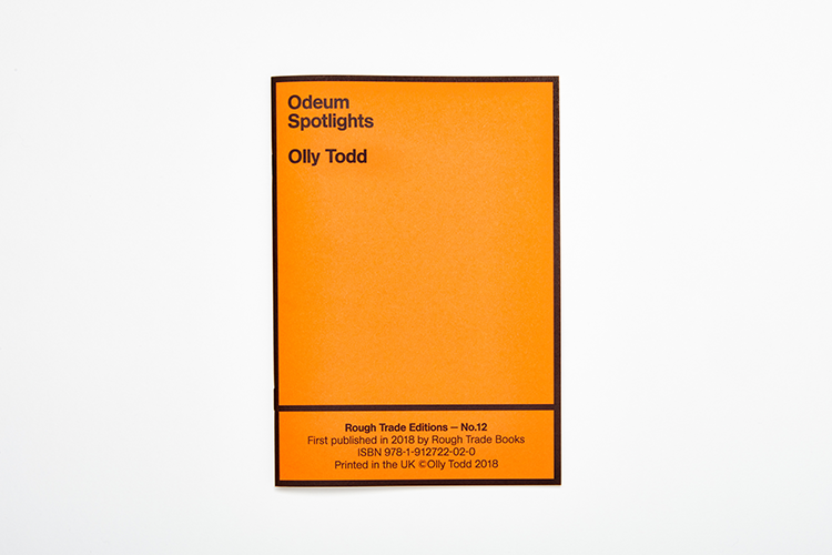
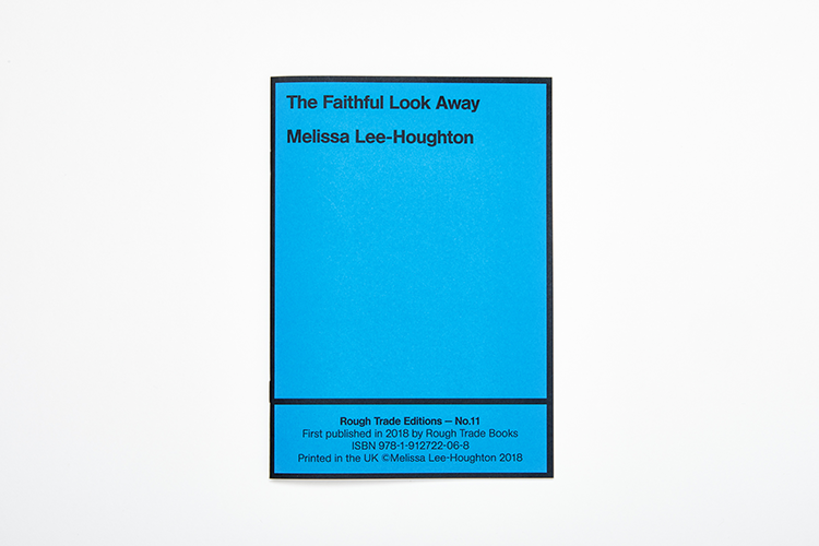
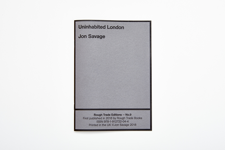
The first releases from the publisher are 12, small, pamphlet-like books under the banner Rough Trade Editions from different writers, poets, musicians, photographers, illustrators and thinkers “producing work relating to their relationship with counter-culture,” says Rough Trade.
Oldham had initially met Rough Trade Books co-founder Nina Hervé when his own book, In Loving Memory of Work, was stocked in the store and an exhibition around it was held in Rough Trade East.
Hervé had approached Rough Trade’s founders Geoff Travis and Jeanette Lee about the idea of a publishing company. “Geoff and Jeanette loved the Beat Poets, the City Lights bookstore in San Francisco, all the political, urgent pamphleteering stuff,” says Oldham. “They wanted [the publishing company] to get back to what Rough Trade was all about.”

The Editions series of publications will come out every three months in a tranche of between six and 12 books. Other larger books will also be published around those throughout the year. “It’s a lot of fucking work,” says Oldham.
“We didn’t like the way that, with a lot of new publishing companies, there’s these long, dormant dead zones between new books being published. We wanted to keep it relevant and moving, and be able to react to topics and political events.”


The designs for the Editions covers use a standard grid format and typography based on Oldham’s explorations of the Rough Trade catalogue.
He saw that the label had often used things like Letraset and stamps to create lettering, so opted for similar techniques, which created a weathered, distressed look over time through the nature of the process.
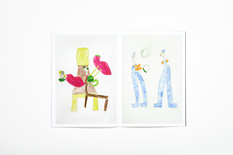
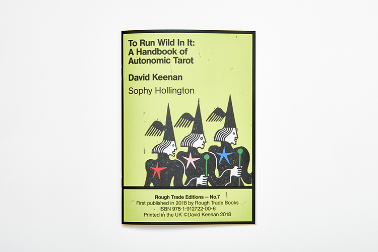
Different publications in the series are demarcated throughout using a range of bright colours across the covers. Where the books are created by or with illustrators (such as David Keenan and Sophy Hollington’s gorgeous tarot-based volume), imagery appears on the cover within the grid.
For Oldham, it was important to break the rules: as such, the ISBN number – usually hidden or relegated to the back of a book – sits on the front with the author’s name, which appears twice.


“It’s been great how each one is so different – everyone had complete autonomy on what they’ve produced, and we’ve tried to facilitate that,” he says. “It’s a collaboration with people who share the same political or social beliefs. I really like exposing the architecture of publishing, and there are usually so many rules that we wanted to have our own take on it.
“The biggest challenge was making a decision [about the design format.] You could make a really strong argument for saying we just do a bespoke thing for each and make it relevant for the content of each book, but the other side is that they should be uniform. I didn’t want to push my interpretation and taste on the reader, so we went down the route of a utilitarian platform.”
The main thrust of the design idea for the Editions was to create a sense of “urgency”. Oldham’s initial plan was to create all the books in a uniform black and white – affectionately dubbed “fag packets” by Hervé. “I’m a purist, me, and I liked how in black and white they looked like dummy preparatory books,” says Oldham, though he later acquiesced and moved into colour.


The Rough Trade Books logo was created in collaboration with Leo Field, again using Letraset and creating a stamp for the typographic mark, which sits within various configurations of a simple book icon. “We’ve got a million versions of it – lying on its side, standing up – so the logo itself feels like a physical book,” says Oldham. “Our logo will disintegrate, but we’ll see it in a million iterations.” Bookmarks were also created, using a die-cut version of the logo.
Rough Trade Books will be sold at Rough Trade stores, online, as part of a subscription service and in various other book stores.


-
Post a comment


