“Where there was certainty, there is doubt”: designers on lockdown messaging
The government’s communications around easing lockdown measures has attracted criticism for a lack of clarification. Designers give us their verdict.
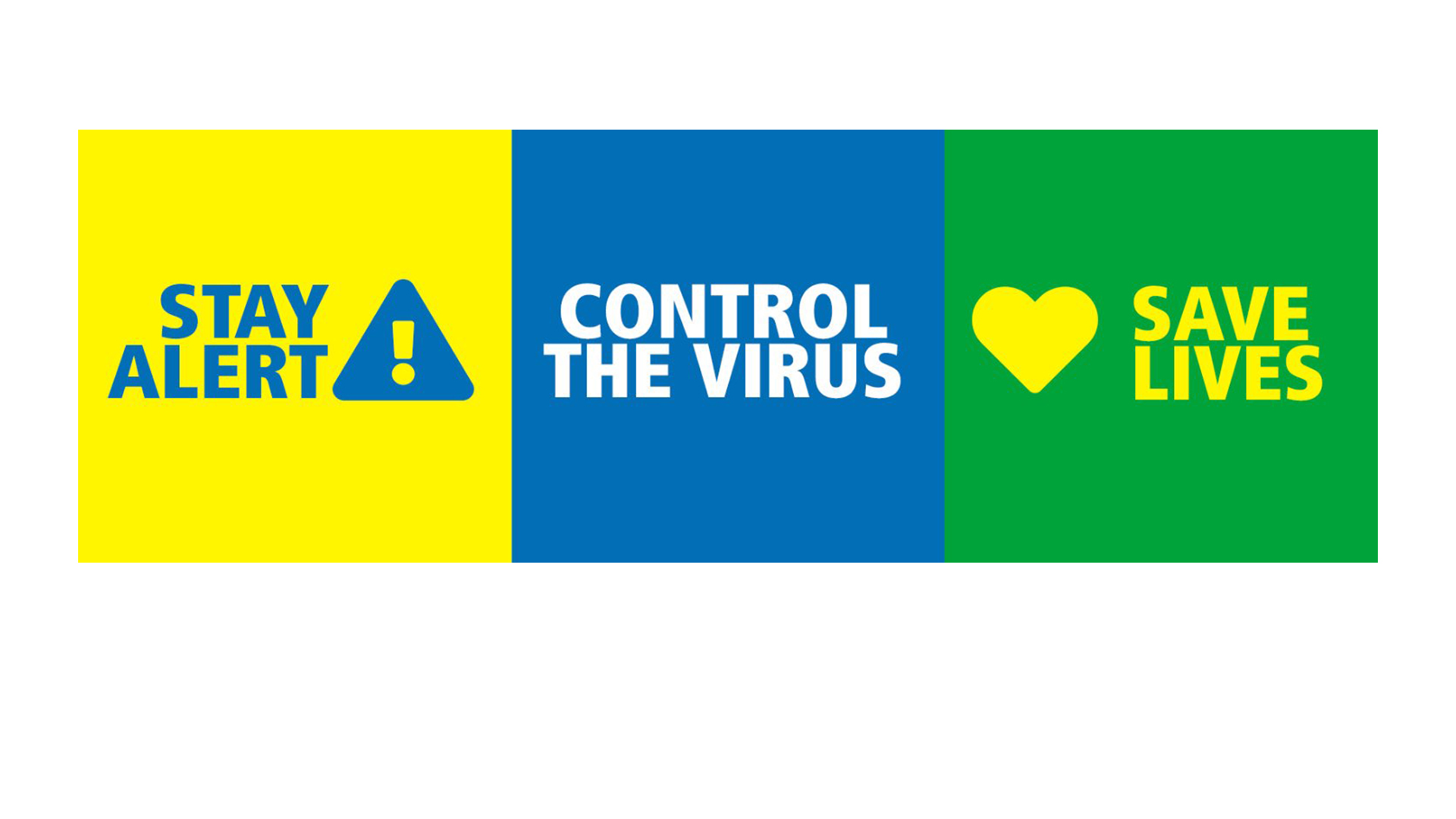
On 10 May, Boris Johnson revealed details around an easing of lockdown after weeks of socially-distancing measures. There were graphs to show the possible easing steps, as well as a coloured scale which indicates the presence of coronavirus in the UK. There was also a new slogan. Instead of ‘Stay Home’, the government is now advising the country to ‘Stay Alert’.

However, the communications campaign has been criticised over a lack of clarification, and on Monday Johnson had to clarify what he meant by the new slogan. We talk to designers about what they think of the communications, from the government’s graphic design to its slogans, and the role design could play in clarifying these measures.
“It doesn’t seem like the right time to change the message”

Design studio Lantern’s founder Ryan Tym, highlights two problems with the government’s new communications.
He says: “There are two issues with the government’s new message; its clarity and its timing. The fact that three out of the four nations within the UK have chosen not to adopt the ‘Stay Alert’ slogan highlights its lack of clarity at a time when people need it most. ‘Stay at Home’ became prolific through its simplicity. Understanding it was easy. Given that we remain in Level 4 of the government’s own new COVID-19 alert system – and that the advice is still for the vast majority of people to stay home wherever possible – it doesn’t seem like the right time to change the message.
“The significance of moving into Level 3 of the alert system would have created a compelling reason for changing the message, and likely drawn more support and understanding from the nations and the public. There’s no doubt that at some point, the message needs to change, as we make the slow transition out of lockdown and the advice becomes more varied, but perhaps ‘Stay Apart’ rather than ‘Stay Alert’ would have been a clearer approach.”
“A lot of confusion and a side of comedy”
In comparison to the previous messaging’s clarity, Anagram’s managing partner Mark Whiteway and creative partner Matt Partis say the new messaging fails to “unite” the UK.
They say: “These are small changes that served up a lot of confusion and a side of comedy. The thing with communication, is it needs to be clear and relevant to everyone it’s aimed at. With this campaign against Covid-19 (in Boris’s words), that means every single person in this country. Now that’s tricky. Without going deep into policy, the ‘Stay Home’ message worked. It was underpinned by two strong messages, Protect The NHS and Save Lives. This united a huge amount of people from different backgrounds, political views, and areas of the UK. We knew what the most important thing was that we could all do to make a difference – even if some of the other details were contradicting. But ‘Stay Alert’? How do you really tackle a virus with vigilance? Hence the heavy mocking it’s received. The new message doesn’t work.
“But the bigger issue here is the constant political need to slogan everything. Like they’re marking their territory with the use of words. Just give people a message that they get, makes sense, and want to use. Stay At Home everyone.”
“Where there was certainty, there is doubt”

Lucienne Roberts, founder of LucienneRoberts+ and co-founder of GraphicDesign&, highlights the graphics of the new campaign, suggesting they are a missed opportunity for clarity.
She says: “The last two years saw GraphicDesign& originate exhibitions and produce books about health (Can Graphic Design Save Your Life?) and politics (Hope to Nope: Graphics and Politics 2008–18 and The Other Side). In the COVID-19 pandemic, these two worlds collide.
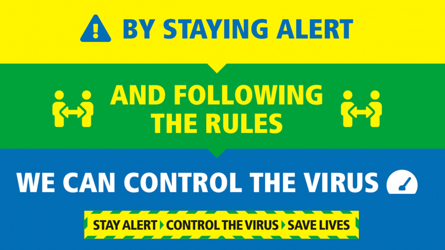
“Whether employed to warn or impart information, graphic design is clearly part of the front-line response to infectious disease, making life-saving messages accessible to all. Way back in March, media experts expressed concern that the UK government hadn’t introduced a nationwide information campaign. Then along came Stay Home > Protect the NHS > Save Lives with its chevrons and colours synonymous with warning, we breathed a collective sigh of relief.
“But, as of Sunday, the messaging has changed. Where there was certainty, there is doubt. ‘Stay Home’ is a clear instruction, ‘Stay Alert’ requires interpretation. Red means STOP, Green means GO. And bizarrely, a lyric (c/o The Clash) has popped into my head.”

“A really, really bad idea”
This is echoed by branding consultancy Brandpie’s global CEO, Dave Allen, who points out how the visuals confuse people’s associations with colour.
“The biggest mistake though for me is the shift from the use of red to green as the primary colour on the border of the statement. This is a really, really bad idea. Stating the obvious, green means go, and they are not trying to communicate that at all. They are trying to say proceed but proceed with caution and intelligence. A flashing amber at best.
“So, in summary they could have used some of the world’s best designers to help them communicate a simple message with real clarity and precision. If they had done this, then maybe the UK wouldn’t be as confused as it is today!”
“Convoluted”
We need to stay alert to stop the spread of the virus.#StayAlert pic.twitter.com/CsqtctnTSN
— UK Prime Minister (@10DowningStreet) May 12, 2020
On Monday, Boris Johnson had to clarify parts of the messaging, and this shows the weakness in the communications according to Tom Cornfoot, creative director and co-founder of A Studio of Our Own.
He says: “Within 24 hours of his original announcement, the Prime Minister has had to clarify that ‘staying alert, for the vast majority of people, means staying at home…’, so it’s not particularly shocking that so few of the people polled by YouGov understand what he’s going on about. With no effort to coordinate the messages coming from different parts of the Union, and different advice from every corner, what would be really surprising is if any two of the 30% of people who claim to know what the new slogan means understood it in the same way.
“I have tremendous sympathy for whoever is charged with converting the government’s increasingly complex communications into graphics. Watching the live statement on Sunday, there was something to do with a gauge and a quivering needle threatening to fly into the red danger zone, which for all the sense the Prime Minister made I can only assume was a measure of the collective blood pressure of millions of parents trying to home school and keep their livelihoods off the rocks at the same time. In terms of simplifying and trying to clarify what’s being said, the problem is not the graphics so much as the convoluted and confused message.”
People need “a clear understanding with a dose of optimism about the future”

What might the government do as it continues its lockdown campaign? We have seen a digital ‘toolkit’ which aims to encourage social distancing measures at work. Cornfoot believes that design thinking could have prompted communications with a more balanced and “clear understanding”.
He says: “The design challenge here is to convey simple, easy to grasp actions and a sense of the gravity of the situation, without being heavy-handed or trying to scare people into compliance. There’s a need to balance people’s desperation to get back to normality with the ongoing medical necessity of lockdown. Design thinking would have led us to look at the government’s communications from the point of view of some of the millions of people who are under immense pressure at the moment — people who need reassurance and a clear understanding of the current situation balanced with a dose of optimism about the future — to formulate a strategy for a clear, coordinated and consistent message. Being consistent really is essential as the government tries to maintain trust and keep people committed to staying at home when most people want nothing more than a return to some sense of normality.”
What do you think about the government’s latest communications strategy? Let us know in the comments below.


I was surprised to see nobody else had started the conversation maybe to avoid being controversial? The way I see it, the new message is about the economy not saving lives. Yet it is so ambiguous. I agree with most of the comments by the designers who you spoke to but I think on matters like this most of us are already united.
It seems as if we have returned to the herd immunity strategy but not in so many words. The real issue underlying all this and sorry, but this is NOT about design, is that we have one of the worst governments in years brought about by the need to deliver Brexit and the people who should have been at the helm are no longer there plus much of the civil service was pushed into sorting out the politics of Brexit which left us completely unprepared.
This virus has come at an inconvenient time for the government and no amount of graphic messaging will hide that fact.
The original messaging, though poorly designed was clear. As the government communications have become more complex, and not easy to get across in a simple slogan, the messages have become mixed and open to interpretation. It’s easy to criticise the design but most people simply want clear information.
Since the lockdown I’ve become a little obsessed with the Covid Crisis and I’ve been keeping a graphic diary on Instagram, with my own messages based on my thoughts and the daily news – over 260 posts to date.
https://www.instagram.com/coronavirus_graphics/
Boris Johnson has a reputation for being evasive and economical with the truth. This latest campaign is evasive and economical with the truth. What did you expect?