Rose blooms for China Heritage
Rose Design has created an identity for the Shanghai-based China Heritage Society which will roll out from this month.
The work comes as the organisation, established by the Chinese government, launches a campaign to ‘preserve and promote’ ancient structures in the country’s cities and ‘rediscover’ traditional crafts, according to Rose Design creative director Garry Blackburn.
CHS briefed the consultancy to develop an ‘up-to-date’ identity with ‘a heritage feel’, that would avoid the ‘Chinese takeaway view of [the country], with red and gold and dragons’, says Blackburn.
The marque also had to translate cleanly from Chinese into French and English, as the organisation obtains much of its financial support from overseas, he adds.
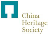
According to Blackburn, the logo, depicting a north-to-south-oriented walled compound, is inspired by traditional Chinese principles of Yin and Yang and Feng Shui and is juxtaposed with ‘classic, western typography’.
The marque’s gold and blue, which are auspicious colours in Chinese culture, represent progress and advancement, and authority respectively. ‘When used together, they symbolise good luck,’ Blackburn explains.
He says the identity, initially rolling out across stationery and promotional materials, will be applied to on-site signage and merchandise as restored temples and monuments become tourist attractions.
Rose Design won the work without a pitch in June.
Blackburn and fellow creative director Simon Elliott were creative leads on the project.

-
Post a comment


