New Identica horizon for Leumi
International branding group Identica has just unveiled a $3m (£2m) rebrand for Israel’s second largest bank, Bank Leumi.
The corporate identity revamp marks the bank’s first redesign for over 20 years and represents its greatest design investment in its century-old history.
Leumi appointed Identica in May to create a new identity, facias for its branch network and corporate literature. The project was instigated partly because the bank faces vastly increased competition from international rivals, such as Citibank, HSBC and ABN Amro that have launched in the region, as well as the growing importance of electronic banking.
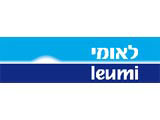
The new logo drops the word bank for the first time. It features the word Leumi, which means national, in both Hebrew and English, and is based on the bank’s original colour palette, using turquoise and a darker blue.
A sunrise device has been created to signify “the dawning of a new age”, according to Identica managing partner Michael Peters.
Identica has also developed preliminary endorsement branding for Leumi-owned subsidiaries and joint venture partners. It will turn its attention to environmental design and further material in the next six months.
Leumi was founded in London as one of the first independent Zionist banks during the 1890s. It established itself in the region as the Anglo Palestine Bank in 1902, some 46 years prior to the creation of the state of Israel.
Read this next

-
Post a comment


