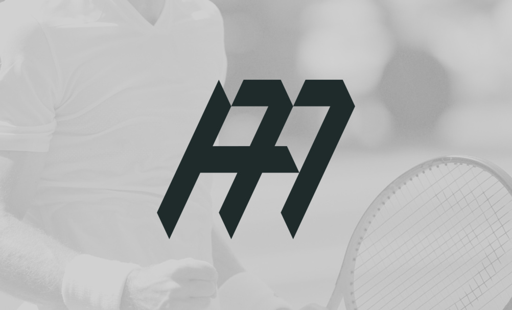
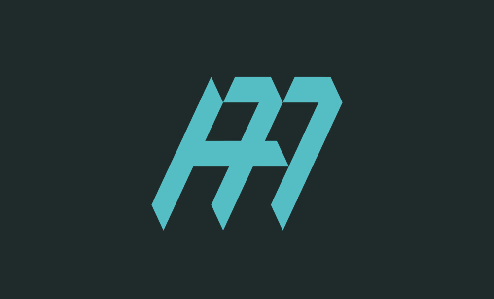
Andy Murray launches own logo
Aesop Agency has designed a personal identity for British tennis player Andy Murray, which will initially appear on his court bag and training T-shirts before rolling out across a range of branded apparel and accessories.

The consultancy has worked with Murray before, creating an identity for his management company Seventy Seven in April 2014, when it designed a mark based on interlocking 7s.
Murray’s personal identity will launch at the Australian Open on 19 January and he will use it on an upcoming collection of consumer goods.
The mark launches as Murray’s new apparel sponsor Under Armour is announced.
Under Armour takes over from Murray’s expired deal with Adidas and will take ownership of the identity, which is not tied to strict guidelines according to Aesop design director Dan Calderwood.
The identity can be read as the initials AM or as a single M and contains the numbers 77 – a reference to Murray winning the 2013 Wimbledon men’s singles title and ending a 77-year wait for a British winner.
His victory also occurred on the 7th day of the 7th month of 2013 giving the number 77 further significance.

Calderwood says: “We wanted to create a modern mark that captures Andy’s energy and spirit while subtly referencing his affinity with the number 77.
“It’s simple and striking, with heraldic cues that echo his dominance on the court.”
Calderwood says that Murray himself “was quite set on including his initials and having an A an M and 77 in there”.
He adds: “The styling had to be athletic and striking. It was then a case of combining them and making a 77 that was discoverable – thanks to the nice angles and the shard effect.”


Dull, dull, dull.
Right on brand.
The Logo looks very WW2 Germanic and feels like Nordic Runes or Waffenesque. You might see 7’s in it but Im getting hints of something all together different. Feels very harsh for a Tennis pro logo.
Looking at all the angles as a designer would do, I think there is not much more simplification within this logo to make, top marks to the designers in creating a symbol that means more than an abstract shape. Maybe rounding of the corners would soften the image a little.