
Knowdonia’s sheepish identity encourages tourists not to follow the flock
Thisaway’s sheep-inspired identity for the Snowdonia-based tour group adds a “deadpan” spin to the animal synonymous with the Welsh countryside.
Bath-based design studio Thisaway has crafted the identity for Knowdonia, a tour guide company launched in Wales’ Snowdonia region.
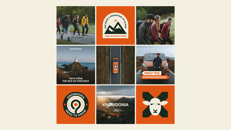
Thisaway created the name and logo for the recently-launched company, as well as a series of social media icons and vehicle livery.
Located in North Wales, Snowdonia is home to the highest point in the country, Snowdon. The area witnessed a resurgence of popularity during lockdown, in addition to the millions of visitors it already attracted annually.
Knowdonia is an expansion of sorts from Christian Wynne, who also founded a hostel in the area. The guide group – which offers curated tours of the region – is an attempt to showcase the region’s diversity not simply limited to the mountain, according to Thisaway founder Graeme Cook.
A tour brand with “personality”

“Having done an audit of brands in the area, we saw an opportunity for a brand to have a personality and a clear point of view,” Cook says. The team considered a target audience of “curious tourists”, he adds, which includes people travelling from London and who are used to high-quality brands and design work.
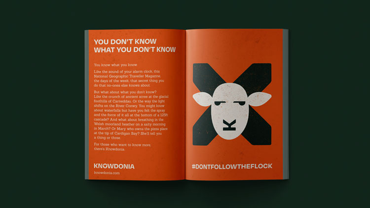
Cook describes the name as a “gift”. “All we had to do was change one letter,” he says, “and it sums up everything he was trying to do – they’re the guys who know where to take you.” The brand’s tagline, ‘Don’t follow the flock’, is another attempt to encourage people beyond the usual attractions.
The central part to conveying this personality is through the sheep icon. “We wanted it to feel deadpan,” Cook says, “obviously Wales has an association with sheep, but we wanted the fun element to come through.”
The icon plays off the idea of how sheep stare at people, Cook explains, but also aims to create a sense of “unexpected” movement. The animal’s mouth and nose is made up of the ‘K’ from the logotype, for example. In the logotype, the whitespace in the ‘O’ is a silhouette of the sheep’s head.
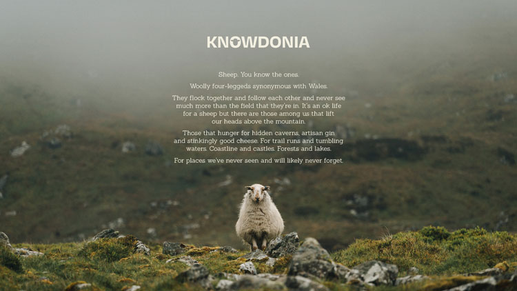
“You’re discovering something by looking at it for a period of time, and then it starts to move,” he says. “There’s an element of delightful discovery there.” ‘Delightful Discovery’ is also the brand’s positioning.
While adding different expressions for the sheep’s face was considered, the team ultimately decided that the sheep’s blank expression was more compelling, the designer explains. The logo is completed with intersecting signposts, a reference to directions and a motif that is used throughout the identity.
Inspired by Snowdonia’s scenery
The burnt orange colour was taken from the tour van Wynne had chosen for the company. The team replicated the shade and added “earthy” tones to complement it, Cook says. The black has shades of green to it, for example. “We wanted it to reflect the colours of the scenery,” he adds.
They typeface used is Degular which – as well as having “personality” – was chosen for its practical solutions, explains Cook.

The logotype’s ‘O’ had to work with the sheep head at its centre, and the ‘K’ had to form the nose and mouth to complete the animal’s face for the symbol. Degular’s ‘K’ has a subtle horizontal between the vertical and arrow which worked well for that purpose, according to the designer.
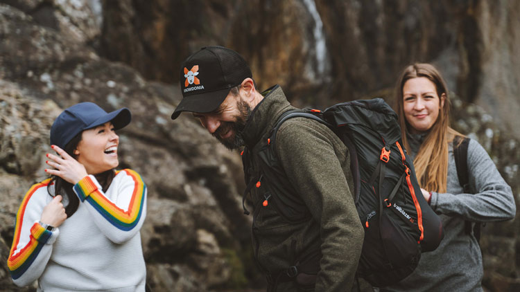
Thisaway has also created a hand-out for the brand and a suite of travel-inspired icons which can be used for social media . The identity also rolls out on livery for the Knowdonia’s van; the sheep’s head has been placed on the roof so that it can be seen by people ascending the region’s hills.


I like it, very clever and the brand expands very well into all areas. But why wasn’t a North Wales based design agency used? There are plenty of good creatives in the area.