Waitrose launches “free from” range with new brand and packaging
The supermarket’s selection, branded by Williams Murray Hamm, is aimed at those with allergies but also the health-conscious, and aims to celebrate rather than diminish “free from” food.

Williams Murray Hamm has designed the branding and packaging for Waitrose’s new own-brand “free from” range, in a bid to show it as a “great-tasting lifestyle choice” rather than make it feel “apologetic”.
The own-brand range is for people with allergies and intolerances, and includes foods that are gluten, nut, dairy and soya-free.
However, the studio has intended the selection to also appeal to people without allergies, who choose to go free from for health reasons, says Chris Ribet, lead designer at Williams Murray Hamm.
“From the outset, we wanted to create something quite different for the category,” he says. “There’s a general tone across [the category], which is quite apologetic in the way it talks about the food, focusing on the allergens and what has been removed rather than making the food feel delicious.
“So we took an editorial approach, almost like a photography magazine like Cereal, to include beautifully shot photography and crafted typography to make [the range] feel beautiful, and so it all looks like great-tasting meals,” he says.
The new sub-brand follows The John Lewis Partnership’s recent rebrand in September led by Pentagram partner Harry Pearce, which saw joint companies John Lewis and Waitrose receive new identities.

The new Waitrose Freefrom brand is centred around the word “freefrom” set in a lowercase, sans-serif typeface in white, which is a bespoke version of a typeface produced by foundry Commercial Type and was produced alongside design studio West One Arts.
This type aims to be “sophisticated and simple”, and is used alongside a pair of parantheses symbols – curved brackets, “{}” – which frame text and food photography. These brackets double up as two lowercase “f” letterforms.
This logo runs alongside the strapline “full of taste”, and the new Waitrose & Partners logo, which was launched as part of the John Lewis and Waitrose rebrands that looked to put more emphasis on the company’s employee-owned business structure.
By highlighting the food through the bracket device, the new brand aims to “shift the mindset for ‘free from’ food”, says Ribet, by celebrating the food as “full of flavour” instead of focusing on the removal of allergens such as gluten and lactose. The hope is to present free from food as a “positive and progressive eating choice”, he says.
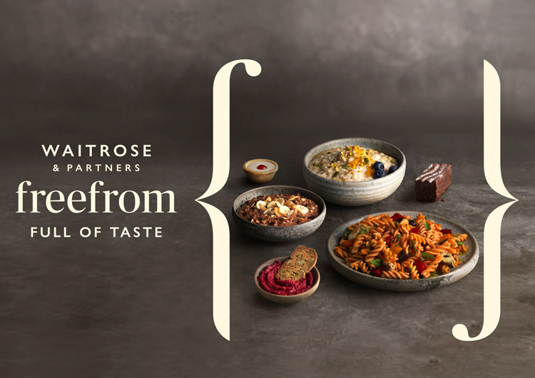
A colour palette of taupe, grey and ivory looks to complement the food photography, with marble, zinc and ceramic utensils and bowls featured.
“I didn’t want a single colour to appear across the products, so we used different temperatures of that taupe grey as a background colour, reflecting the different stones shown in the photography,” says Ribet.
Gill Sans is used as a secondary typeface for body copy, which aligns the brand with the John Lewis and Waitrose rebrands, as this is used extensively across their identities.
The studio has worked with photographer Jonathan Gregson, who took inspiration from the way food magazines present meals.

On certain product packaging, such as cakes, photography is replaced with a clear window, and just the brackets, grey background colour and the logo is used for a “simple message”, says Ribet.
“The market for free from has expanded so exponentially with how people’s lifestyles are changing,” he says. “Its core consumers, 71%, are looking for allergen-free products, but there’s an additional 30% who buy free from because of their lifestyle choices. We wanted our branding to move with the progress of how people are shopping.”
Waitrose’s Freefrom range includes over 40 products, such as gluten-free lasagne, spaghetti, flapjacks and granola, and lactose-free halloumi, mozzarella and feta.
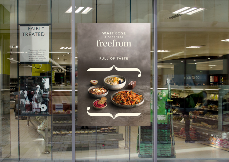
The range is currently launching across Waitrose stores nationwide, and the sub-branding is rolling out across all touchpoints, including print materials like advertising posters, on-shelf food packaging and online platforms including the Waitrose website.


Not free from plastic packaging though! Why?
It’s a shame that creativity in design isn’t being used widely to reduce plastic use yet – or at least maximise what can be recycled.