Supple creates visual identity for app aimed at ex-prisoners
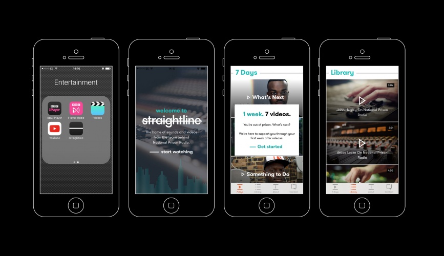
Supple Studio has worked on the the branding for Straightline, a new video and podcast app from the Prison Radio Association (PRA).

Supple Studio has worked on the the branding for Straightline, a new video and podcast app from the Prison Radio Association (PRA).
The charity – which previously developed the National Prison Radio station – has targeted the beta app and website at people who have recently been released from prison, as well as those at risk of getting into trouble with the law.
Phil Maguire, CEO of PRA, says: “On leaving prison people often receive little or no support. In an age where technology and new media channels are developing with pace, the audio and video content of the app represent a straightforward, sharable and accessible way of communicating information to hard-to-reach audiences. This is the logical next step for us.”
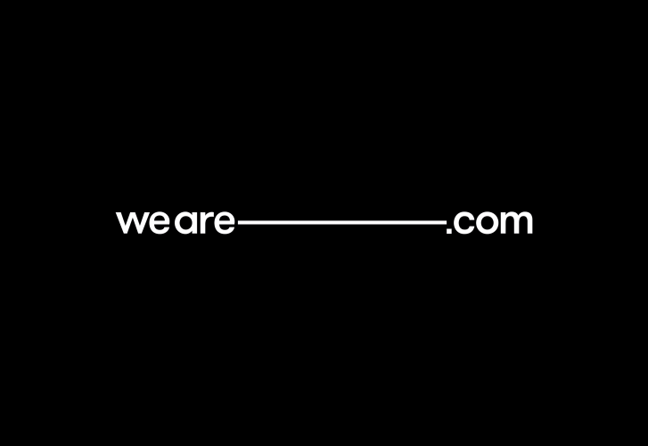
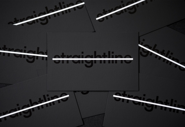
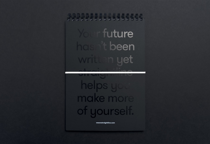
Identity centred around a “simple straight line”
Supple was briefed to create a “simple and cool” brand identity which would appeal to a largely young target audience. “Our solution was to create a rebus-based identity around a simple straight line,” says director, Jamie Ellul.
“Clean, unfussy and easily recognisable, the logo also works as a sting on video content, revealing the Straightline name in a glitchy way.”
Digital agency Mud also designed and built the app and website, which include videos and spoken word programs featuring stories from people who have been in prison.
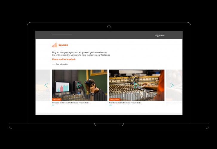
“No nonsense” app and website design
The user experience was designed to be really straightforward, according to founder and creative director, Matt Powell. “We knew we’d be communicating with people with varying levels of computer literacy so it was key that everything on the website and the app was no nonsense and easily accessible,” he says.
“But equally we were keen to build the brand where possible – such as devices like the Sounds feature on the website, which interprets a Soundcloud histogram file and outputs a completely ownable, unique and on-brand audio player.”
The app and website have now launched in beta form.


Read this next


Like the line motif and the execution throughout the literature and digital material but I think the typeface choice waters it down. It looks fine but for me it also makes it look like any other new identity from the last few years. At the moments it feels like 99% of new identities across all sectors seem to feature these geometric sans serifs. Just my opinion of course.