Zulver & Co sweetens Honeypot
Honeypot, the charity that provides refuge for disadvantaged children, has unveiled a new identity created by Zulver & Co, as part of a wider programme to revitalise its image.
Honeypot, the charity that provides refuge for disadvantaged children, has unveiled a new identity created by Zulver & Co, as part of a wider programme to revitalise its image.
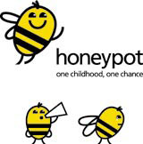
The consultancy has created a ‘stylised bee’ symbol that will act as the charity’s marque, replacing the previous house and sun identity. ‘The problem with our [original] logo is that it wasn’t saying on the tin what it is that we do,’ explains Honeypot chief executive Caroline Short. ‘If the charity is to grow up as we want it to, then the image needs to grow up, too.’
The bee symbol can be adapted for a range of applications, offering a more versatile identity than previously, says Zulver & Co design director Andrew Zulver. ‘The bee can be happy or sad, depending on the tone of any future campaign,’ he explains.
Short says Honeypot will become more hard-hitting in its use of imagery. ‘We want to show images of where these children have come from, using stronger black and white photography,’ she says.
Zulver also generated a new strapline for the charity, One Childhood, One Chance. ‘This captures brilliantly in four words what the charity is about,’ says Short.
The identity will roll out this month and a redesigned website is expected to follow. Zulver & Co was appointed to the work in June without a pitch, on the basis of Short’s ongoing relationship with the consultancy.
-
Post a comment


