Festivecheers
Sara Manuelli rounds up a selection of wines and ports to help bring on the Christmas merriment, but takes in the packaging design before having a tipple
Wine packaging used to fall in two camps. On one side you had the Old World approach, where quality was secured by a discreet design, premium quality paper and sparse, but informative typography, while on the other you had the New World wines, which had to compete hard for the consumer’s attention and were, in their design as well as their produce, less inhibited by tradition and heritage. Today the separation is not so distinct, with European wines having to compete for the slice of the market dominated by the New World, and New World wines aiming for higher prestige.
But what do we look for when buying a bottle? A good price, an attractive label or the desire for quality that can only be satisfied by a 1982 Chateau Margeaux? As our taste buds become more savvy and cosmopolitan, we are picking our vintages with staggering confidence.
Yet the eye wants to play its part in the selection process too, as buying a bottle is increasingly becoming a lifestyle choice, one to display proudly on the table. Here is a selection of the newest labels and bottles to hit the shelves.
1 Sandeman Confradeiro Reserva
redesign by Wren & Rowe
‘Sandeman is placing a greater focus on its wine collection,’ according to Wren & Rowe managing director Paul Foulkes-Arellano. ‘A new tapered bottle was chosen for this premium Douro Reserva. The graphics therefore needed to reflect the “premiumness” and a modern, classic look was created. The label paper was specially selected to highlight the “torn” effect as the special feature at the top of the label. The typography has been carefully crafted and the imagery has been chosen from the private collection of William Pratter images in the Sandeman archives.’
2 Le Clou
by Wren & Rowe
‘Le Clou is a small production wine. The design breaks with most French wine [packaging design] traditions. The label features an embossed image of a nail with a quirky script logo underneath. The striped gold and black capsule is also eccentric. The brand name derives from the French word for “nail”, as the winemaking team felt they had “hit the nail on the head”,’ says Wren & Rowe managing director Paul Foulkes-Arellano.
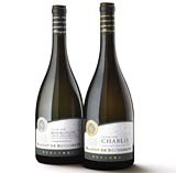
3 BLASON DE BOURGOGNE
by CorpBrand
‘The Blason de Bourgogne brand represents four winemaking co-operatives in the Burgundy region that have come together for the first time to create a brand-offer specifically targeted to meet the needs of the UK consumer,’ says CorpBrand creative director Colin Porter. ‘Typically, French labels carry complex messages surrounding different villages, appellations, producers and grape varieties. Branding is limited and the use of French terms can be off-putting to a market that has grown increasingly used to the straightforward, English-speaking approach of New World producers. The development of the Blason de Bourgogne brand by the four co-operatives – La Chablisienne, Cave de Buxy, Cave de Bailly and Cave de Prissé – has come about by the breaking down of these old ways of working, turning the emphasis away from production and very much towards the consumer. The word “Burgundy” is placed prominently on every single bottle, alongside the Blason de Bourgogne brand marque.’
4 FERREIRA PORTS
by Lewis Moberly
To commemorate the 250th anniversary of Portuguese brand Ferreira, Lewis Moberly has redesigned the complete portfolio of Ferreria ports. ‘Wine has moved from artisanal and elitist, to populist,’ says Lewis Moberly creative director Mary Lewis. ‘Mass market techniques have led to wines that have been blended for blandness, which use every trick in the trade to get noticed. Meanwhile, consumers have become more experienced and many will move back to wine roots in search of variety, ‘terroir’ and taste. Those brands that can hold on to these values will thrive. Those that lose sight of them will be passing ships in the night.’
5 REINE ELISSA CHATEAU
by CorpBrand
‘This wine is owned by a Belgian producer that has some vineyards in Tunisia. Tunisia has a great soil for red wine making. The first vintage, a Cabernet Shiraz was exceptional,’ says CorpBrand creative director Colin Porter. ‘We went for a modern design with a hint of New World since we couldn’t really opt for the North African look – consumers are a bit suspicious of that,’ he says. Since Tunisia is an ex-colony, the French connection was also reinforced.
6 SELFRIDGES OWN-LABEL WINES AND CHAMPAGNE
by R Design
R Design created the packaging of all the Selfridges own-label products, including the wines and the champagne. ‘Our first idea was to design a range of packs as simple as possible. We decided that all packs should be one colour with no product showing and flavour insinuated through type colour,’ says R Design director Dave Richmond. ‘Typography is simple and placed within a strict grid all the same point size no matter what size the pack is. We wanted people to actually notice the packs and the fact that it was unmistakably from Selfridges before the product itself. I’ve already been asked several times “why black?”. Well, I could say that one of the corporate colours is black and it’s timeless and classic, but the truth is it looks sexy and luxurious, and I seem to remember it working for Henry T Ford on something or other.’
7 The Dow’s range of Ports
by Design Bridge
‘The Dow’s range of vintage ports have all been designed in a new Dow’s bottle,’ says Design Bridge group creative director Graham Shearsby. ‘All the individual label designs bear a family resemblance, utilising the trademark Dow’s triangle to a greater or lesser extent and all portraying the brand’s core characteristics – simple, but smart, an understated British classic that is steeped in history. Within this overall family language, each individual product has its own personality. Traditionally, ports tend to be designed for a male audience, with heavy-duty style stencilled labels. Dow’s Midnight, which is hitting the shelves now, is more in touch with its feminine side. The inspiration was “Dangerous Liaisons”, and the label is set in elegant type.’
-
Post a comment


