Free design should not be dull design with Queen’s Golden Jubilee logo
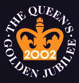
In reference to the Queen’s Golden Jubilee logo by Nicholas Jenkins Design (DW 28 June), I am not surprised to learn that the design of the logo was completed free of charge.
If Britain still considers itself to be a leading light in the global design community, and a country proud of its monarchy and heritage, then to produce such a dismal effort for such a major national celebration is something of which we should be ashamed .
Simple, it most certainly needs to be. Boring? Dull? Predictable? It didn’t have to be, but it is.
It must have taken considerable thought to put a crown in the centre, run four words around the outside and then just slap a completely inconsistent 2002 inside the crown.
Does free design also have to be dull design? Does anyone else have a view?
Mark Elgar
Head of sales & marketing
Barsby Prince & Partners
Letters to the Editor should be sent to: Design Week, 50 Poland Street, London W1F 7AX
Fax: 020 7970 6730, e-mail: lyndark@centaur.co.UK, website: www.design-week.co.UK
Read this next

-
Post a comment


